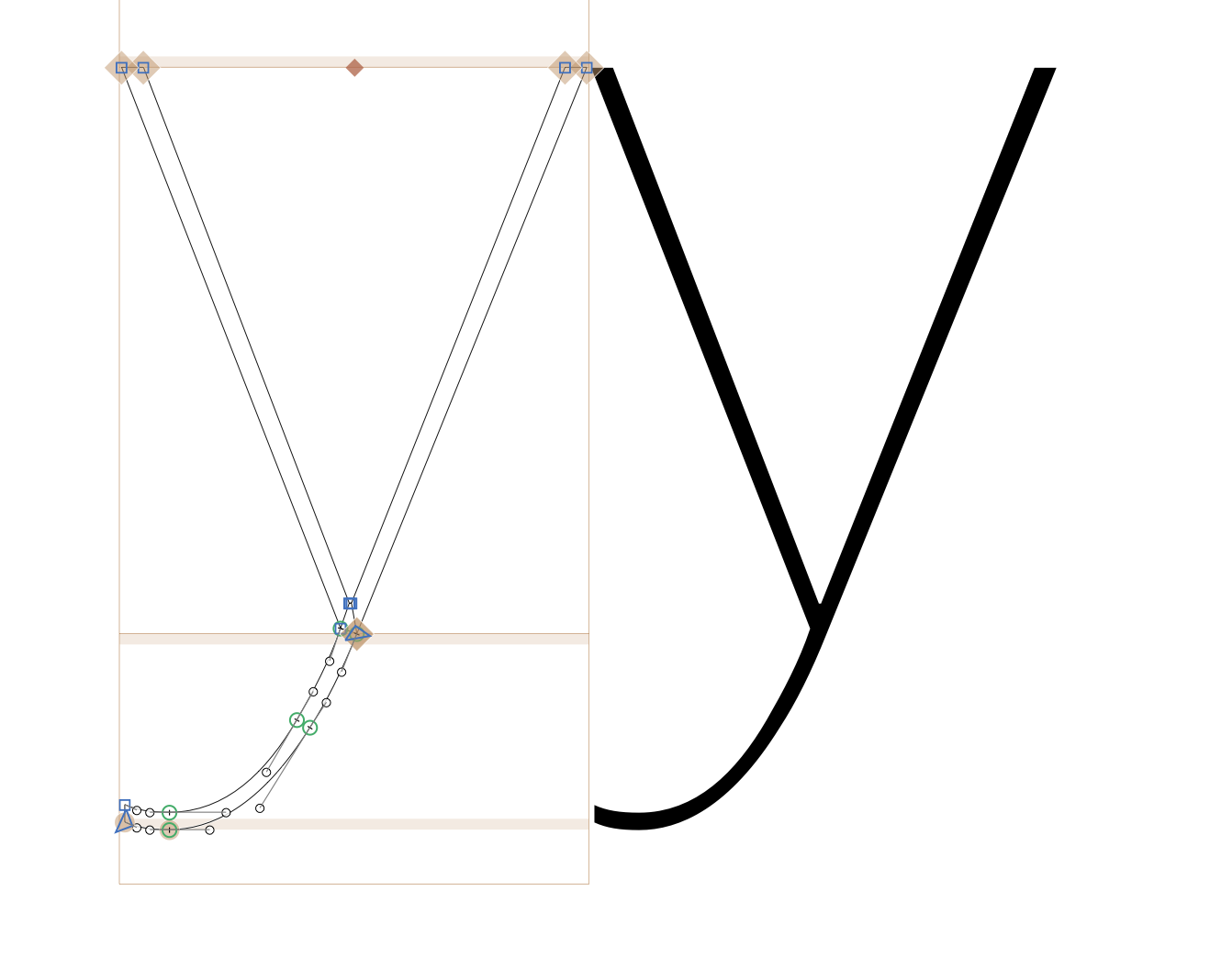
I’m having difficulties getting a clean interpolation of the lowercase y.
Any inputs? (I’m familiar with the Bracket trick)
Thanks a lot!
I’m having difficulties getting a clean interpolation of the lowercase y.
Any inputs? (I’m familiar with the Bracket trick)
Thanks a lot!
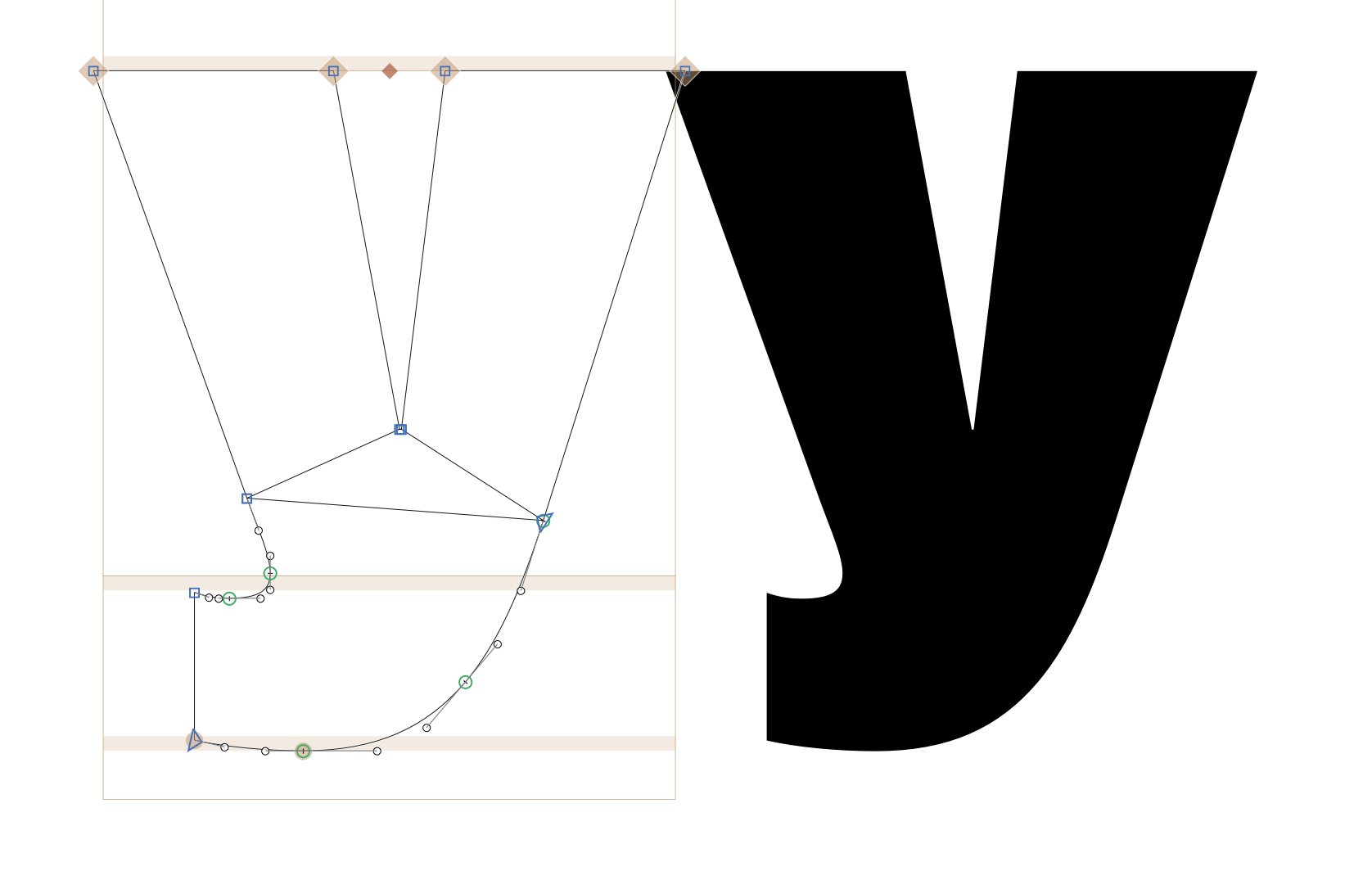
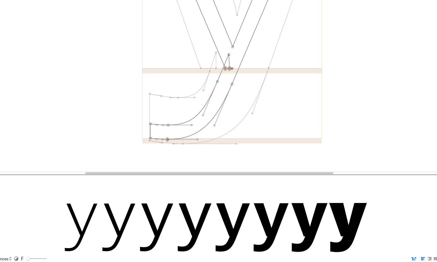
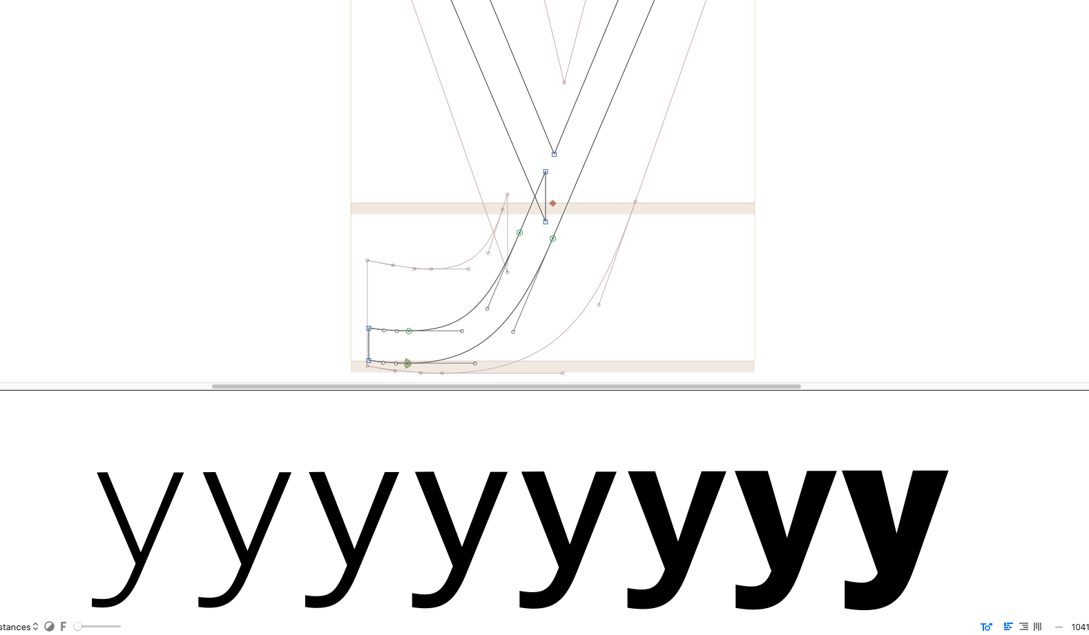
I tried this and it seems that the structure is too different to get it to work with two masters. a intermediate master is not helping much. So you need to use brackets layers. Or change the design a bit. The problem is that the connection between the left stroke is sharp and pointing right and the stroke goes into the other stem in the same way
Thanks George.
I’m also struggling with the lower stem, which gains too much weight almost at the beginning of the interpolation.
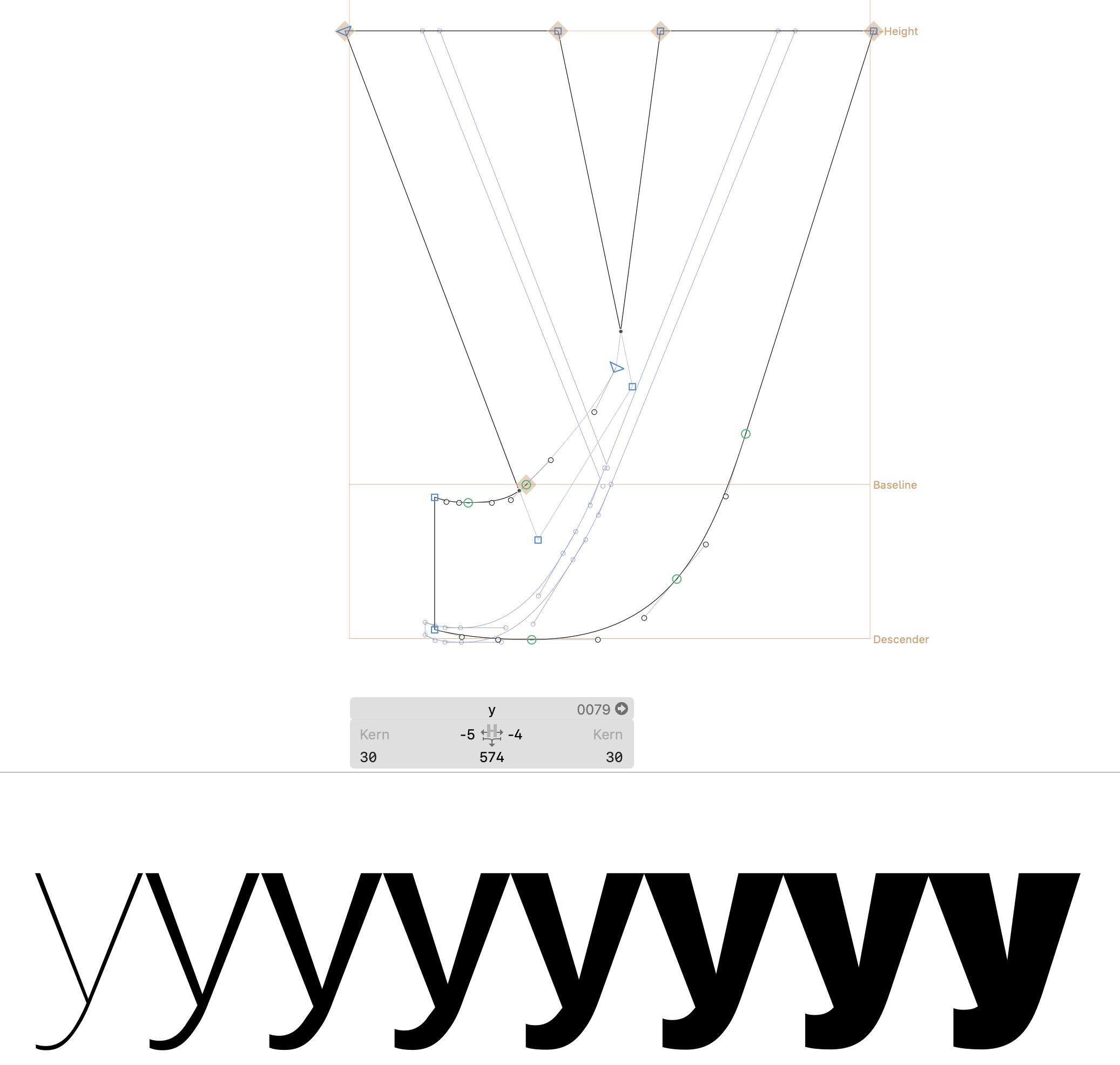
Hi, I’m not sure how you imagine it to interpolate properly between a y with a sharp connection and a smooth connection at the baseline. Try braces (or brackets? No idea, I always mix up the names) where you switch between the two design choices at some point in the interpolation. in regards to the weight distribution which doesn’t interpolate nicely, what part exactly do you mean?
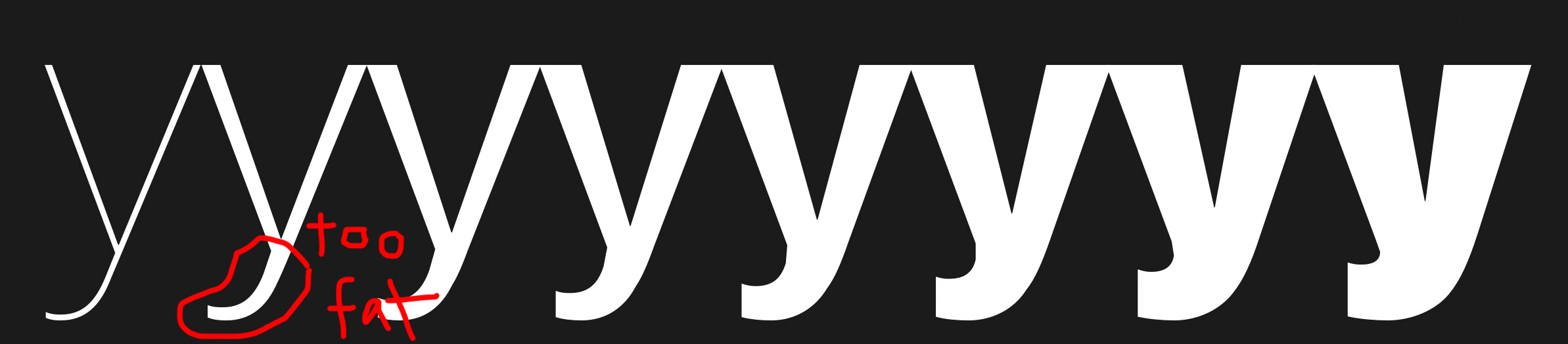
The lower part gains too much weight immediately.
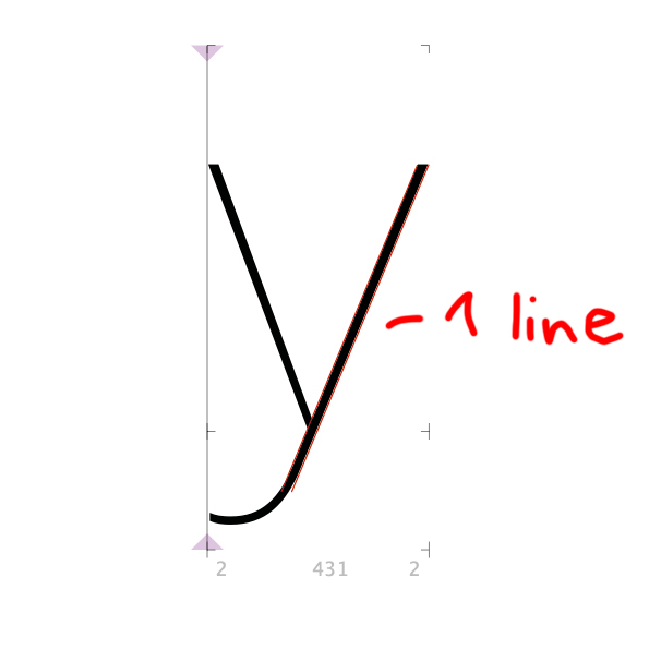
I want the red marked line in image 2 to stay as one line with the same weight until the regular weight.
Yes, that is because you’re trying to interpolate between the y with a sharp (Thin) and a smooth (Black) connection. Measure the distance between the two nodes responsible for the thickness of that line and you will find it to be much much thicker in the Black than your actual stem weight – you are using compatible outlines for different designs, meaning while both constructions work in their respective masters, the nodes have different functions. Makes sense?
Hi, sorry to revive this topic, but I just thought of it again while drawing a y. As you will find in many typefaces which support a broad range of weights, a very useful construction of the y utilises a flat section at the bottom part which can interpolate nicely if you draw it like (for instance) this:
Note that it is important that the node construction is not only technically compatible, but that the nodes each serve the same design function in your glyph. This is why it’s sometimes necessary to use more nodes than might appear obligatory, as in the construction shown above.
Hope that helps.
P.S.: you can opt for a slightly different design if you wish, without the flat segment. This works up until a certain weight, but gets very difficult to maintain after a certain point. Note that the ExtraLight master looks the same but has a different construction in order to maintain design compatibility with the Black.