I’m considering editing Gill Sans to include a raised c, or possibly a raised c with a dot or line beneath for use in the Mc in Scottish names. The line or dot denotes that the Mc is a contraction of Mac. I want to know if there is an actual name and unicode for this glyph? It is for an earthquake memorial in Christchurch New Zealand.
I doubt there is a unicode for that. I would implement it as a ligature of c+dotbelow. Possibly put it in a stylistic set to be able to switch between the raised ann normal version. But if you only need it for a particular project it doesn’t really matter.
You might ask on typedrawers.com.
How about an alternate c when a normal c is preceded and followed by capital letters? Like this:
sub @AllCapitals c’ @AllCapitals by c.raised;
That’s bad practice. The dotbelow mark has semantic meaning.
Yeah, an abbreviation of a letter. In this case it’s a.
Was that a response to me? The dot below mark is, for example, used for cerebral and retroflex consonants in Sanskrit and Vedic.
Thank you all for your responses. FYI, Scottish editors I’ve spoken to have noted that originally all Mc had a dot or a line beneath the c to denote the contraction from Mac, but this was largely dropped when typewriters replaced handwriting. There are examples in some Scottish monuments that I’ve researched where this practice has been used. Interesting to know that it is used for other purposes in other languages.
You could include “c” in sups.
You don’t need a universal solution, just something that works for your case. The easies would be to make it a discretional ligature of c+period. That would make a bit sense and is easy to type.
Yes that was a response to you. In this case the dot below is not literally the diacritic mark, rather it’s a period kerned to the bottom of the letter. In Britain for example, you see lots of examples of № but period is used instead of underscore as abbreviation.
In this case, I don’t think you don’t need to type period. You just make a raised c with a dot below it, and make it appear when they are sandwiched by two capital letters, or more specifically, by M and another capital.
I’m just saying you shouldn’t use an OpenType feature to turn base character + mark to a stylistic form. I have no objections to using a stylistic form.
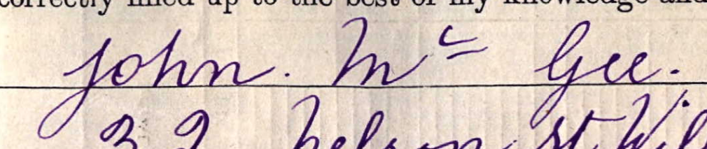
This is how one of my relatives has written his name Mc Gee in the 1911 England Census.
It does have the raised c with an underline under it.
Not sure what sort of style this is called though?
Could be done with a contextual alternate for a c after a cap M and before another @Uppercase letter.