I’m working on a font and I’d like to add the Ǻ character and can’t find it in the Glyphs App. Any pointers on creating this character?
What do you mean you cant find it? You have to generate ‘Aringacute’. You can make the ring a bit smaller and the acute a bit flatter.
You can always access WINDOW > GLYPH INFO to find characters that are not reachable through the basic interface.
Ah both replies helped so much. Thank you for your feedback. I’ve been learning as I go so each project requires a new learning experience.
1 Like
So, tell me: What do you need the Ǻ for?
It is not included in the Western Latin list, because I believe (@Frode_Helland, please correct me if I am wrong on this) no one has ever seen this letter in the wild. Same goes for glyphs like napostrophe or aeacute. It is usually the better choice to not include them in your glyph set.
In this vein I am not sure about oeacute either. Can someone verify the usage?
Ǽ occurs in Danish, but only in linguistic/dictionary texts and is used to mark syllable stress. Some documents claim the same for Ǻ, but there are multiple conflicting sources. Following the same logic, Norwegian and Swedish should also have it, but no sources claim that to be the case. The one place the Ǻ actually is in daily use, is in a small Norwegian dialect called Vallemål (or Setesdalsk). The orthography is unofficial, and not recognized by the Norwegian government. To make matters worse, most Vallemål-speakers omit these accented variants because they are cumbersome to reproduce on the keyboard and often missing from fonts. Ǽ also occur in Danish transliteration (please correct me if I’m using the wrong term) of Old Norse, and it is still used in reproduction of Old Icelandic texts (a dialect of Old Norse).
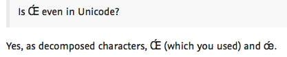
Is Œ́ even in Unicode? It occurs in some very early Old Icelandic texts, but modern reproductions use Á or Æ instead.
5 Likes
Yes, as decomposed characters, Œ́ (which you used) and œ́.
The Glyphs forum font doesn’t accurately support capital Œ with combining acute.
![]()
Anyway, I meant what you said.
I guess that depends on the browser you use. Does not look that bad to me:
Chrome previous one. Here’s Firefox: ![]()
1 Like
As a space-saving technique would it be acceptable to put the acute alongside the ring on the same level? I have seen this done with Sacutedotaccent but I’m not sure how well it would be accepted for everything, or if at all.
Putting the second accent next to the first is common for Vietnamese accents but I haven’t seen it for the ring+acute.
After looking at more comparison resources, the solution I settled on is to make an alternate ring for this glyph only. I flattened it about 2% and rotated the acute slightly to tighten things up. That brings it much closer to the alignment of the Vietnamese stacked accents.
The majority of the resources did not use a side-by-side solution on the /Sacutedotaccent either so I will consider that it shouldn’t be done.
I once did a smaller A that I used as a component in Aringacute and usually attach the ring to the A (with an extra anchor).
Personally I don’t like reducing the size of glyphs just to accommodate an accent. Equipment manufacturers frequently had those in the early days due to machine limitations and I always thought they looked too odd.
As for attaching the ring onto the /A, from what I’ve read that is something Scandinavians don’t like to see, so I will avoid doing that.
For a letter that is only there by accident it is okay to cheat a bit.
I was in Sweden a few years ago and had a look on what locals whould use. There was no clear winner but I think the connected shape was a bit more frequent. Very anecdotal evidence that is.
Looks perfectly fine on Safari.
1 Like
Looks perfectly fine on Safari.
I’ve seen Safari synthesize a solution in the past, when the mark positioning code was missing. It aligns the black area of the base with the black area of the mark. It works OK for some combinations, but fails spectaculary in other. In any case, Œ and œ typically do not need top anchors.
I was in Sweden a few years ago and had a look on what locals whould use. There was no clear winner but I think the connected shape was a bit more frequent. Very anecdotal evidence that is.
I would be very surprised if you saw an Ǻ in the wild in Sweden. Did you perhaps mean the Å? Lettering-wise, it gets bullied around a lot, and much of the type we have available in Scandinavia does not originate from here, so it is hard to judge by type usage. Newspapers do commonly adjust fonts for tight setting, but often times very crudely and agressively. For tight settings, the most common (and least jarring) solution is to merge the ring with the base – not to resize the A. I, and many with me, prefer the ring in Å disconnected from the base in text setting, but don’t mind it in display context.