Hello!
What may be causing this misalignment at this specific point/pixel size?
The font looks descent at larger sizes, but at font-sizes smaller than 32px the glyphs are very weird looking (especially on windows). It is a hinting problem?
But if you get a similar result from auto hinting and manual hinting, then there is something wrong. Are you sure you disabled the “autohinting” in the export dialog?
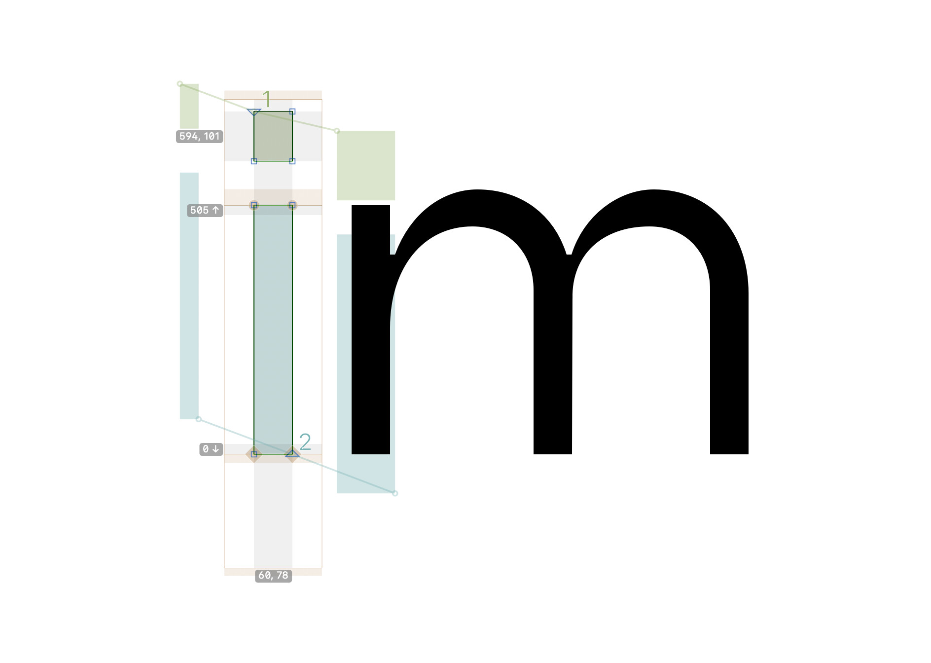
The baseline seems to match but the nodes at the x-height are not on the metrics line (they don’t have the brown diamond shape behind them). But that shouldn’t cause those issues.
Your overshot is quite big. It might be that the autohinter is confused by this. I’m not so familiar with the autohinting settings parameter if it can solves this.
The screenshots show PS hints, not TT hints. They have no influence on TT Hinting.
This design does not lend itself for good overshoot suppression. The overshoots are simply too big. A rasterizer will only be able to suppress overshoots up to a relatively small size.
If your drawings are consistent enough (stick to the metrics and overshoots), you can try ttfautohint with optimized settings. See the ttfautohint tutorial.