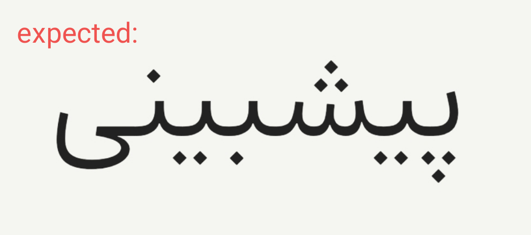
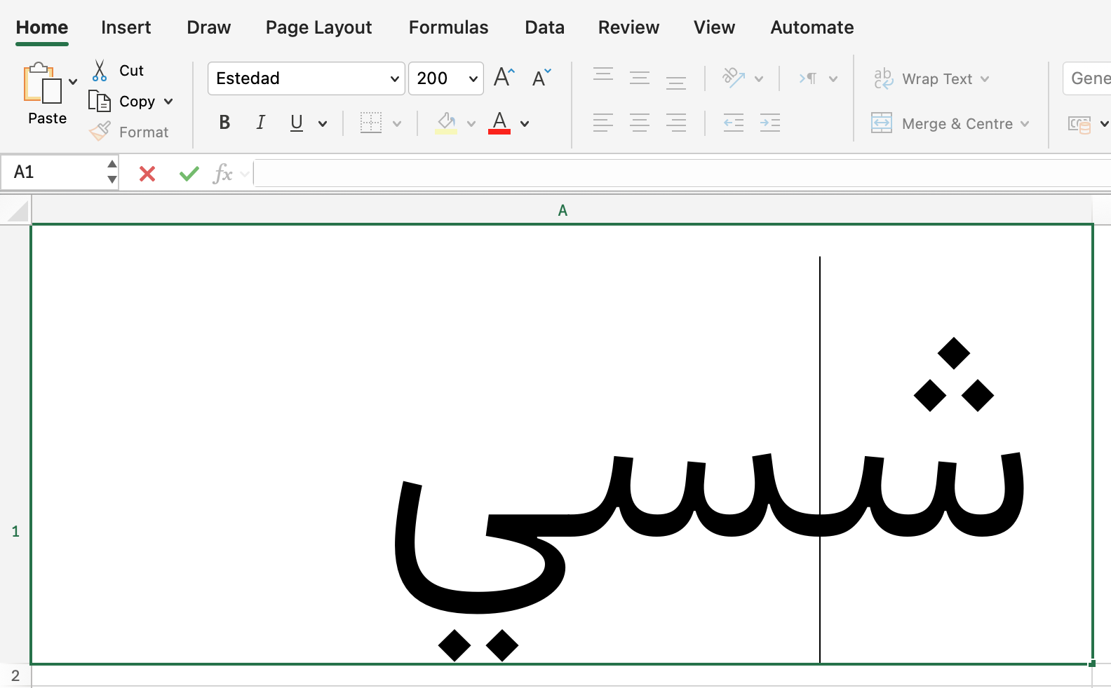
Microsoft Excel seems to have trouble with correctly applying the mark feature for Estedad. Apparently, it cannot properly handle the decomposed structure.(There is no issue with MS Word or MS PowerPoint)
One thing I’ve noticed is that the decomposed structure works without any issues in some other Arabic fonts (for example, Dabestan from MaryamSoft). So there is hope that a workaround or solution exists. any insights would be appreciated.
Yes, I mentioned it. It uses a decomposed approach (the input is decomposed into base and mark glyphs (strokes and dots), instead of using precomposed glyphs built from components of stroke and dots).
MaryamSoft has been using this method for years, moving dots by means of kerning them with other invisible characters. I use the same approach to change dot forms via stylistic sets here.
Not sure at all about Excel. A lot of things do not work there. Wouldn’t be surprised if what you see in other fonts are the precomposed fallbacks.
Put the dots in good fallback places. I see you put them close to the baseline. So that in the worst case, the vertical position is not all bad.
If you want to have any chance at making GPOS work in MS Office apps, add an empty fvar table. There is a script called winfix.py in the Post Production subfolder of the mekkablue scripts. You can run it in the Terminal with python3 winfix.py "~/Desktop/My Fonts/*.ttf" (the part between straight quotes should be the path to your TTFs.
But the issue is definitely more complex, because it would also snap back sometimes while editing, but I have not been able to reproduce it reliably.
For the time being I would not trust Excel for Mac with variable fonts, nor with GPOS. I see similar issues with Chromium-based browsers. It works remarkably well in TextEdit (and presumably all CoreText-based apps).
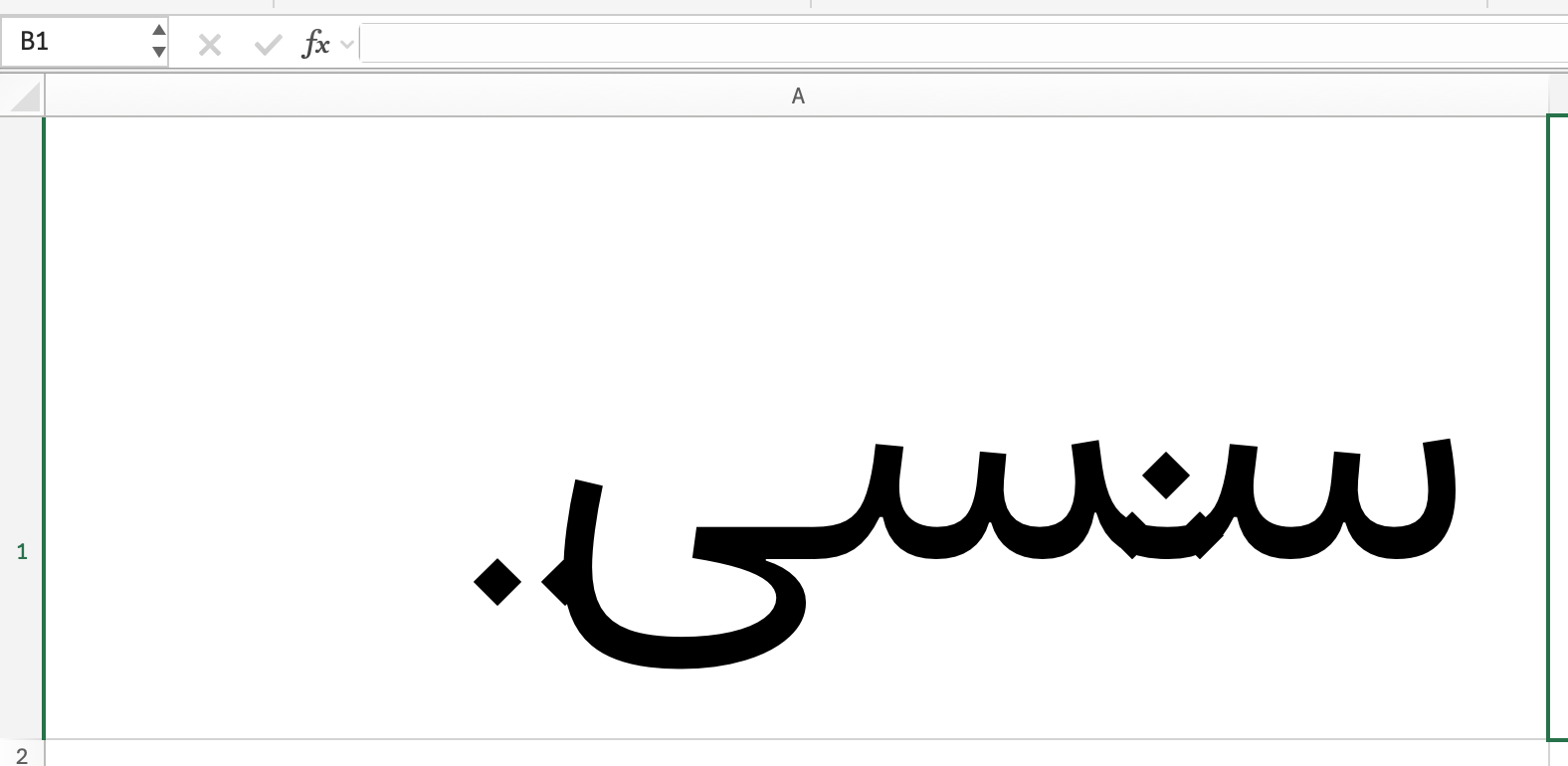
It seems to be a general issue with glyph positioning an even substitution. Almost all fonts are affected, regardless if they are decomposed or not, though in many decomposed fonts the issue is more pronounced.
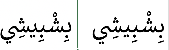
Even Callibri is affected. Left while editing the text and right while not. The mark positions are slightly different, but also the beh-like glyphs are different ones:
The Calibri example is interesting. The beh teeth are all done in calt as precomposed alternates, while the seen yeh is a skeleton ligature with dots placed via OT.