I’m programming my first font in Glyphs. I decided to learn, and here I am. Everything was going very well with Glyphs, until the italic version…
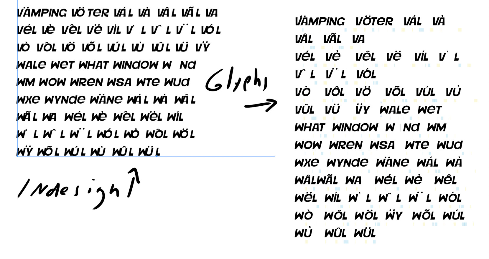
In Glyphs, a perfect preview appears, but when I export, the accents and some kernings appear misconfigured in InDesign, Illustrator, etc…
I really need to solve this. Maybe it’s something related to the anchors? Can anyone help me, or know someone who can? Thank you in advance.
Hi George! Thank you for your attention. I reinstalled the font on other computers and the error persisted. I don’t think it’s a cache issue; I think I made a mistake in the process : (
the other styles are working well
The file had an enormous amount of tabs open, to the point that it slows down the app. Opt-click on the close button of one of the tabs to close all tabs but that one.
The paths need cleaning up. See the Drawing Good Paths tutorial for tips, I recommend the Show Angled Handles plug-in or the View menu.
Uppercase and lowercase appear to be the same. Delete your lowercase glyphs and apply double encoding to your caps. See the Creating an All-Caps Font tutorial.
Do not export both OTF and TTF, focus on one of the two, otherwise you run into font conflicts. If you are focusing on Adobe apps, take CFF/OTF and use the Adobe Fonts folder. For Windows, TTF is better.
For diacritics, make sure you use anchors. See the Diacritics tutorial on how to most efficiently build your accent marks and diacritic letters.
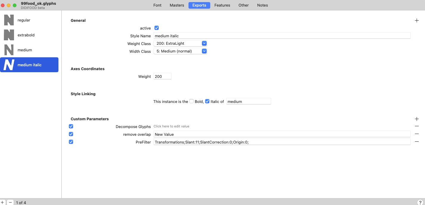
In Font Info > Font and Font Info > Masters, the axes and master positions (the ‘design space’) are not set up correctly. Two masters share the same coordinates. And on the Weight axis, lower coordinates usually correspond to lighter styles, higher coordinates to bolder styles. In the file I received, it was the other way around. If you want to avoid adding an Italic axis, consider automating the Italic export instance with custom parameters as you already do in the italic export in Font Info > Export. In that case, just delete your italic master in Font Info > Masters. Set the metrics of your font in File > Font Info > Masters. The cap height should correspond to the actual height of your caps.
When you slant, use the center of the cap height as pivotal point (transformation origin ‘1/2 cap height’). Consider a more conservative angle. 11 is a lot, better try 8.
Spacing seems off, all the glyphs seem to have been moved to the left. See the Spacing tutorial on how to redo the spacing. Also, many glyphs are just 1 unit away from the baseline.
HTH. See the setup in the file I sent back. This one exports fine in the Adobe Fonts folder.
Out of curiosity, how did you make those outlines? They do not appear to have been drawn in Glyphs.
Rainer, thank you very much for your attention.
I’m a self-taught illustrator… I draw some alphabets from time to time, but I deliver them in Illustrator or PSD. I made these outlines in Illustrator and copied them to Glyphs letter by letter… and adjusted them by pasting them back into Illustrator. For my next project, I want to draw in Glyphs; I found it much better than Illustrator for drawing – but when I started with this one, I didn’t know. This was my first attempt at programming a font.
I humbly acknowledge that if I want to continue down this path, I need to study.
Perhaps you want a kickstarter workshop. I think Viktor Balthus has another one coming up these days. Scroll down on the Learn page and you’ll find a lot of online courses.