Justify low.. spaces and gaps in Arabic

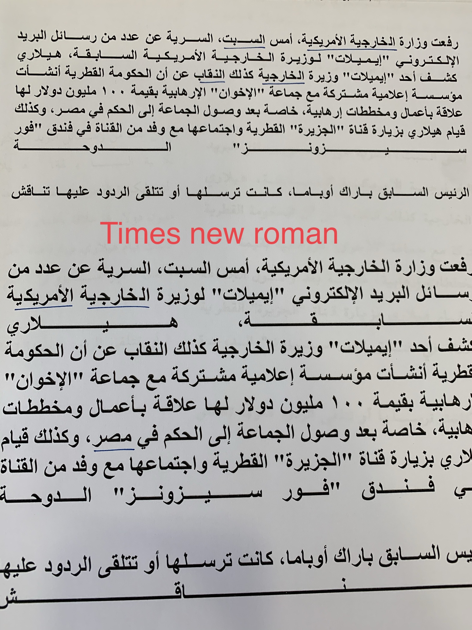
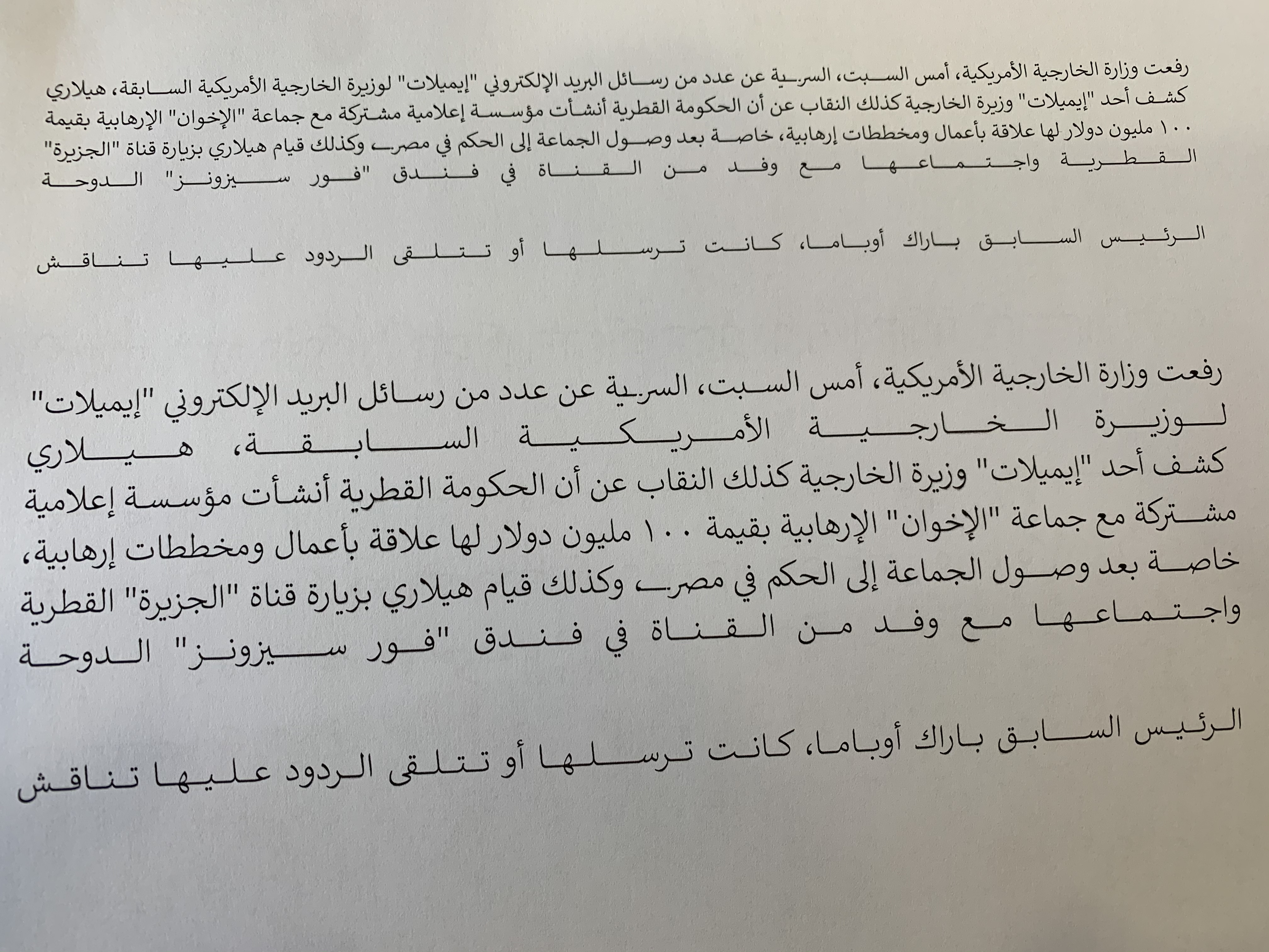
I am using Microsoft Word 2016. And I am facing an issue with my Arabic fonts and other Arabic system fonts ( Times new roman - Tahoma - Arial …) when I use ( justify low) option. There are some spaces and gaps between Kasheda.ar and the next glyph ( after printing). please see image

Comparing with some other font like Calibri there are no gaps or spaces with ( justify low) option.

Is there any thing should I do with the font to avoiding that gaps and spaces? or its an issue with the application itself?

Calibri font

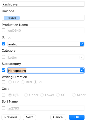
My version of Calibri does not contain Arabic. Perhaps take a look at the kashida-ar and its relationship to the nbspace. And of course, it is also luck, because it has to stretch very far, it may put some of the weight on word spaces, not just the kashida. Some apps offer extra Arabic justification settings for this, but I don’t think Word does.

What I can say for making fonts work in Word on Windows:

  • Make sure you cover Win1252 completely, including nbspace.
  • Export as TTF.

Hello
Thank you for your reply
Can you please give me more information resources about nbspace and how can I use it in my font?

nbspace is the non-breaking space. Make it the same as space, best to set the width to =space.

I notice that justify low works fine with DIN Next LT Arabic and Arial Arabic. Because that fonts use different types of kashidas:

  • Kashida
  • Kashida.Narrow
  • Kashida.Long

but I need to know how that fonts use it as lookup to trick MS Office. how can I see the source code of DIN Next LT Arabic and Arial Arabic fonts?

You cannot see the source code but you can look inside the OTFs with OTMaster.

OTMaster is too expensive for me.
is there any other way to look inside OTFs?

Fonttools/ttx if you know how to handle it.

OTMaster Light is free. It doesn’t let you save changes, but you don’t need that for this purpose.

Maybe FontTableViewer can help too.

Thank you
I will try it :rose: