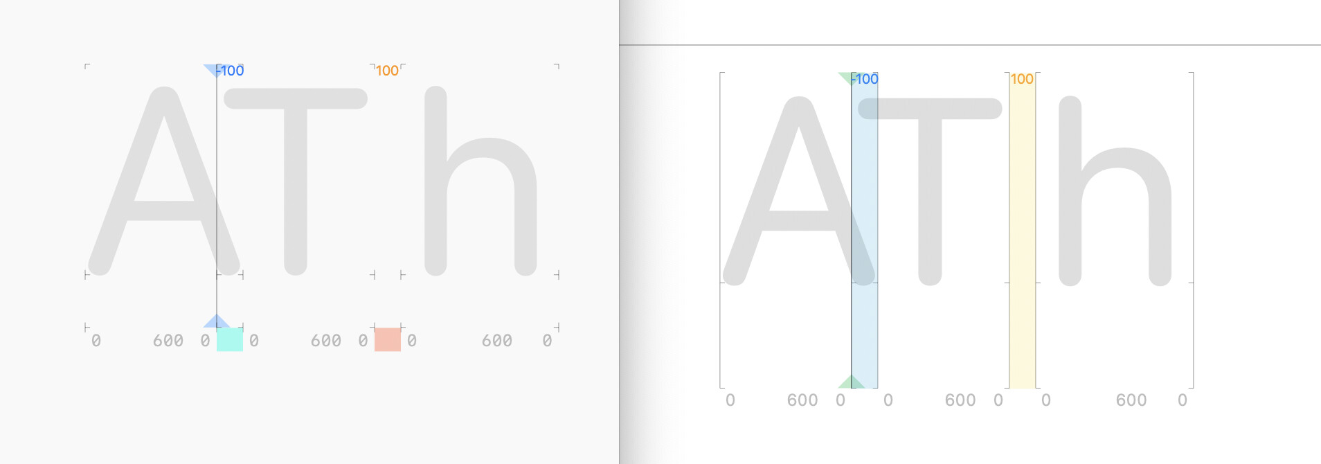
I really appreciate the subtly of G3 minimal kerning and metric line visuals.
In G4, when the kerning color bands span the full height of glyph, the text becomes too many colorful stripes and it is distracting while kerning.
The sidebearing lines and the horizontal lines between text also feel somewhat visually distracting.
Would it be possible to add a setting to be able to switch to G3 minimal visuals?