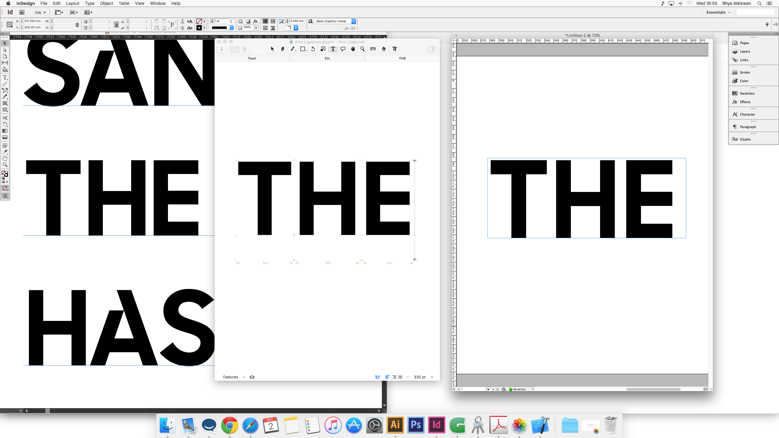
I am noticing quite a large difference in the kerning between, Illustrator, Indesign and glyphs, I was just wondering what the reasoning to this was?
1 Like
Optical Kerning in InD?
Both are set to metric, InD is close to glyphs, Its illustrator that is tightening everything up
Are you using the Adobe Fonts folder?
http://www.glyphsapp.com/tutorials/testing-your-fonts-in-adobe-apps
Yeah
Some other setting in AI maybe? Tracking? InD and Glyphs seem to be the same to me.
Nope everything is standard, Maybe be interesting to open this up to some other users to do comparisons on their typefaces, maybe more of a problem with illustrator.
Took a closer look and it seems okay except for the missing positive kerning between H and E. Are you sure kerning is not off in AI? Please send me the .glyphs file in a DM.