Hey Guys  !
!
I hope this isn’t something i’ve missed in the forum, but i don’t know how to find this out and i didn’t find something in the learning section.
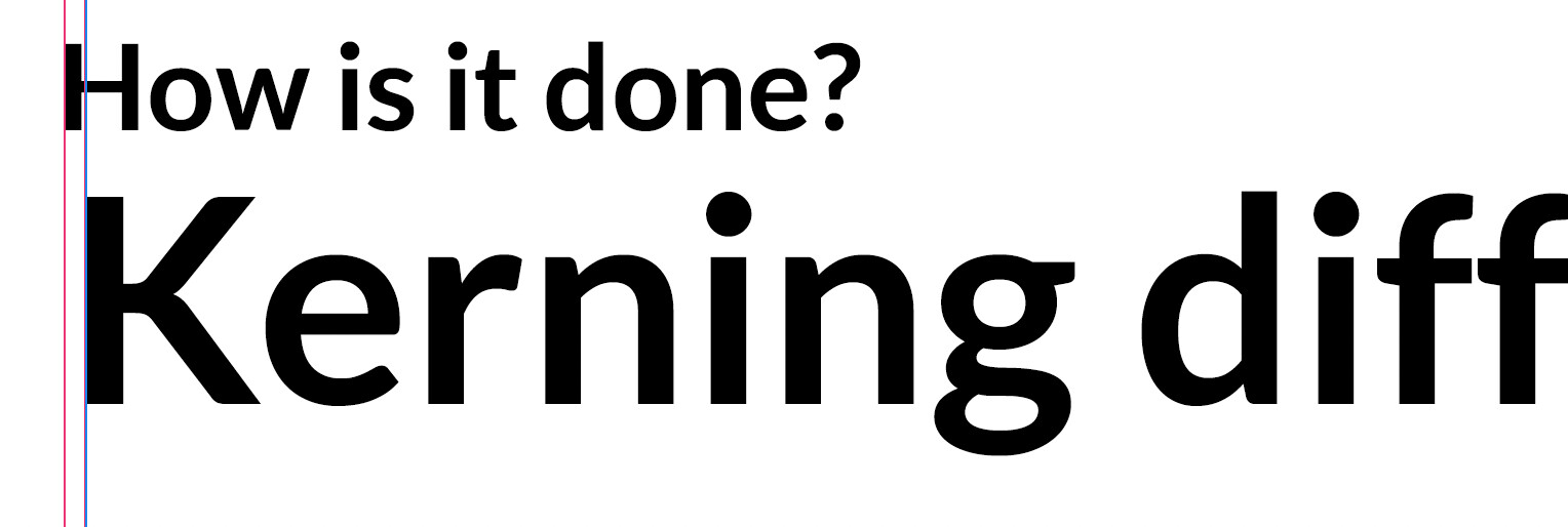
On websites i often see this: a subheadline set above the Headline, both in different sizes. Because the Subheadline has a (logically) smaller font size than the Headline, the space between the left Edge and the first letters in each line are extremely different. Here is an example:
Is this somehow avoidable by designing different kerning values on different sizes or is there any possibility to kern the first letter in a line different? Something similar? Or is this a problem concerning css coding and it isn’t something which belongs to this forum and designing fonts? Somebody here who can tell me something? 
There are the lfbd and rtbd OpenType features which allow the font to kern into the left and right margin respectively. As far as I know, not many applications make use of these features, so you might want to test in the applications relevant to you first before defining adjustments for all your glyphs.
Even if lfbd and rtbd are supported, you might find that they do not provide sufficiently fine control to match lines of different font-sizes. (These features are mainly designed to align lines of the same size; e.g. to balance a T at the start of a line with an M as the first letter on the next line.)
Specifically for hanging punctuation, there is the CSS property hanging-punctuation, but it is still a working draft and thus not implemented by many browsers.
As far as I can tell, such adjustments need to be made manually (which is close to impossible with dynamic content on the Web) and there is no satisfactory automation method for HTML/CSS.
1 Like
Wow! That’s a detailed answer! Thank you so much for helping me. I really appreciate it.
Can i ask one more?
Like as you said: „not many applications make use of these features”. What is your assessment? Make the type foundries use of these lfbd and rtbd features? Because in my opinion all the fonts (also expensive and done by established foundries) out there are not well aligned when it comes to the first letters in different lines. So, is it something you should definetly think of and use, when designing a font. Or is it not common to use these features? Because i am not able to find any tutorial with regard to this topic out there.
Again: Thank you so much!
Out of 2550 fonts on my computer, only 4 have lfbd and rtbd features. Two of those four have only 3 adjusted glyphs (hyphen, V, and W).
The other two fonts — EBGaramond12-Regular and EBGaramondSC12-Regular — have around 35 adjusted glyph classes for lfbd and rtbd.
So, my answer to
is: no. Practically no font has these features.
If, however, you are still interested, then you should know that the excellent EB Garamond fonts are open-source; you can have a look at their feature code for lfbd and rtbd on the GitHub repository.
In the TeX-world there is the much-used microtype package that does this kind of alignment (among other things). microtype does not use the OpenType lfbd and rtbd features; instead, it reads values from the \SetProtrusion macro. Luckily, EB Garamond also ships with pre-made values for the \SetProtrusion macro which can also be found on GitHub.
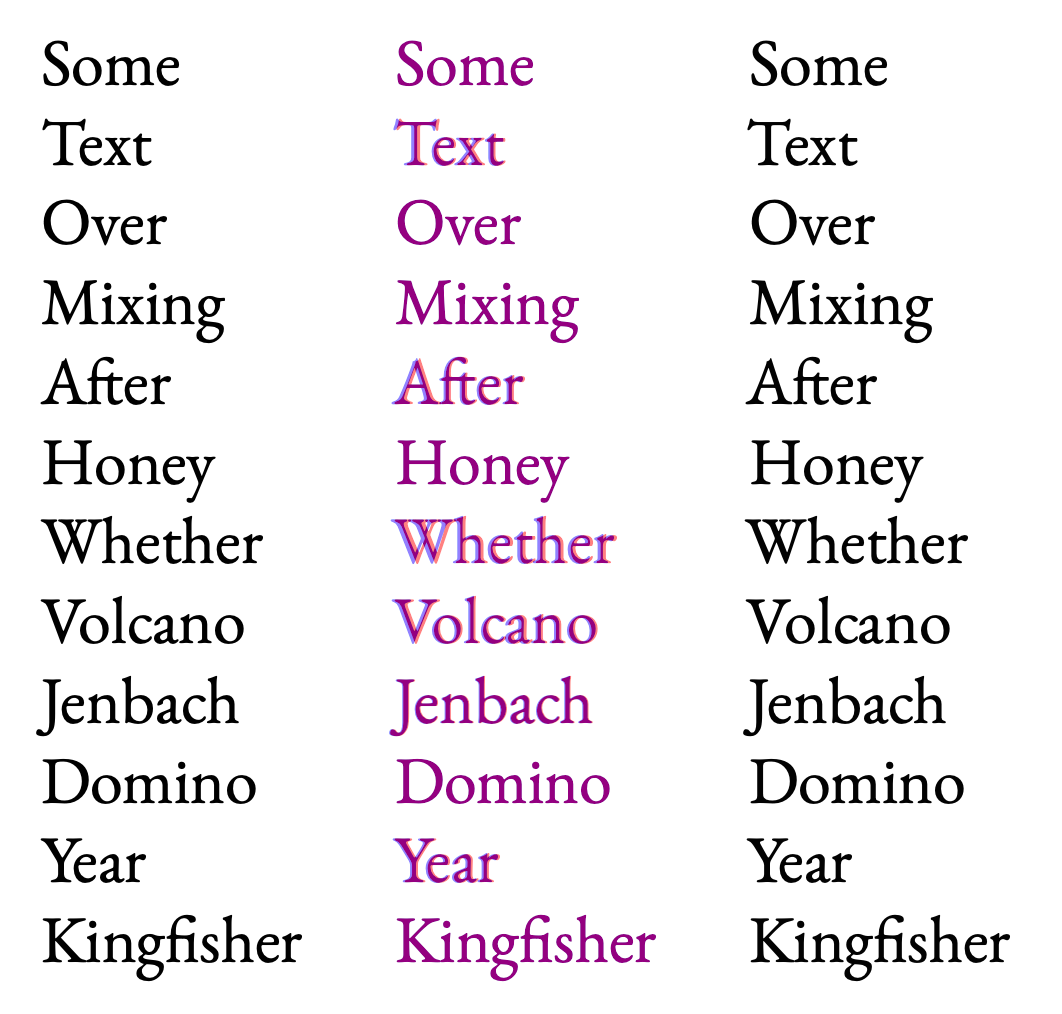
This is the effect of using EB Garamond with microtype:
[left: without microtype; middle: red=without, blue=with; right: with microtype]
Note that the left edge on the right column is much more even than the left edge on the left column.
If you have the EB Garamond fonts and either LuaTeX or XeTeX installed, you can try it yourself: demo.zip (7.6 KB)
For technical insight into how a text rendering engine processes such features, have a look at Apple’s 2012 video at timestamp 09:25 on its rendering engine, Core Text. The technical details discussed in the video are not relevant to you as a font designer. Instead, it offers a view into how your font could be processed by an application supporting these features. Again, in practice few applications do.
3 Likes
It would be remiss of me if I did not also share the publication by Hàn Thế Thành, Micro-typographic extensions to the TeX typesetting system, where he explores the topic of margin kerning in great detail from page 39. This works forms the basis for the microtype package mentioned above.
2 Likes
wow, wow. Thank you so much! I’ll look through your sources and try to get behind this topic!