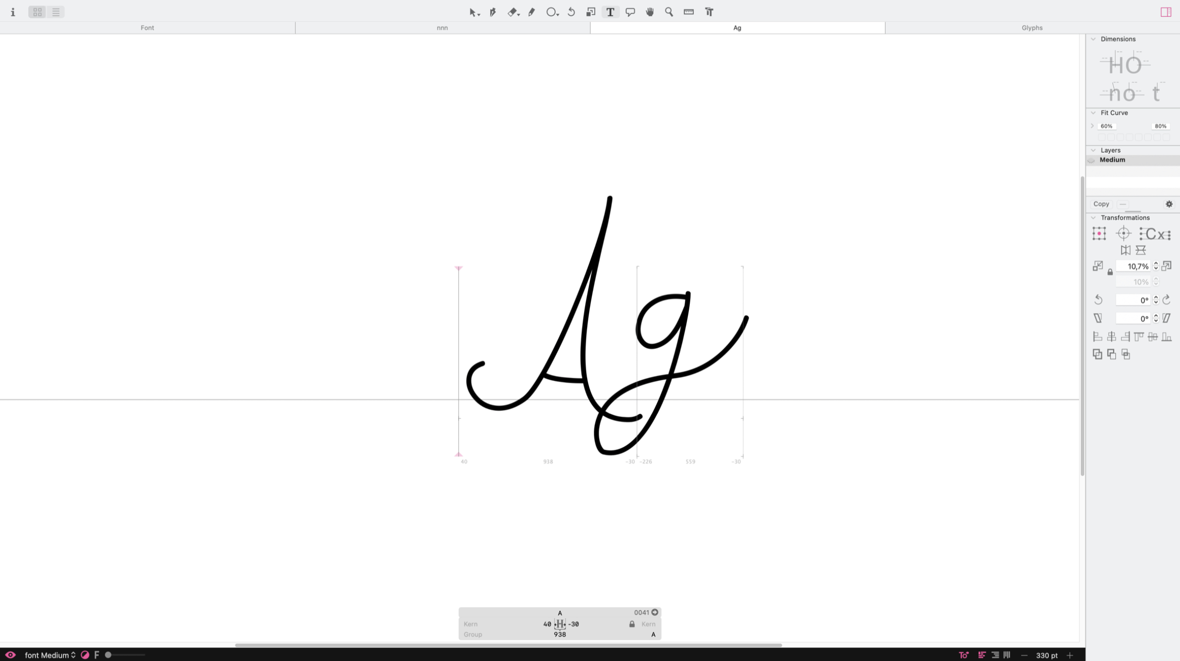
But this only happens between A and g. So I though about doing kerning, and found this tutorial: Kerning | Glyphs
It tells to put the cursor in between the letters, hold ctrl and option at the same time and then adjust the spacing.
However, when I do that, the kerning is only created to the g. That means that whenever there is a g, the spacing stays with the altered value. How can i make an Ag kerning without affecting the “normal” spacing of the letters A and g (that work just fine when combined with other letters)?
Also, is there any way to make a stylistic kerning (not sure if that’s the name of it)? For example, when you type tt, instead of having two lines one crossing each one of the t’s, having one bigger line crossing both t’s.
Yes, I’m sure I pressed ctrl and option, not command. I must be doing something else wrong.
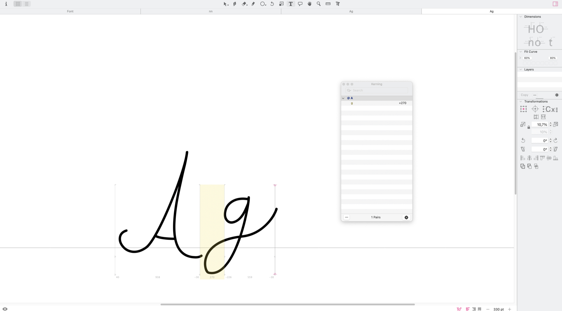
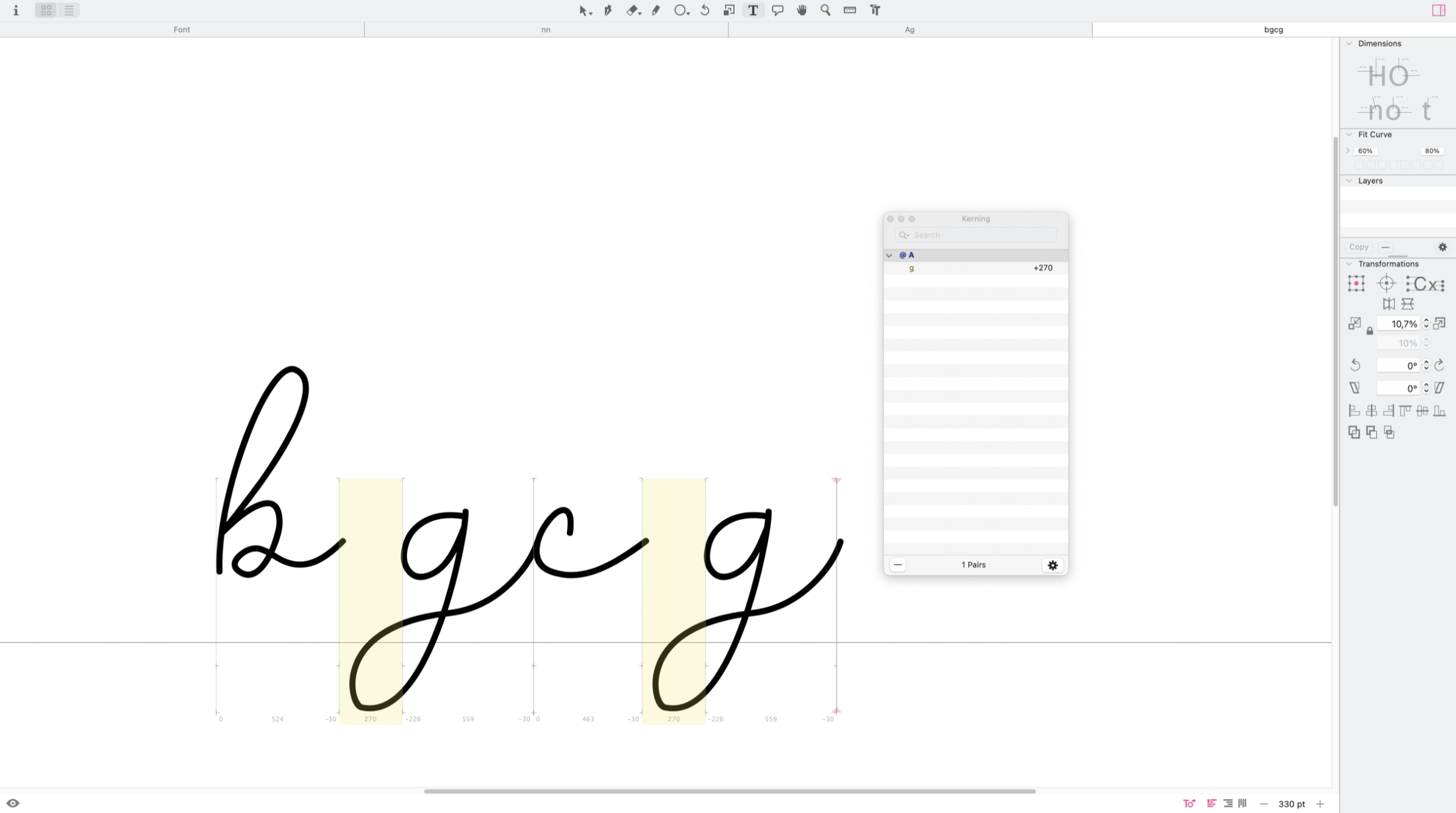
Down bellow are some images that explain even further my issue. As you can see, I created a kerning (and It has @A because I renamed it in hopes it would solve the issue, before it had some weird name). But when I write bg or cg, the altered spacing on g stays. From what I read its supposed to use the original spacing, since I only changed the spacing on g when A comes before it, right?
No you did add kerning. It seems like you put all glyphs in the same right kerning group. Please read the kerning tutorial and verify you the right kerning groups are set properly.
Oh, I see. It now worked. The issue was that they were all in one group. Once i created a group especificaly for A and g, it worked! But can I add a letter in more than one group? Eg: I changed the spacing between A and g by adding then into one group. But now I need to add g and n into a separate group so I can kern then. How can I do that?
Please read the kerning tutorial about kerning group again.
Groups are used to group glyphs with similar shapes.
And before you spend more time on the kerning, have a look at the spacing. You need to pick a reference glyph like ‘n’ and set the sidebearings so that it visually sits in the center of the bounding box and that it fits with more ‘n’. Then you type ‘nnnannn’ and adjust the spacing of the ‘a’. Do that with all other glyphs. I pretty sure that you need very little kerning between lowercase with a connected script like yours.