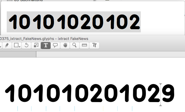
I set up the kerning for numbers, but when i export the font as TTF and open a document in Illustrator it just does not care about the kerning. I tried TextPreview, too, but it will behave like Illustrator.
So at the moment Glyphs will show a completely different kerning than the others… What can i do, now?
I already tried to clear Illustrators font cache, but it did not change anything… any idea?
Hmm as i mentioned we cleand caches already. We did this with the options for program and system font caches with linotype fontexplorer, which worked properly so far.
As you can see it will be displayed wrongly with your own TextPreview App, too. I think it does not use the adobe caches?
Any other idea?
I will check it later with a “clean” computer where i would install the font the first time to see if it works there, so we see if it is a cache problem.
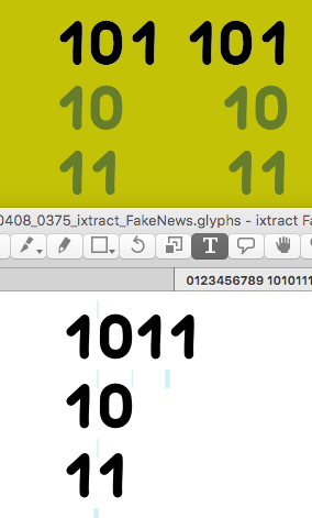
O.k. i installed in on a completely different and clean machine, where this font was never installed before, neither edited in Glyphs (as it is not installed there, too).
It does not change to show the wrong kerning in TextPreview compared to Glyphs!
So it’s obviously no cache problem at all… So what can cause the different appearance other than the caches?
So did you test it with OS X? We are currently running El Capitan 10.11.6
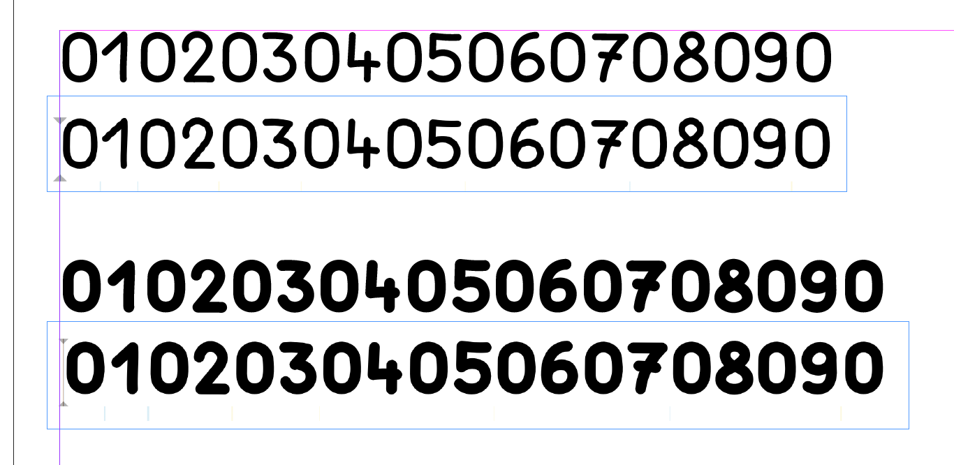
Actually it should look like you posted, but it still doesn’t here, on different machines. Kerning options are activated, which is confirmed by regular and semibold, which are working fine. It’s just the bold one which shows wrong metrics…?
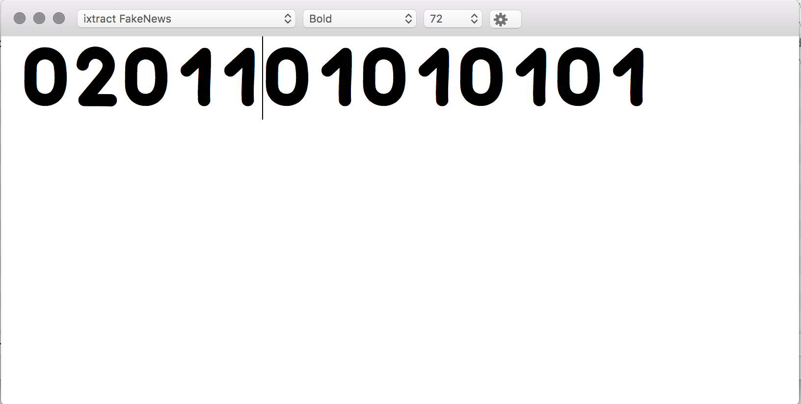
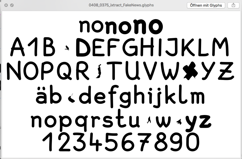
If i get the preview in Finder from the .glyphs file, it looks wired, too. So after the A there is 1 but it should just show B, shouldn’t it? May there be a mismatch of the Unicode code of the letters?
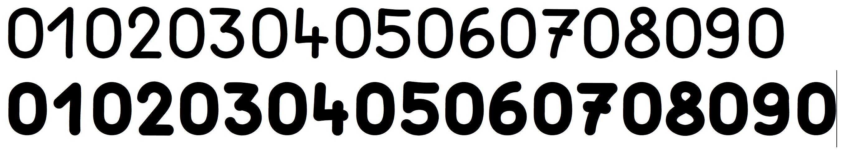
Anyway i can’t find the problems leading to e.g. show a wrong X in preview…
The font does not show any errors in Glyphs but that’s not like i would expect it to show up?
O.k. no it works. What i did? I stored the glyphs file with a new name > added the shape from number 2 into number 1 (together with the shape of 1 > exported the whole font > deleted number 2 in number 1 > exported the font again and now it works!?..
Please do not use the Quicklook preview for testing fonts. It is unreliable and prone to cache problems. What you see in C, S, X are interpolation errors. You can ignore them if you are not interpolating. Read here how to fix them.
The preview for .glyphs files contains a few gimmicks: The 1 after the A indicates the presence of lining figures, the ä instead of the a indicates Western Latin covered, etc.
Oh no i do not use the Finder Preview anyhow, but it made me skeptical as there is really no problem with the “X” or the “C” and i do not know why the semibold “D” shows up in the regular letters…
So where should htese interpolation problems result from? I tried to “Fix” them in Glyphs, but there is nothing to fix…