Hello Glyphs people, A nasty problem here. I did a lot of kerning on my Roman and Italic. But after I did once or twice a ‘compress’ it’s a mess (!). Example: The f and the n don’ need kerning. The f and the n with a caron a bit of kerning. Sure I unlocked the n caron on the left side. Controlling : the f with n stays the same. But after a compress in the kerning panel, there is unwanted kerning between my f and n. So, the difference between locked and unlocked has disappeared! That is a heavy problem. All strange kerning happens now. What did I do wrong?
That is why you should not use ‘compress’ in the middle of the process. It is useful if you started kerning and later added kerning groups. In your case, don’t touch it.
That means: start kerning all over again …
Why? Don’t you have any backups whatsoever?
I would strongly advise to use version control, exactly for cases like this. Backup early, backup often. You can do this locally as well as with a remote repository. Look into GitHub and use the .glyphspackage file format.
At the very least this will have been a lesson for the future ![]()
1 Like
Yes it’s a lesson. Of course I made my back-up versions, so I can compare … Let’s think positive: I can make a better / more economically kerning version and improve weaknesses.
If you have the old file, you can also export its kerning and import in the new file.
Yes, of course. But I take also the opportunity to check my kerning again and bring it back below 1000 pairs.
1000 sounds like a bit excessive for manual kerning (depends on the scope of the project, of course). Are you using kerning groups?
Yes I use groups. It’s a font with about 670 glyphs each weight. With glyphs and accents West- and Middle-European. But I rework the kerning and use more groups.
When you are at it, check the spacing first. Maybe that can save some kerning.
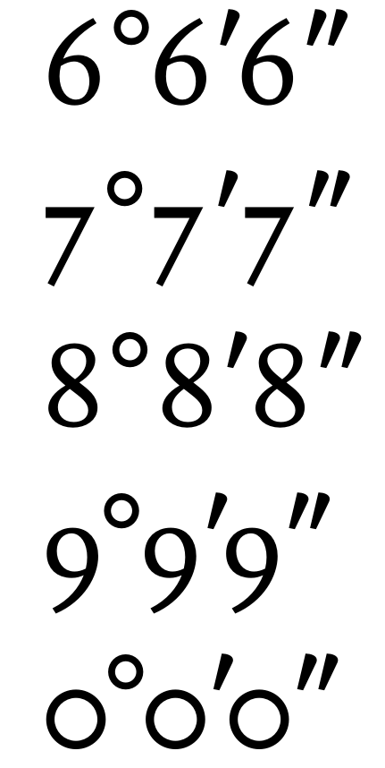
My spacing is good. I spaced everything at 11 pt, the most used tekstsize. But indeed, I have to make more groups … I’ve worked freelance 25 years as a bookdesigner for several publishers. Mostly non-fiction and art history. And by now I design my first book face. I don’t have to kern my lowercase for example, but yes , and . between figures or quotemarks to upper- and lowercase … And (see example) degree, minute, etc. Most of my kerning is in these things. It’s a little obsession from the design years.
I’m genuinely interested in how someone would pull this off. Your figures don’t suggest anything substantially different from other text faces, so I’m intrigued if lowercase indeed works without kerning. Could you show some samples? DM is fine if you don’t want to post publicly. Like I said, not for critique, just out of interest.
Some examples that come to mind for very good serif text typefaces with very little kerning overall:
Novel by Christoph Dunst
Alegreya by Juan Pablo del Peral
“Very little” wouldn’t catch my attention, none at all is interesting ![]() I try to work on spacing so I need the least kerning possible, but for text faces I couldn’t manage to do without completely.
I try to work on spacing so I need the least kerning possible, but for text faces I couldn’t manage to do without completely.
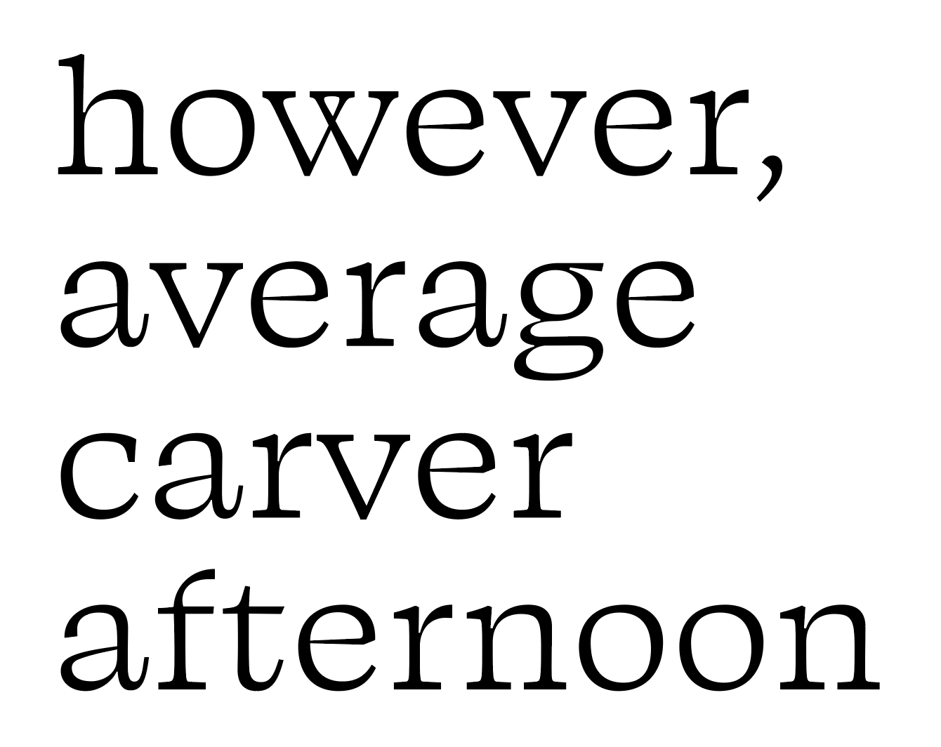
Here is a page in roman and italic. Of course there is some kerning between some kaps and lowercase. Accents to kaps or the f
Hermans.pdf (450.0 KB)
are kerned also.
For no kerning, that looks pretty good!
Of course, some things will always clash:
(I would also be interested in seeing combinations like vv, xx, etc.)
Rounds followed by rounds are a question of taste, but I would almost always add positive kerning:
A few things can probably fixed by spacing:

But overall, the spacing already does a very good job, especially in the italic.
If I may permit myself just one design critique: The s looks a bit top-heavy, as in, there appears to be more white space in the top than in the bottom, so it looks a bit like it’s on its head.
As I say before: I grab this opportunity to redo the kerning. Some lowercase combinations like r v w can have some adjustment later.
Thanks for sharing, very interesting. In my opinion it does work fairly well, but usual suspects would still benefit from kerning. The rounds seem too tight, /e RSB too open. /g looks a bit short and a bit loose. Would also check /p LSB. So maybe it’s also an opportunity to systemize and recheck the spacing before kerning. Feel free to ignore unsolicited advice ![]()
Ha, ha, thanx. Enough work to do I guess. Have a good weekend.