Hello!
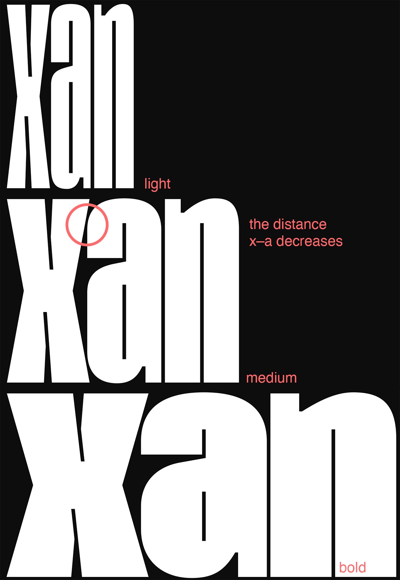
I’ve some problems with kerning a extrem narrow typeface. It contains five weights from light to bold. What I see is, that the distance between certain kerned pairs decreases towards the medium weight. Typical pairs are: xo ke KO etc.
In other words: light kerning ist OK, bold kerning is OK, regular and semibold is soso, medium is way to narrow.
I played around with the Brace-Layer, but that is not the right way to solve it, right?
Any advices on what I can try next? Thank you.
The reason why that happens is that the angle of the x and the “contact point” change between the masters. That results in a different perceived distance between the two.
You add number values to the master. (Unfortunately they are also bound to the master, so I’m not sure it’s actually a solution in this case.)
Then you add a kern feature with a token referencing the number value. This tutorial contains an example:
Perhaps there is a solution with a simple calculation. For instance for number value X going from -3 to +3, you could use the token ${X*X-9} and the calculated values would go from 0 to -9 to 0.
If the sidebearings of the brace layer are incorrect then fixing them would be the best solution. “Playing around” until one specific case looks right may lead to wrong spacing in other scenarios, of course. You can try “re-interpolate metrics” to give you an indication whether the brace layer’s metrics may be wrong. Note that “re-interpolate metrics” is simple and convenient, in many cases it is exactly what you want but it is not guaranteed to give you the correct sidebearings for the brace layer, in particular if the glyph shape was re-touched significantly.