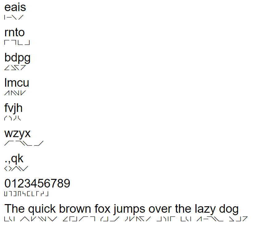
I made a little font (each letter is from 2 segments of an 8 directions compass),
with some kerning (a lot? maybe too much?), about 170 pairs for 38 characters.
woff2 works exactly as expected, mac os looks fine, but there is no kerning in ms windows with ttf/otf.
ms windows:
version 10.0.17134 / 1803 build 17134.165
I want to install those glyphs on the whole pc to learn to read them faster. I made this font the simpliest possible to take notes fast. I have joint issue so I write very slow. In course i have to speed up, so its hugly and painful, but I like to write to memorize. Also, I want to code to make it machine readable. Easier, I suppose, if the glyphs don’t have all kind of loops, points and curls. There is only 4 letters type, straigth angle, obtuse angle, right angle and acute angle. It’s also funny to encrypt with clock patterns. I want it to replace braille. I want it to be the official glyphs of the entire galaxy federation.
The default available font have kerning and it doesn’t look disabled. So the problem is on installation? Also, I don’t really care about office, I don’t use it. I’ll install it on the whole pc and send a capture.
It seems like the sidebearings are zero and you added a lot of kerning values.
Why don’t you try spacing the letters so that they look good without kerning as much as possible. IIUC they should not overlap, so it makes sense to have all LSB and RSB fields with a positive value. That way it will be not so bad in situations where there is no kerning available, like the ones you described.
Add some negative kerning only in the rare cases where the space between letters is too much.
Thanks for the reply For the moment, the only glyph with no potential kerning is the letter e ( I ) hehe. All other letters ( angles ) overlap on each others width. Could I make the letter larger than their width zone ?
I didn’t know there is no way of kerning in ms windows. If its gonna be hugly no matter what… I’ll only install it on a website.