Hi all, I am trying to export a monospaced font where all the glyphs have a width of 600.
I have set the isFixedPitch custom parameter to True.
For all the marks I have used a script to calculate the sidebearings so that the total width was 600. Was this step necessary at all? I remember reading that isFixedPitch overrides this.
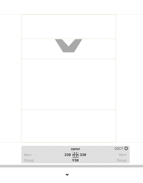
However, the exported ttf and otf files have different widths. In Glyphs 2, the exported combining marks have a width of zero and the legacy /caron has a width of 930 (not sure where this figure comes from):
This is regardless of whether isFixedPitch is set to True or not.
In Glyphs 3, the isFixedPitch parameter does make a difference and, with it set to True, the combining marks have a width of 600, otherwise 0. But the legacy /caron still has the same width of 930.
What am I doing wrong? What is the correct way to design and export a monospaced font in Glyphs?
I have a suspicion that the metrics keys are confusing the algorithm.
==181 on either side is a bad strategy for centering a glyph on a fixed pitch. Better use =600 in the width and =| in the RSB. I usually do not specify the RSB key because it will complain if it is just 1 unit off, so I prefer centering them with a script.
Thanks, after some initial difficulty entering these values, I was able to set the LSB to 181 (no equals sign), RSB to =| and the width to =600. I take it this is what you meant.
I’ve tried this in both Glyphs 2 and Glyphs 3 and the exported ttfs still have a width of 930 for the legacy /caron