So I am constructing a font of designed numbers to use in lists for a book I am working on. These are essentially numbers reversed out of a solid oval. In order to maintain greater control, my initial idea was to create separate glyphs for every number (1,2,3,4,5,6,7,8,9,10,11, …) up to say 50. The lists won’t go longer than that. I have set the numbering scheme in the Bullets and Numbering style section of indesign to A, B, C… and have a character style set to this new font. My glyphs are set so that the A character now holds the graphic for 1, B holds 2, etc. This all works great until 27. Indesign then starts numbering AA, AB, AC, etc. So I created a ligature for A_A to hold 27. But when the list gets to AA, it shows 1 twice. If I make a separate text box and select my new font and type AA, I get 27. I can even copy and paste AA into this new font box and still get 27. I have found references to people doing what I am attempting in the past. But I can’t seem to figure out what I am doing wrong. Does anyone have any experience with something similar?
I literally just had to post a plea for help–and then I figure it out. In case anyone sees this and is having the same problem: Under the character style / basic character formats / you have to set the tracking explicitly to 0. I’m not sure why, but it defaults to no value. When I changed it to 0 everything worked immediately.
Why would you set the character style to use letters if you want to use numbers? Why not put the numbers in the regular number slots and make ligatures of one_zero, one_one and so on? That way, if the list changes to another font, the only thing that changes is the way the numbers look.
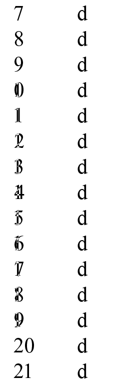
Doing it that way works for me, anyway, also without setting the tracking. I just made a quick font with ligatured numbers for 10–19, and making a list in InDesign using that font correctly applies the ligatures for those numbers:
Note that if you use automatic feature code generation in Glyphs, these ligatures will be in dlig, which means that you have to make sure to enable discretionary ligatures in the OpenType Features section of your character style definition for them to work.
That’s a great question. And my complete and thoughtful answer? I have no idea. I think i initially thought I’d save time on ligatures, but that really makes no sense. In fact, I had planned on doing another font with letters in the same style–so with your suggestion, I can now do this in the same font. Thanks.