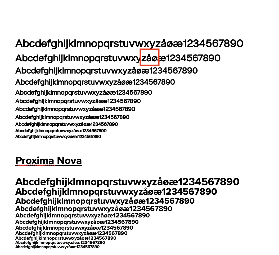
Hi, I’m wondering what settings recquire changing on my font to get a better line height, as when compared to Proxima, it seems to be much wider, although both fonts are set to 1.0.
It also appears that the font is appearing bolder, almost as if a stroke is being added when used at small sizes, what would cause this issue?
It is to be expected that different fonts have different line heights. They do not have to be the same between all fonts. And what may be right for one font, may be completely wrong for another.