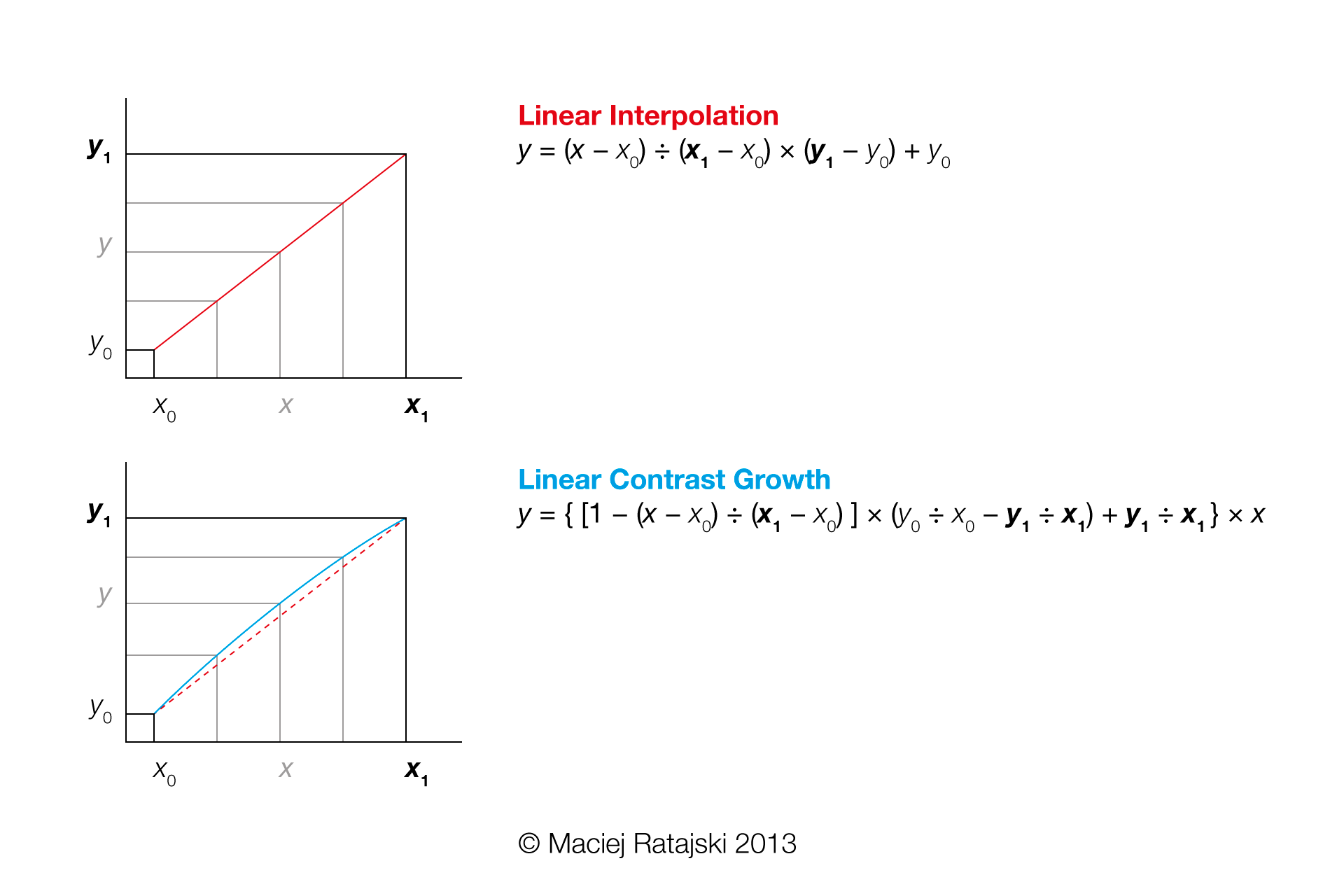
Linear Contrast Growth

Linear Contrast Growth - a slightly different interpolation

The width of vertical and horizontal strokes is almost never equal in type design. It is assumed that horizontals tend to look thicker than verticals of the same width, but the effect is much more visible in the bold weights than it is in the light weights. Thus it is a common practise to design light weights with lower stroke contrast than the bold weights.

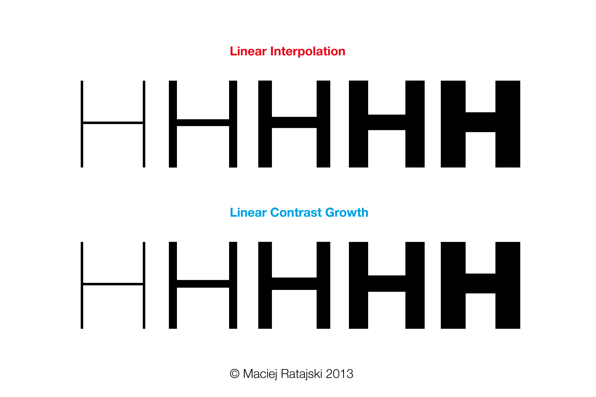
However, to my eye the standard linear interpolation between a very light weight with almost no stroke contrast and a very bold one with hight contrast doesn’t produce satisfying in-between weights. Horizontals tend to look too thin in most of the interpolated weights.

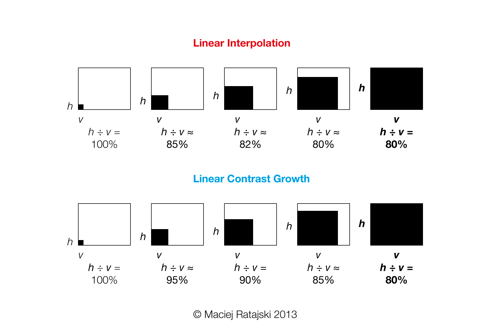
Linear Contrast Growth vs Linear Interpolation of the letter H

The problem

Let’s assume that we designed an ExtraLight master with equal vertical and horizontal strokes (LightMasterWeightX = 20; LightMasterWeightY = 20) and an ExtraBold master with horizontals that are 80% of verticals (BoldMasterWeightX = 200; BoldMasterWeightY = 160). The linear interpolation of Light (InterpolationWeightX = 65), Medium (InterpolationWeightX = 110) and Bold (InterpolationWeightX = 155) weights would result in horizontal strokes of 55, 90 and 125.

So the contrast would grows like this:

  • ExtraLight - 20á20 = 100%
  • Light - 55á65 ≈ 85%
  • Medium - 90á110 ≈ 82%
  • Bold - 125á155 ≈ 80%
  • ExtraBold - 160á200 = 80%

I’d prefer it to grow linearly:

  • ExtraLight - 20á20 = 100%
  • Light - 62á65 ≈ 95%
  • Medium - 99á110 = 90%
  • Bold - 132á155 ≈ 85%
  • ExtraBold - 160á200 = 80%

To achieve this, we would need to transform horizontal and vertical weights independently.

Linear Contrast Growth vs The growth of contrast in the linear interpolation

The solution: Linear Contrast Growth formula

Interpolation of the x coordinates

Coordinates on the x axis are interpolated traditionally. We start by calculating the “interpolation point” using this formula:

InterpolationPointX = (InterpolationWeightX - LightMasterWeightX) á (BoldMasterWeightX - LightMasterWeightX)

It designates the position on the interpolation axis. For our ExtraLight (InterpolationWeightX = 20) the InterpolationPointX is 0, for Light (InterpolationWeightX = 65) it is 0.25, for Medium (InterpolationWeightX = 110) it is 0.5, for Bold (InterpolationWeightX = 155) it is 0.75, for ExtraBold (InterpolationWeightX = 200) it is 1.

Then we apply the interpolation to x coordinates of our points:

x = InterpolationPointX × (x1 - x0) + x0

Interpolation of the y coordinates

To calculate the “interpolation point” on the y axis we can use the InterpolationWeightY (which is a different parameter than the one currently used in Glyphs app). We calculate it with this equation:

InterpolationWeightY = [(1 - InterpolationPointX) × (LightMasterWeightY ÷ LightMasterWeightX - BoldMasterWeightY ÷ BoldMasterWeightX) + BoldMasterWeightY ÷ BoldMasterWeightX] × InterpolationWeightX

Since the formula for the “interpolation point” is:

 InterpolationPointY = (InterpolationWeightY - LightMasterWeightY) á (BoldMasterWeightY - LightMasterWeightY)

we get:

InterpolationPointY = {[(-InterpolationWeightX + LightMasterWeightX) ÷ (BoldMasterWeightX - LightMasterWeightX) + 1] × (LightMasterWeightY ÷ LightMasterWeightX - BoldMasterWeightY ÷ BoldMasterWeightX) × InterpolationWeightX + BoldMasterWeightY × InterpolationWeightX ÷ BoldMasterWeightX - LightMasterWeightY} ÷ (BoldMasterWeightY - LightMasterWeightY)

So, for our ExtraLight (InterpolationWeightX = 20) the InterpolationPointY is again 0, for Light (InterpolationWeightX = 65) it is 0.2982, for Medium (InterpolationWeightX = 110) it is 0.5643, for Bold (InterpolationWeightX = 155) it is 0.7982, for ExtraBold (InterpolationWeightX = 200) it is 1.

Now we apply the interpolation to y coordinates of your points:

y = InterpolationPointY × (y1 - y0) + y0

Linear Contrast Growth formula

Testing in Glyphs app

It is possible to test this in Glyphs app using the InterpolationWeightY custom parameter. To calculate it, apply the InterpolationPointY value to the x axis.

GlyphsInterpolationWeightY = (BoldMasterWeightX - LightMasterWeightX) × InterpolationPointY + LightMasterWeightX

Implementing in Glyphs app

If there was an option to provide a separate parameter for WeightY in the masters, the Linear Contrast Growth interpolation could be calculated automatically. It could result in adding the InterpolationWeightY parameter to the instances.
1 Like

I’d rather use the Bracket Trick (if it is only applied to a few letters) or an intermediate master (if most or all letters are affected) for this because InterpolationWeightY is not really good for diagonals, outstrokes, and connections.

As far as I’m concerned, the problem with contrast in linear interpolation is currently addressed with adding an intermediate master or tuning the generated instances. My solution offers two possible advantages: (1) it can be easily automated, (2) contrast between horizontal and vertical strokes can grow smoothly within the family.

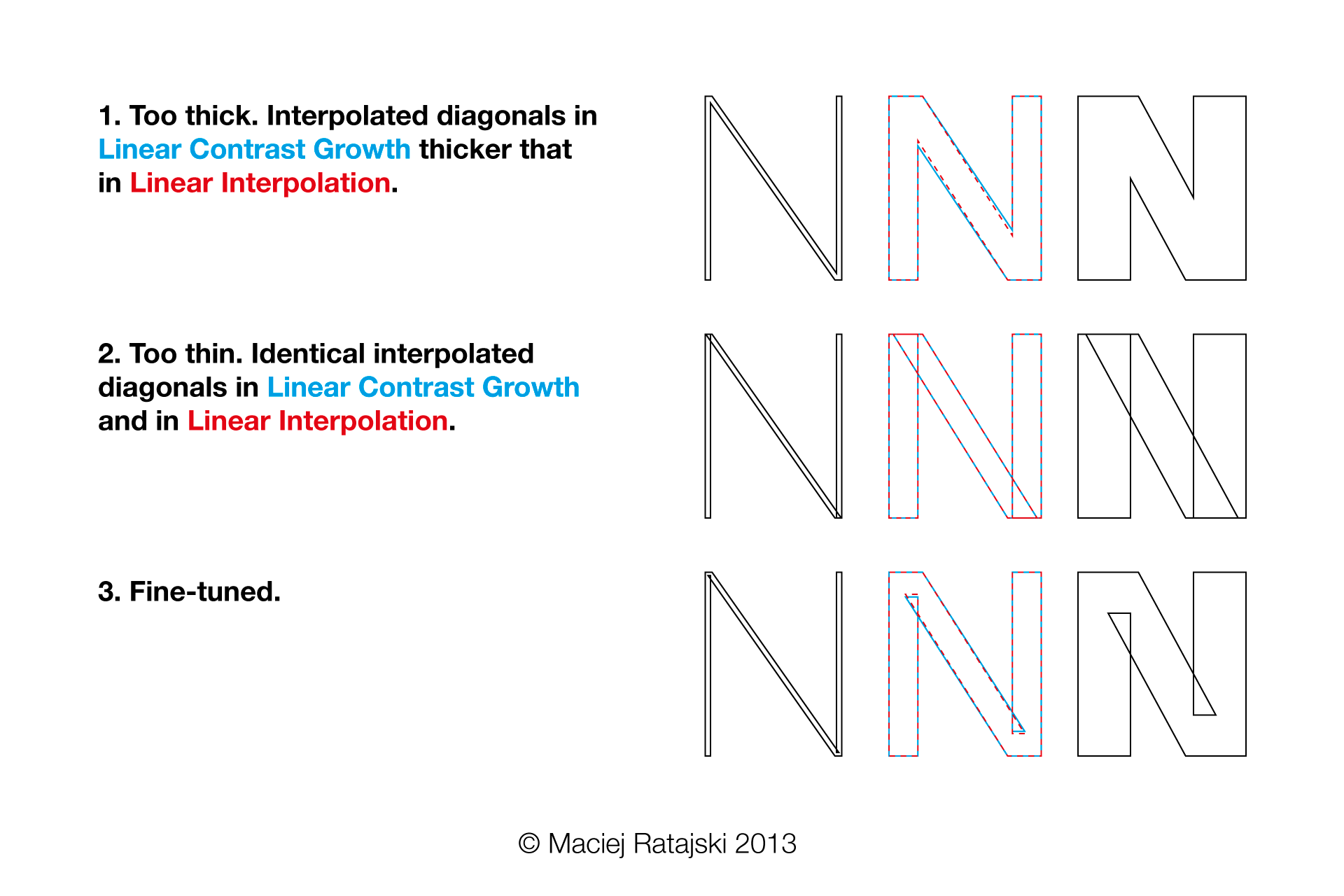
The problem with diagonals is also present (though less visible) in traditional linear interpolation. It can usually be addressed with fine-tuning the design of masters.

Linear Contrast Growth vs Linear interpolation of diagonals

Maciek thanks for sharing this. I’d like to hear more about this. I love interpolation stuff ;]

I am afraid a different UI that requires users to set two values in each Master for single-master interpolation would be too confusing, and the results too disappointing, because interpolating stems vs. horizontals is simply not as straight-forward as differentiating the interpolation between x and y. Many more design considerations have to be made. Also, I doubt that the algorithm can be applied to most designs.

Since the functionality is already provided with the custom parameter, a Python script is the better solution in this case. I can see adding this algorithm to my Insert Instances script, naming it the Maciej x/y distribution. Perhaps as an additional option? It should be possible to define y depending on x, so this is compatible with linear, Luc and Pablo distributions.

I just made the fiddle to apply the idea to my font. Check it here: http://jsfiddle.net/Dm2Zk/1/ . Just change first five variables.

Though, the change was rather cosmetic in my case, it would be great to have an ability to modify Y-axis independently in Glyphs.

This is how I implemented it now. Will do test runs and upload it tomorrow:
http://cl.ly/image/1C2x1u2c1M0g

Can you send me a sample file to mekka at my username dot com?

@dadastudio Thanks for testing it and making a fiddle! Probably the change was cosmetic in your case, because the difference between stroke contrast of your light and bold versions wasn’t that big.

I suppose, we tend to design extreme masters with the regular weight in mind (and use the great Bracket Trick in Glyphs to solve problems with specific letters). With Linear Contrast Growth however, we could theoretically make horizontals much thinner in extra bold weights while leaving the regular and light weights intact.

@mekkablue Your Python script looks great. I’m not yet sure, if the interface is self-explanatory (how will someone know what numbers to put there?).

Another way of implementing this idea would be to give user an option to define weight independently for the X- and Y-axis both for the instances and for the masters. It could be done with a custom parameter (WeightY).

For Linear Contrast Growth it is essential to calculate the difference in horizontal to vertical stroke weight ratio between the masters (if there is no difference, the interpolation is linear).

dadastudio
Modifying the y-axis independently is already covered by the InterpolationWeightY parameter.

Maciej Ratajski
I doubt a separate WeightY parameter would help with understanding. I am afraid it would be more confusing.

Perhaps you want to set up a page on your website explaining the ‘Maciej y distribution’, then I can link to it in the read-me. I suggest you first give a non-technical explanation, and a chart that indicates what to measure as LightMasterY and BoldMasterWeightY, and then, the detailed technical explanation and the algorithm as you did above.

I’ll set up a page.

This sounds interesting but I am wondering whether it could work at all.

If you have an 80% contrast for the Extrabold then this is more than for visual h/v correction, the stroke contrast is a design feature right?

If the H has 80% contrast, as in your example, doesn’t the V also have a noticeable contrast? In that case, any automatic (i.e. global) fiddling with horizontal vs vertical interpolation will probably do more harm than good since it is not “aware” of thin uprights or diagonals. Then I’d rather keep my fingers off it.

(Follow)

Tim: That, indeed, is my concern too. We are talking about small shifts though. We’ll have to test it with a lot of multiple master set-ups, and see how it works in each case.

@TimAhrens @mekkablue I agree with your concerns regarding the diagonals. That is usually the case with anisotropic scaling, isn’t it?

What this formula does however is it helps with even distribution of contrast. Provided with horizontal and vertical stem widths of the extremes, it calculates the “right” horizontal stem width for any chosen vertical stem width. How this is translated to letters such as “N”, “V” or “S”, depends on the designer.

What the implementation does is it creates instances that are (in most cases) slightly “bolder” vertically than their traditionally interpolated counterparts and can at least serve as a starting point for the final design.

It’s worth mentioning that this method can in some cases be tricked into producing the desired results right away. One way is to put points between which you interpolate at the same height (and interpolate traditionally). The other is to turn the flaw into a feature by setting vertical distances between interpolated points so that the angle (and the diagonal stroke) end up right.

This is all very interesting! I’m enjoying it very much.

I wonder if both methods can be integrated?
For example: Using the Lucas or the Impallari method for setting the instances across the X axis, and using the Maciej method for Y axis (both at the same time, in correlation).

I’m not sure if that is possible… Mekkablue what do you think? maybe you can do some magic :slight_smile:

Pablo: already done.
https://github.com/mekkablue/Glyphs-Scripts/blob/master/Masters/Insert%20instances.py

mekkablue: thanks for the script, it’s great!

I made a page:
http://www.maciejratajski.com/theory/interpolation-of-contrast/

Maciej: Any chance we can see the V in your example font? Why aren’t you showing the whole alphabet?

Tim: I’ll think of it.

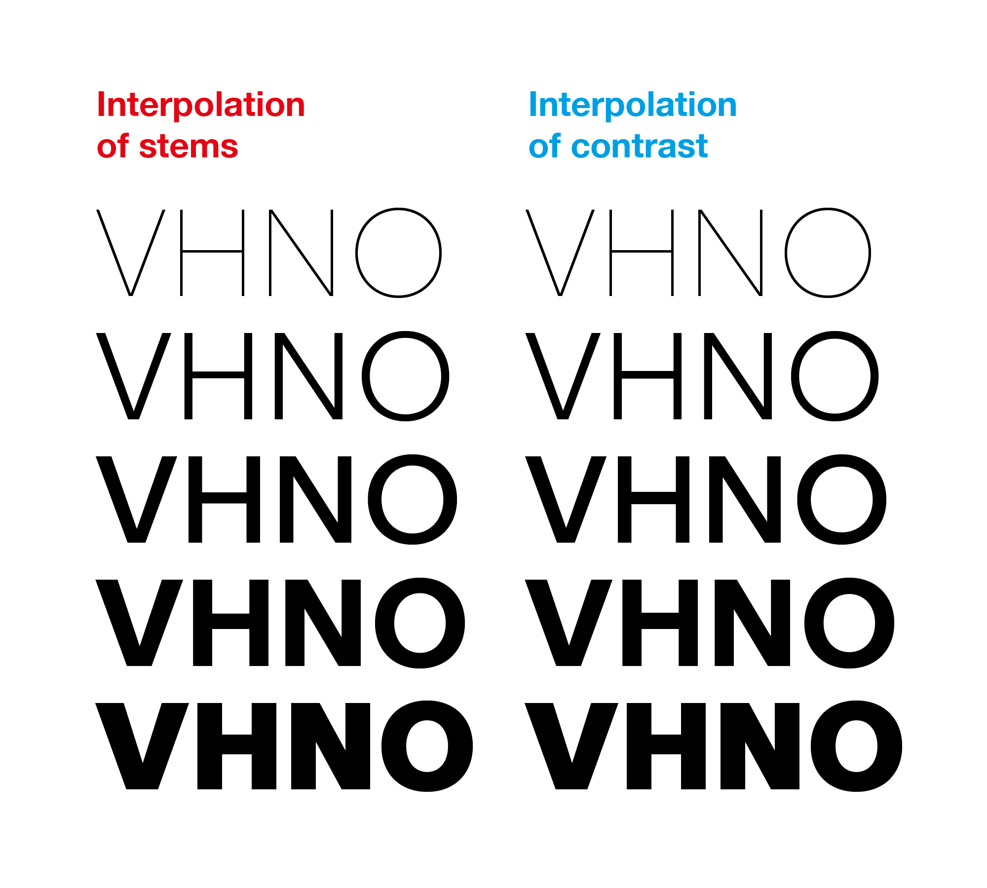
In the meantime, here are the two versions of “V” and “N” next to “H” and “O”.

In the first picture all four letters have exactly same contrast and “N” has thin verticals. Obviously the method works only for “H” and “O”.

VHNO with exactly same contrast, N with thin verticals

In the second picture, contrast is significantly lower in “V” and “N” has a thinner diagonal. The method works for all four letters and it is also deliberately used to achieve a thicker diagonal in interpolated “N” and a slightly different angle inside “V”.

VHNO, V with significantly lower contrast