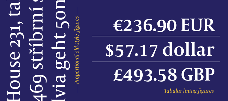
in many typefaces the height of the lining figures is a little bit smaller than the cap height (which sometimes feels irritating to me, especially in bigger point sizes, headlines etc.).
I read somewhere about the specific reason for this and it felt conclusive and logic to me, but unfortunately I can’t remember where and what it was.
Can anybody help me out on this and explain the advantage of lining figures not aligning the cap height?
Or is it simply a design decision based on personal taste preferences?
Thanks!
I always have the lining figure at cap hight. Thats the point of lining figures.
What I sometimes do is to have numbers between lining and oldstyle as default and then have proper lining and oldstyle numbers accessible by Opentype features.
The reason for them being smaller so often is the idea that figures usually come in the context of other figures, e.g., year numbers. And full cap height looks like all-cap text in the middle of regular text. To compensate the all-cap effect, they are made a little smaller. (Many typographers set all-cap words a little smaller too, for the same reason.)
Smaller lining figure heights only make sense, of course, in text typefaces. And even then, only in texts where the assumption about figure context actually fits. It comes at the costly disadvantage that letter-figure combos will have a distracting appearance, and those appear often in product names, e.g., 6S or A1 or BMW-7, etc.
That is quite strange. If you are concerned about numbers not sticking out in text, then use oldstyle figures?
One thing we might confuse her is that when I speak about lining figures, I mean dedicated .lf alternates. My defaults are almost always oldstyle or hybrid as I explained before. If you dont oldstyle as default, making the default a bit smaller would make sense. But then you should add proper lining figure (.lf) as alternates.
I like the way Gerard Unger did his figures. A hybrid form, sitting between lining and oldstyle figures. In height the fall between lower and uppercase.