I’m a bit new to type design and have a question for our European friends. (For the record, I’m in Arizona.)
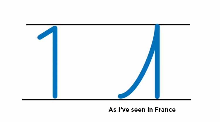
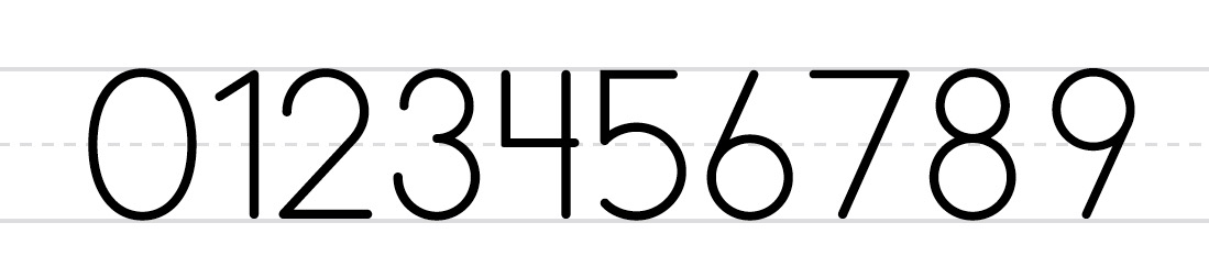
I’m designing a geometric typeface for very young children to recognize basic letters and numbers. I have a “1” with a small flag, but in my travels in France I’ve often seen 1 with a curved flag starting at the baseline. Since I’ll be including European glyphs, should the long flag 1 necessarily be included too? Is this style taught in school, or is it an outgrowth of handwriting? I’ve included a barred seven and slashed zero.
It’s a convention you see in European handwriting but it’s not some thing you encounter in typefaces (outside of those that explicitly intend to mimic European handwriting!).
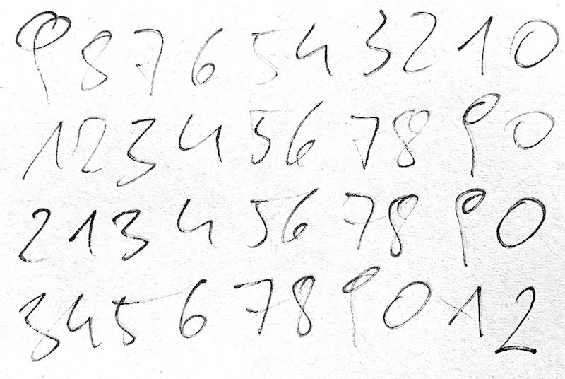
I was curious how I would write it and wrote a lot of figures on a piece of paper. Occasionally, the flag of my one does reach the baseline, e.g., in the second line:
Now that I think about it, although it’s not a standard 1 I may end up including it. The purpose of the typeface for children to recognize letters and numbers. Common variations should be shown too. (My American friends in France didn’t know what that 1 was.) I’ll also design a closed 4, and a minuscule q without a hook.