When adding glyphs, the popup list cuts off the names so sometimes we can’t know which one to select:

1 Like
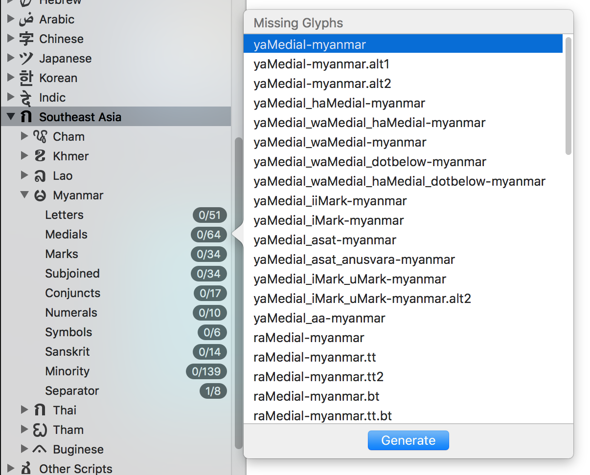
It’s quite big, isn’t it! But yes, I think that’s the cleanest way. Alternatively you could allow the pane to be resized/scrolled horizontally.
I don’t think that the width being big should be a problem, UI-wise. You don’t have that panel open all the time, so it’s not in the way. And I assume it will only be as wide if there are such long names in that particular list (I guess ![]() )
)