Is there any way to make paths/outlines thicker, darker, or otherwise easier to see in Edit view for your low-vision users? If I’m working over scanned images, I find the paths are almost impossible to see.
Thanks!
Is there any way to make paths/outlines thicker, darker, or otherwise easier to see in Edit view for your low-vision users? If I’m working over scanned images, I find the paths are almost impossible to see.
Thanks!
+1 yes!
I have the same issue, and what I do as a workaround is:
This is necessary prep work I do on all files which use scans as a template. I have it setup in Photoshop as an Action so it goes quickly.
Thanks, George.
wait, there’s a plugin… let me find it…
ah, Skedge!
try it, check this:
code for last example:
###################################################################
# green
###################################################################
import traceback

scale = Glyphs.font.currentTab.scale

def badge(x, y, size):
	myPath = NSBezierPath.alloc().init()
	myRect = NSRect( ( x-size/2, y-size/2 ), ( size, size ) )
	thisPath = NSBezierPath.bezierPathWithOvalInRect_( myRect )
	myPath.appendBezierPath_( thisPath )
	NSColor.colorWithCalibratedRed_green_blue_alpha_( 1, 1, 0, 0.5 ).set()
	myPath.fill()

for path in layer.paths:
	NSColor.grayColor().colorWithAlphaComponent_(0.3).set()
	bp = path.bezierPath
	# bp.fill()
	bp.setLineWidth_(10/scale)
	NSColor.greenColor().set()
	bp.stroke()
	for i, node in enumerate(path.nodes):
#		if i % 2:
			badge(node.x, node.y, 40/scale )
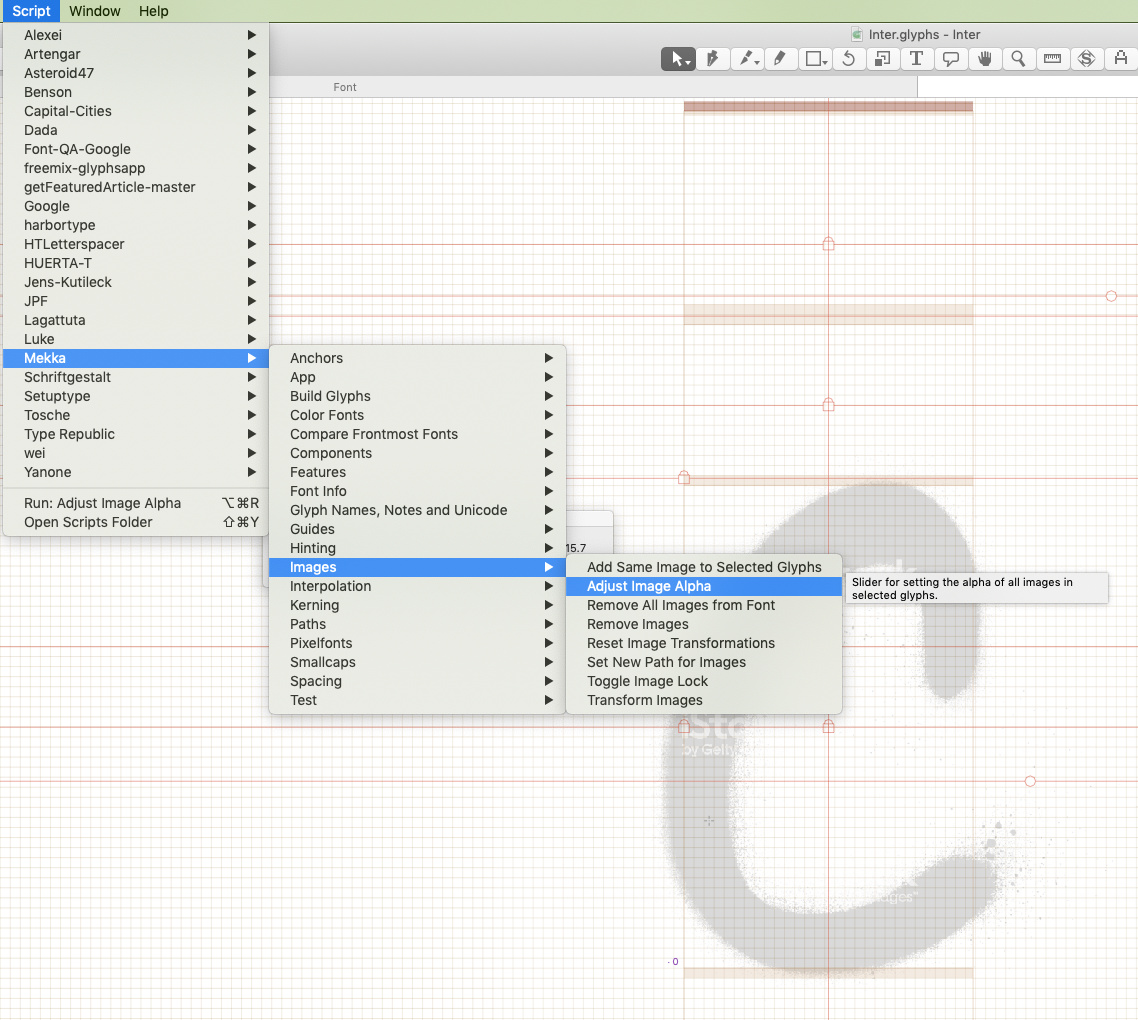
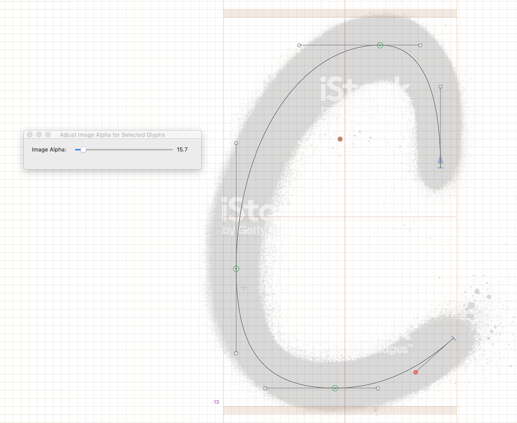
Or try this in the macro window:
Layer.backgroundImage.setAlpha_(25)
Thanks for your suggestions, everyone. I already do reduce the contrast of my scans, and it helps, but it’s really no substitute for having an outline that’s easier to see in the first place. I understand if this is not a priority, but it is a need for some of us.
Thanks for the plugin tip, Ghost. I’ve found it and will give it a try.
Can you make a Photoshop mockup on how you like it to look?
Making the path pop out more means you see less of the image. We need to find the right balance.
(not Max)
Photoshop has a setting to change selected path’s width and color:
and Illustrator highlights path on mouse over:
these two updates would help improve usability 100x
Side comment: Does anyone remember that in older Photoshop versions, the Pen Tool applied a contrast against the background? so, a path was clearer over dark backgrounds and darker against light ones. Looks like this was removed.
I see if I can improve that.
Did you try to change the stroke color? You can set it in the Preferences.
The stroke color’s set to black, so I don’t think a different color would help me.
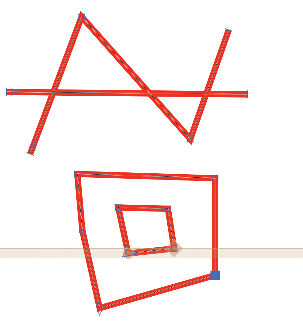
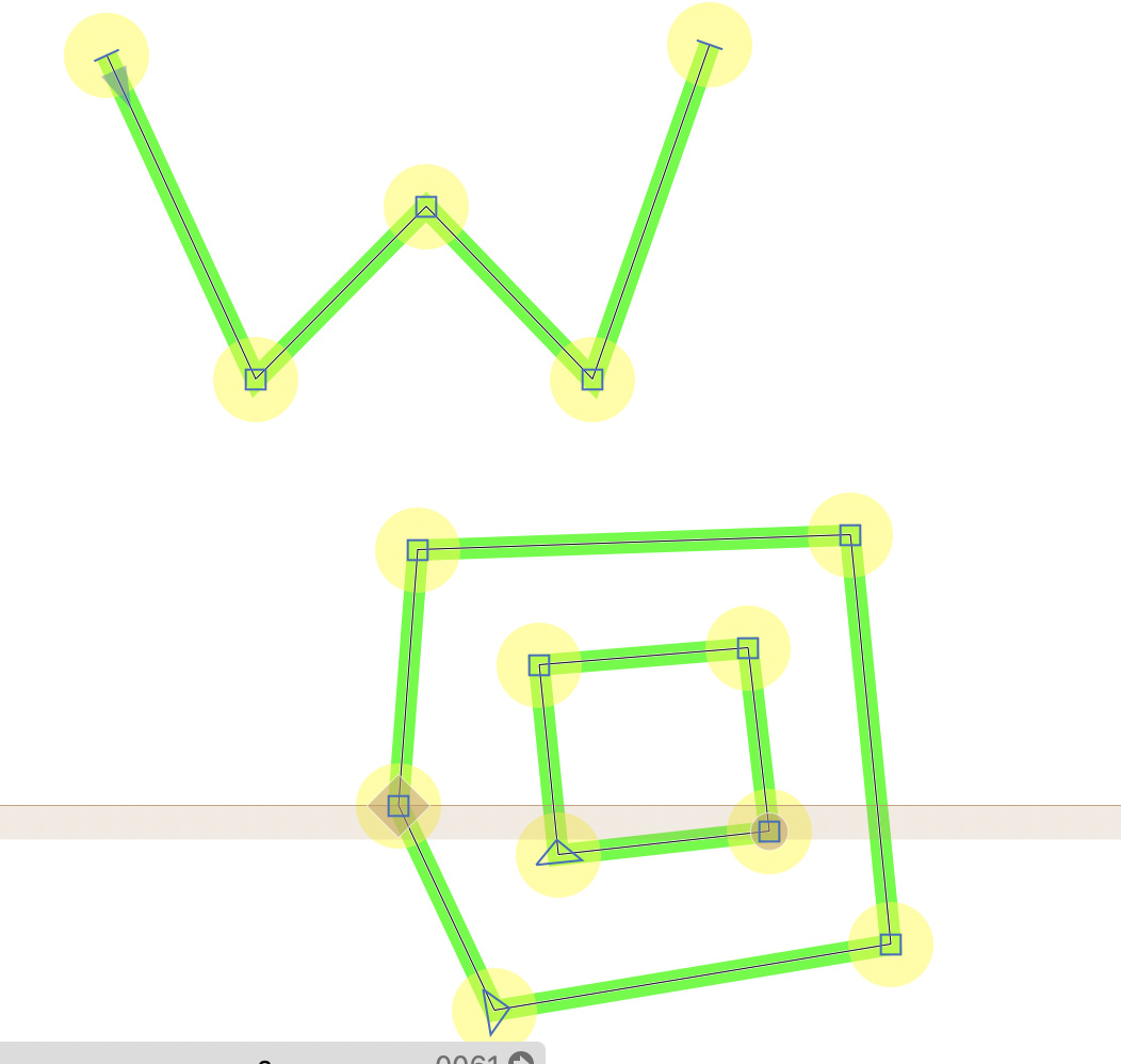
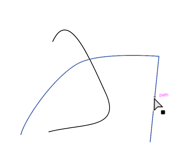
Here’s the sort of difference I’d like to see. Ideally, I’d like to toggle back to the finer rule weight when I was done tracing the image.
Thanks, Georg!
I added a plugin “Thicker Outlines” to the plugin manager. It will draw a bit thicker outline on top of everything. This is not perfect, yet.
This is not an original observation, but: You’re a saint.
Works beautifully. Just what I wanted. Thanks!
Work only with closed paths,
Cheers,
Edu
Fixed the open paths.
Any tips on how to make component’s lines thicker? i.e. when a component is in a glyph?
What do you mean by components lines? Can you post a screenshot?