I’ve been using the manual TT instructor for a variable font because TTFAutoHint does not yet (as far as I know) handle variable fonts. The manual instructor in Glyphs is a great tool, and it’s wonderful that Glyphs can instruct variable fonts, but I’ve run into a problem and am wondering if there’s a workaround.
When Glyphs generates TT instructions, it appears to handle alignment zones by generating two CVT entries, one for the bottom of the zone and one for the top. If a point is closer to the bottom of the zone, the first CVT entry is used, and if it’s closer to the top, the second is used. This is usually not a problem, if an alignment zone is no wider than it has to be, but sometimes it produces anomalies.
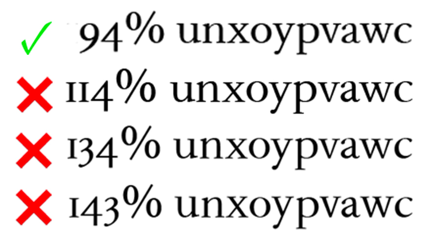
Here’s a test done in Illustrator, with some letters exactly at the font’s x-height (848) and some with overshoot (870). The letters with overshoot (nopac) have their tops aligned via a MIAP instruction with a CVT entry of 870; the others (uxyvw) have a CVT entry of 848. (The percentages are Illustrator’s zoom factor, and the type is 12pt: I’ve magnified the image to 200%. Sorry, I don’t know the pixels-per-em values.)
The top line is correct, and it’s what you mostly get. In the next two (114% and 134%), uxyvw are lower at a resolution where they ought to match nopac. At 143% there’s a truly bizarre effect, probably due to the 848 CVT entry being rounded up while the 870 entry is being rounded down.
Here’s my question. If I could, I would want the points in the x-height alignment zone for both uxyvw and nopac to use a single CVT entry so that you wouldn’t see these differences at low resolutions. Is there any way to do this?
Thanks again, Georg. I suppose I have a retina screen: it’s a recent (within the last six months) 15" MacBook Pro. I’m not sure I understand exactly what you mean by “axis positions.” Here are the axes:
wght 200-800
opsz 6-18
Grade 1-500
Masters at:
wght 200, opsz 18, Grade 1
wght 800, opsz 18, Grade 1
wght 200, opsz 6, Grade 1
wght 100, opsz 18, Grade 500
Regular is wght 420, opsz 12, Grade 1.
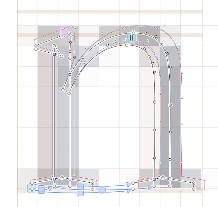
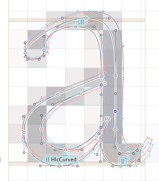
I have revised the instructions for u and n as you suggest (will revise the rest later) and copied over the TTFZones parameters to my current file (TTFZones are very cool! I missed them somehow).
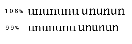
Here is a sample of what I get:
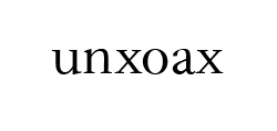
I’ve added some u’s and n’s from Gentium on the right for comparison. At 99% (magnification in AI) I’m getting what I want, while at 106% my u’s and n’s seem to be jumping up and down.
I suppose things look different on different screens. In AI, if you put your cursor in the scale box at lower left and step up or down using the cursor keys, you may see the problem I’m talking about at several different sizes.
Another parameter I didn’t know about! (I see it was discussed in the announcement of v. 2.4.) This could be exactly what I’m looking for–but it seems to be working at the baseline, not the x-height:
Is this the intention?
I’m going to experiment with TTFOvershootSuppressionBelowPPM and correct my instructions, and if I can’t figure it out I’ll come back looking for more advice.
Hm, that is currently a Font custom parameter. Is that optimal?
A Light instance certainly needs different overshoot suppression from a Black instance, and a zone for superiors needs different overshoot suppression than a zone for capitals.
So I think the OvershootSuppression should be a parameter of a zone, like in VTT.
In Calibri I built several overlapping zones, thin zones for rounded vertical stems, thick zones for rounded letters, each with their specific overshoot behavior. (2003, VTT)
This would be cool. I’m not absolutely sure I understand what’s going on in the prep and fpgm code, but it looks as if a function is being called once for each zone, to set the cvt entries for the top and bottom of the zone to be equal to each other. So in theory it ought to be possible to have a separate value for each zone.