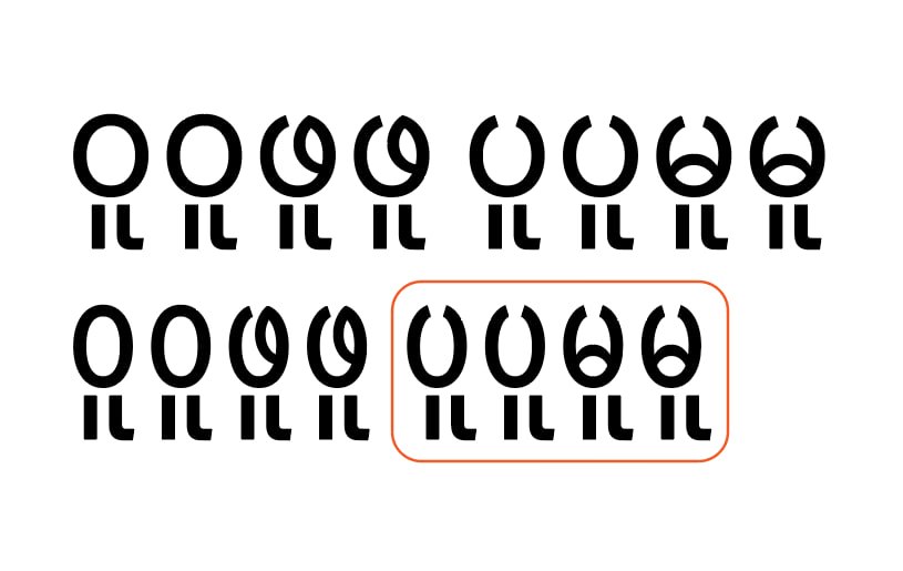
When I exported the font after adjusting the anchors, the Regular weight was fine, but some characters in the Condensed version were uneven as shown in the picture. Why is that? In Glyphs 3.