I’m trying to use this script for a handwritten font which has 2 alternate glyphs for each letter (A-Z, a-z). I’ve set-up the alternate glyphs as stylistic sets, so the glyph naming structure is ‘A, A.ss01, A.ss02 …’ and so on.
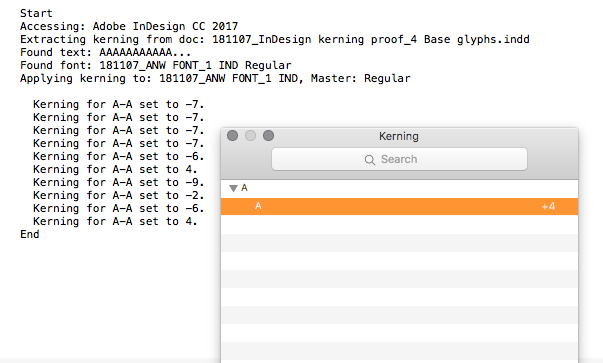
When I try to run the script on (for example) ‘A/A.ss01/A.ss02/A.ss01/A.ss02/A.ss01/A’, only the unicode values are being read, so kerning values are only applied to the A (see screenshot example below).
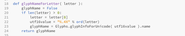
So my question is, would it be possible to modify mekkablue’s script to copy kerning values based on glyph names rather than being based on a glyphs unicode value? I think i’ve located the area of code in mekkablue’s script that would need to be modified (see below), but i’m still a novice with python and could do with some pointers, if indeed it is even possible?
No that is not possible because the script can only read out the character, not the glyph. It could theoretically also sense the OT features that are on and do some guessing, but that is probably not worth it.
If they are sufficiently similar, why not put them in the same kerning groups, and simply compress kerning after stealing it from InDesign?
If they are sufficiently similar, why not put them in the same kerning groups, and simply compress kerning after stealing it from InDesign?
Not all the characters are sufficiently similar to do this really, though this might be the closest I can get.
I also thought to auto-kern ss02 (in Indesign) and then copy the kerning values to ss02 in glyphs, and repeat for ss01 and A-z and so on… which isn’t a terrible compromise, but specifically I was looking for an ‘elegant’ (i.e. quick) way to kern between stylistic sets since the font has a contextual alt substitution feature that will generate many instances of pairs from different sets.
That goes beyond the scope of the script. It is supposed to only do a rough preliminary kerning that is better than nothing. Do not expect too much of it, it only makes sense for fonts that are regular enough for the Optical Kerning to actually work.