I came across this as I’m looking through forum posts on using the “core” functions.
I had this same issue, as did another acquaintance! If I may, here’s a theory on why people are missing this.
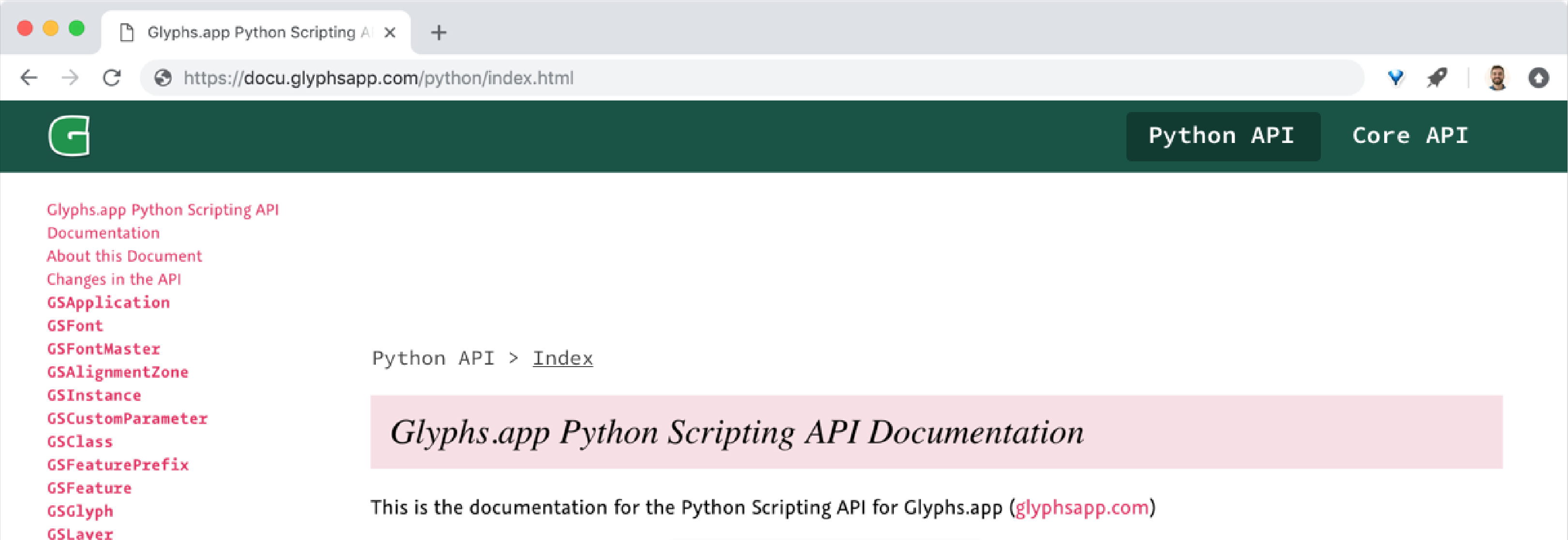
The way the navigation is set – with just two navigational items – gives the appearance that “Python Core” is a single logo or title for the documentation. After all, people coming into these docs for the first few times may not realize yet that there are separate APIs for “python” and “core,” so they aren’t prompted to search for the second type of API docs.
After I learned that “core” was actually a separate option, I realized that the “active” item style matches the “active” tab style of the main Glyphs website. However, the header on the main site is more obviously a navigation bar (with familiar link names, like home, get started, forum, blog, etc), which is why people don’t misunderstand it so often.
Possibly, adding in some repetition to the titles might help clarify them as separate options. For instance, the navigation could look like this:
Other ways of clarifying it could make it even more obvious, such as:
- more closely copying a typical style of web navigation from familiar sites like GitHub or Facebook, where the navigation bar is a bit thinner, and the navigation gets a similar prominence to the site logo/title.
- The URL could reflect that the Python docs are a section of the docs site, rather than just the whole of it.
- Separating the “breadcrumb” navigation from the sidebar style and from its proximity to the header, to show that it isn’t the main navigation.
Perhaps, that could be something like this:
Of course, other ways could go further still, like adding a “home” or “about” page to the docs. But, even shifting section titles could probably save someone pain in the future.
Hope this helps a bit, at least for getting a couple of ideas out there!