Hello (again haha). I’ve decide to create a font with multiple masters. But this time, instead of modifying each variable as an individual font and give proper naming, I’ve decide to do it all in one file by using masters and instances.
As you can see on the images below, when I install the fonts (they exported separately, of course) just couple of letters work and the naming of the masters and/or instances is incorrect.
By the way, I did Paths > Correct Path Direction in all Masters , Filter > Fix Compatibility, Paths > Tidy up Paths and Paths > Add Extremes for all masters but the issue still happens after that.
(Sorry about so many pics and all the questions I’ve been making, but i found nothing on tutorials or questions)
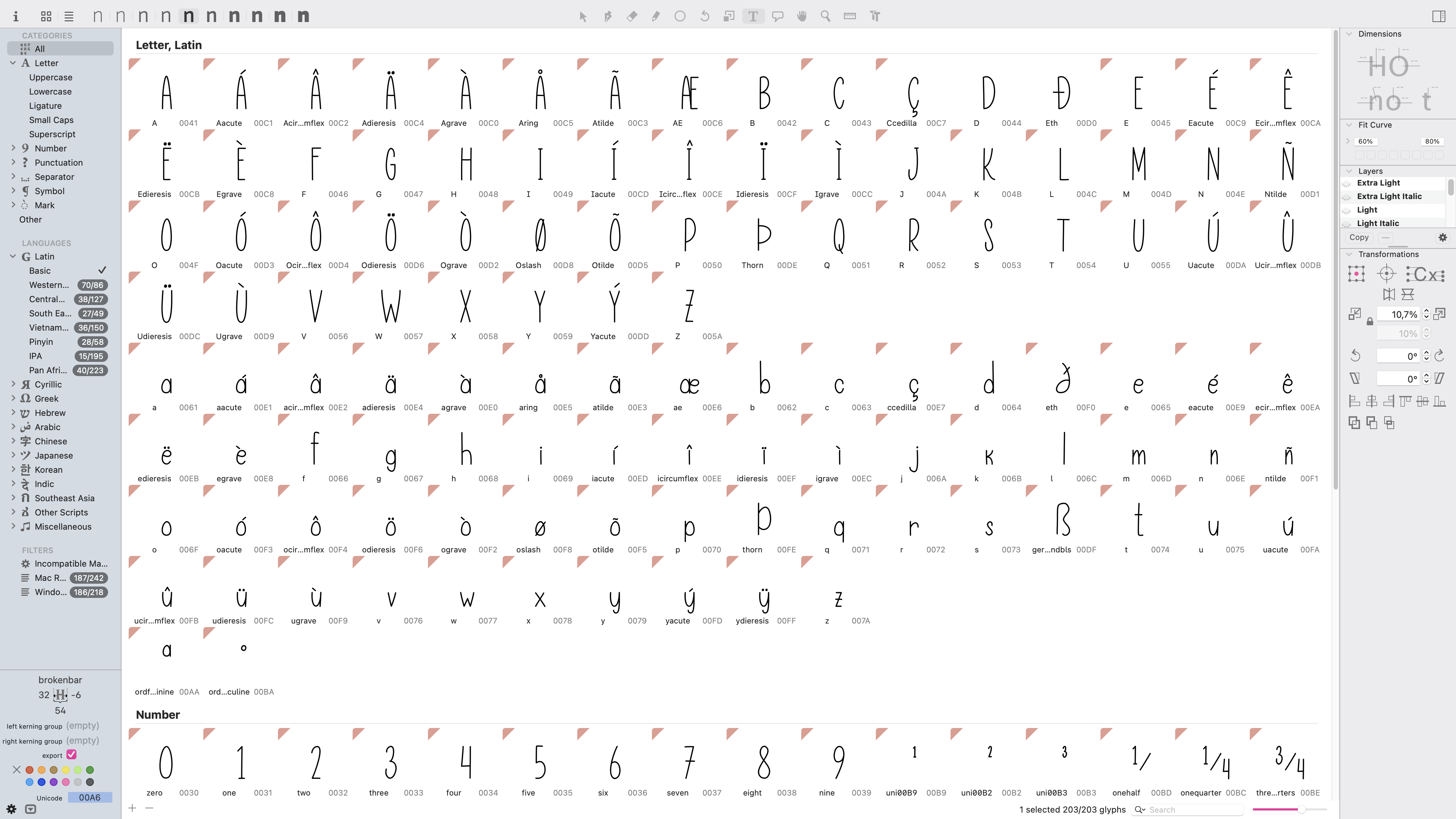
Make sure your paths are compatible. See that red triangle on the letters? It means that paths in those letters are not compatible. It’s not only about direction of the paths but about how many point there are and where the 1st node is etc etc. There are plenty of tutorials here. https://glyphsapp.com/tutorials/articles/tag:interpolation
Another thing - if it’s a handwritten font it is not practical to do interpolation unless you are tracing the letters manually.
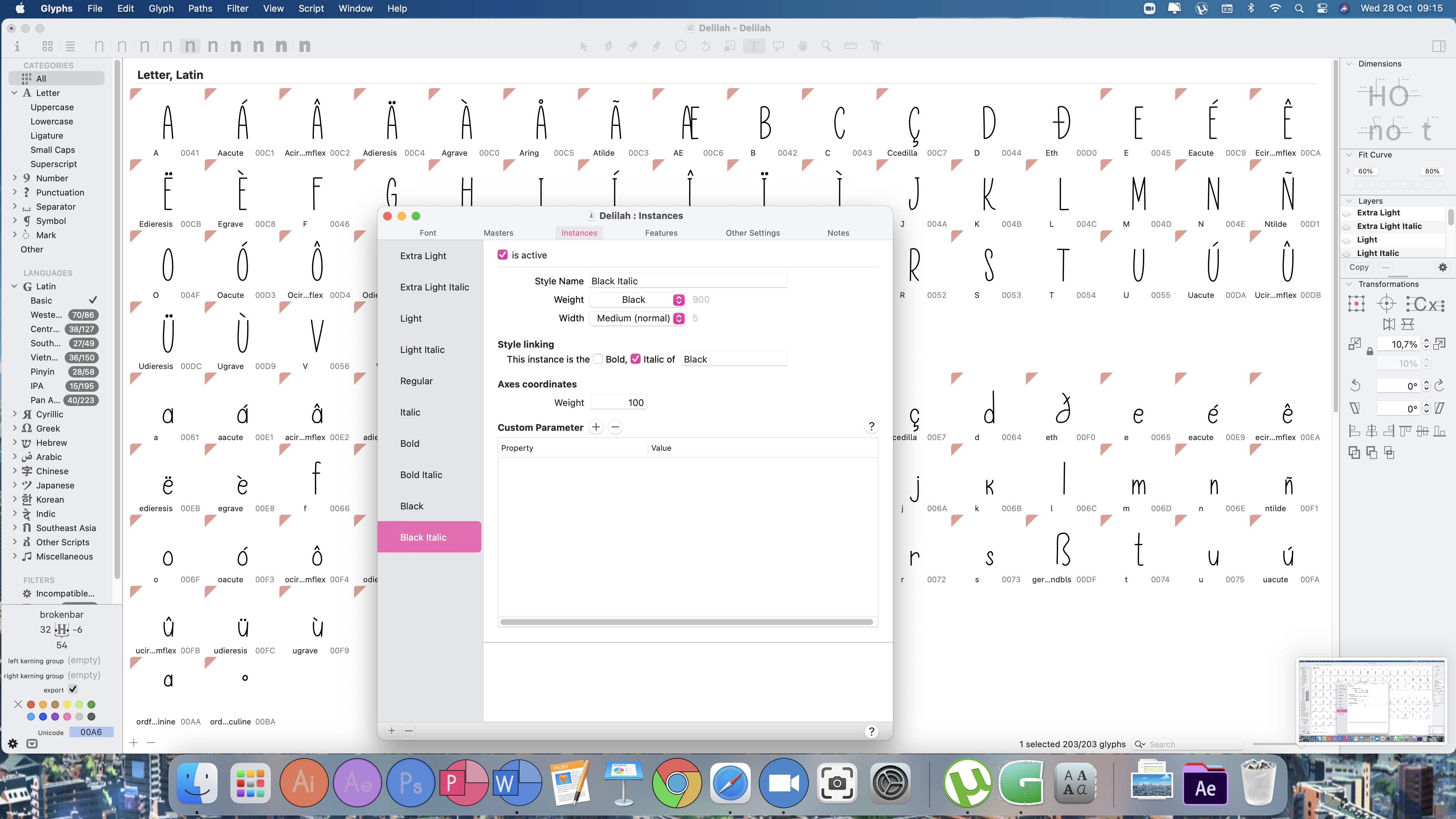
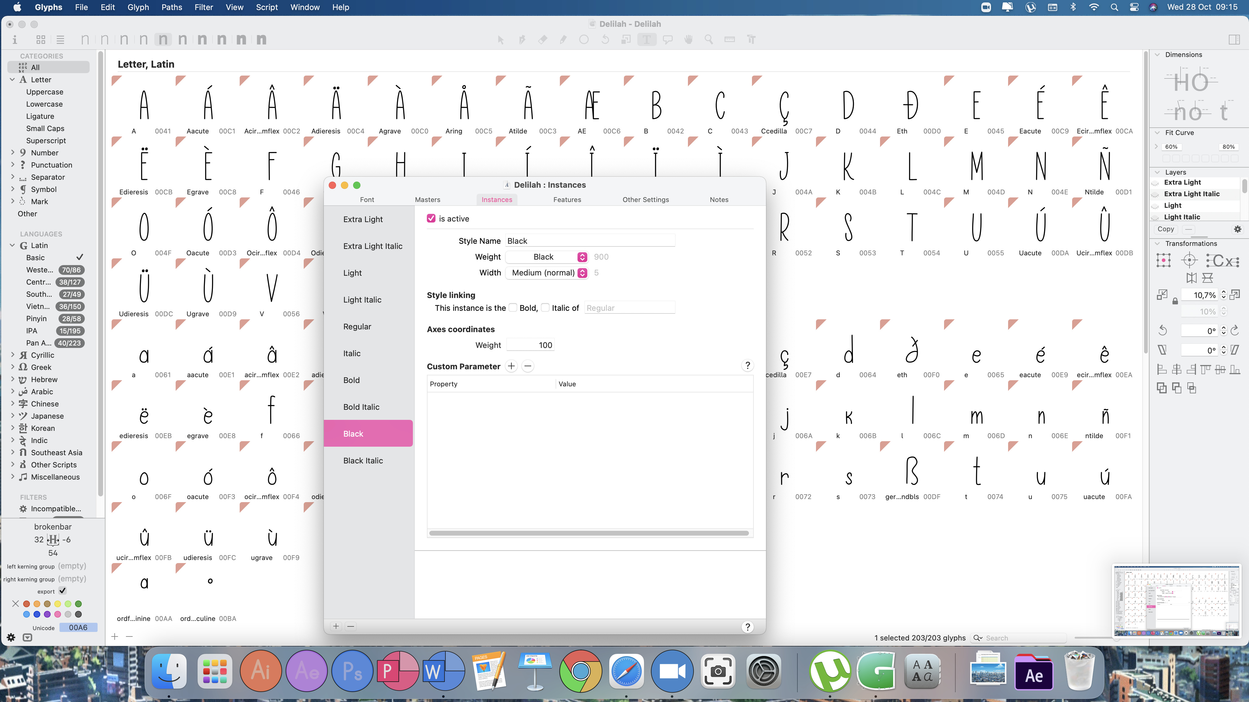
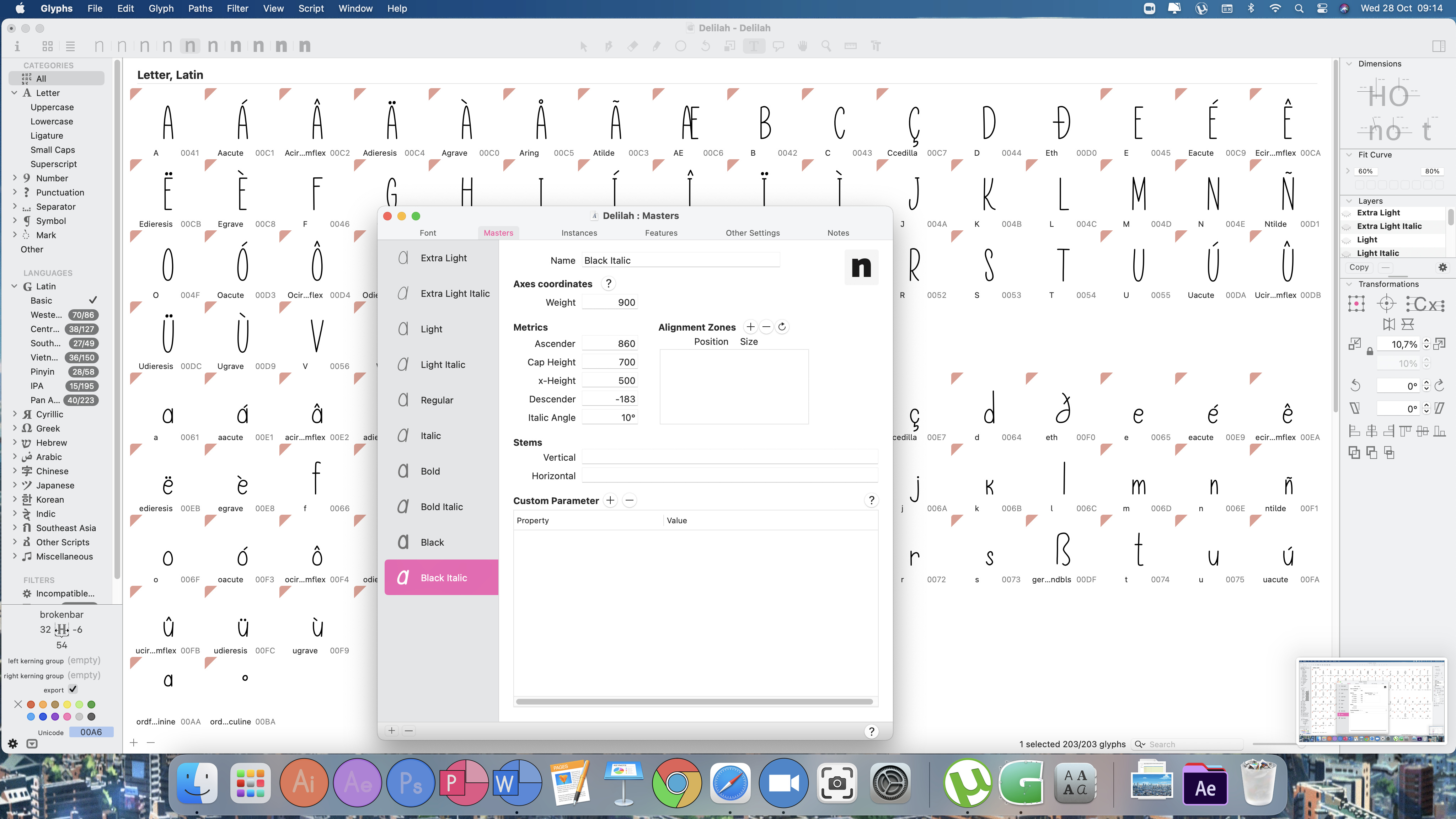
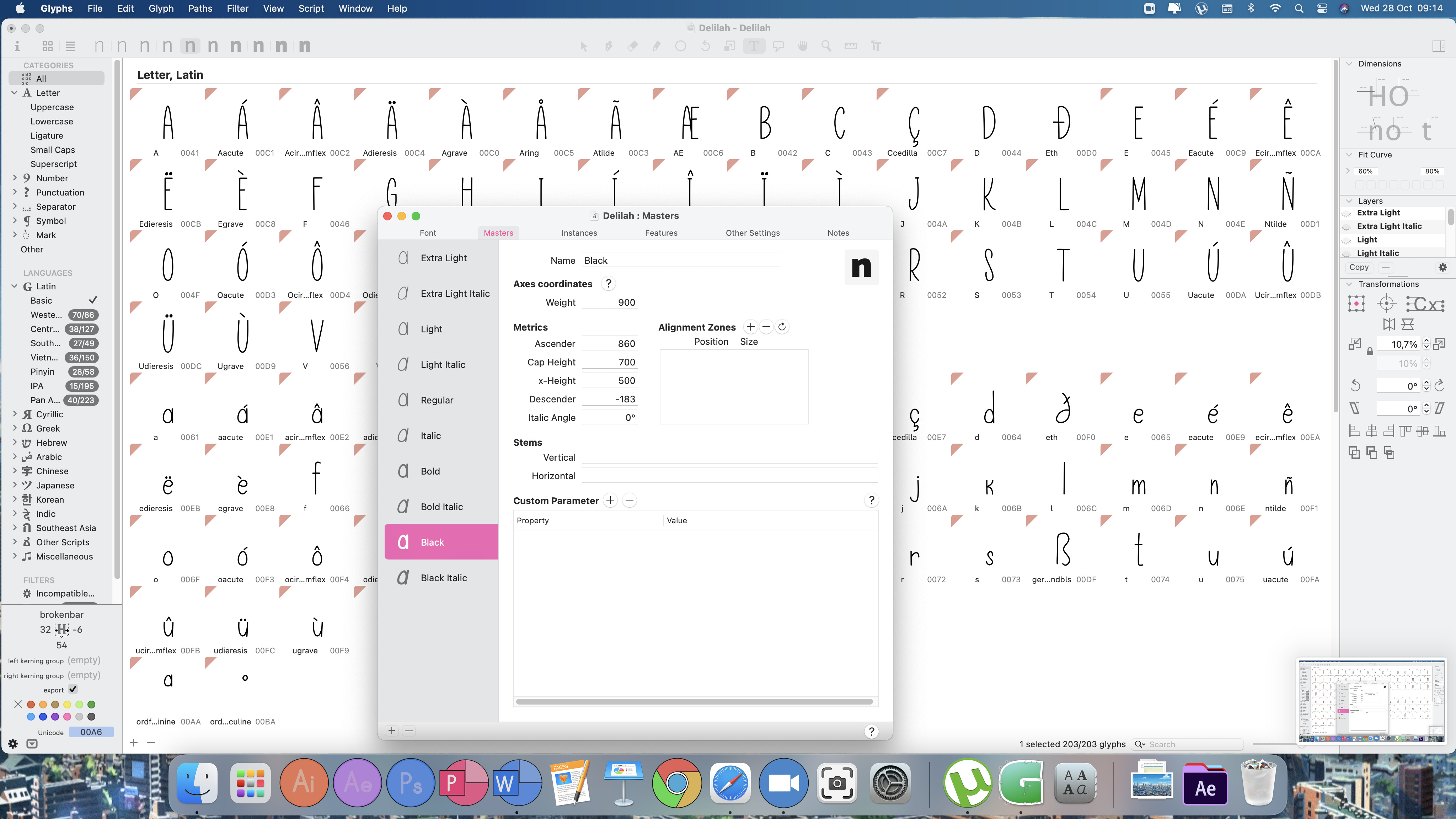
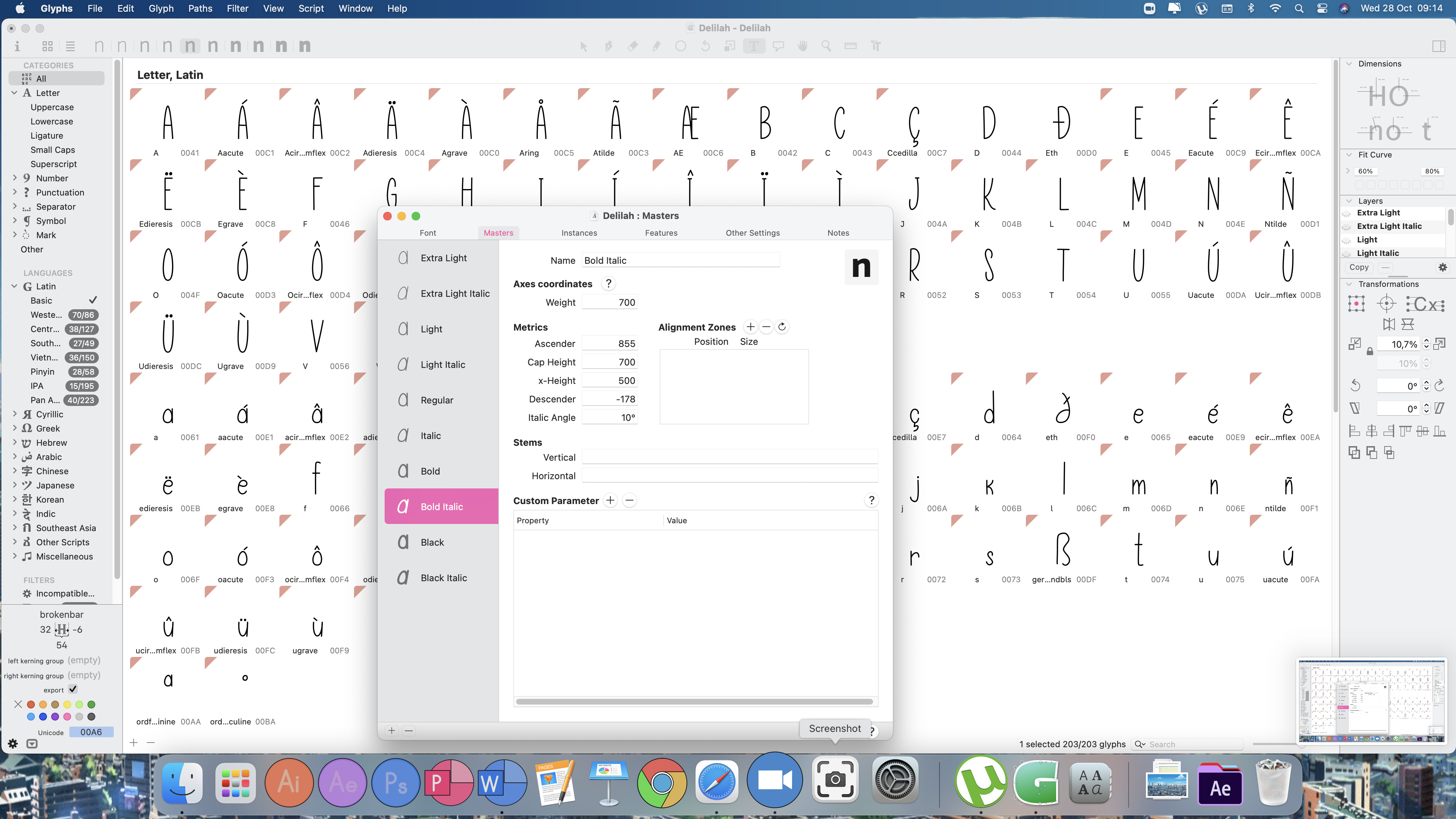
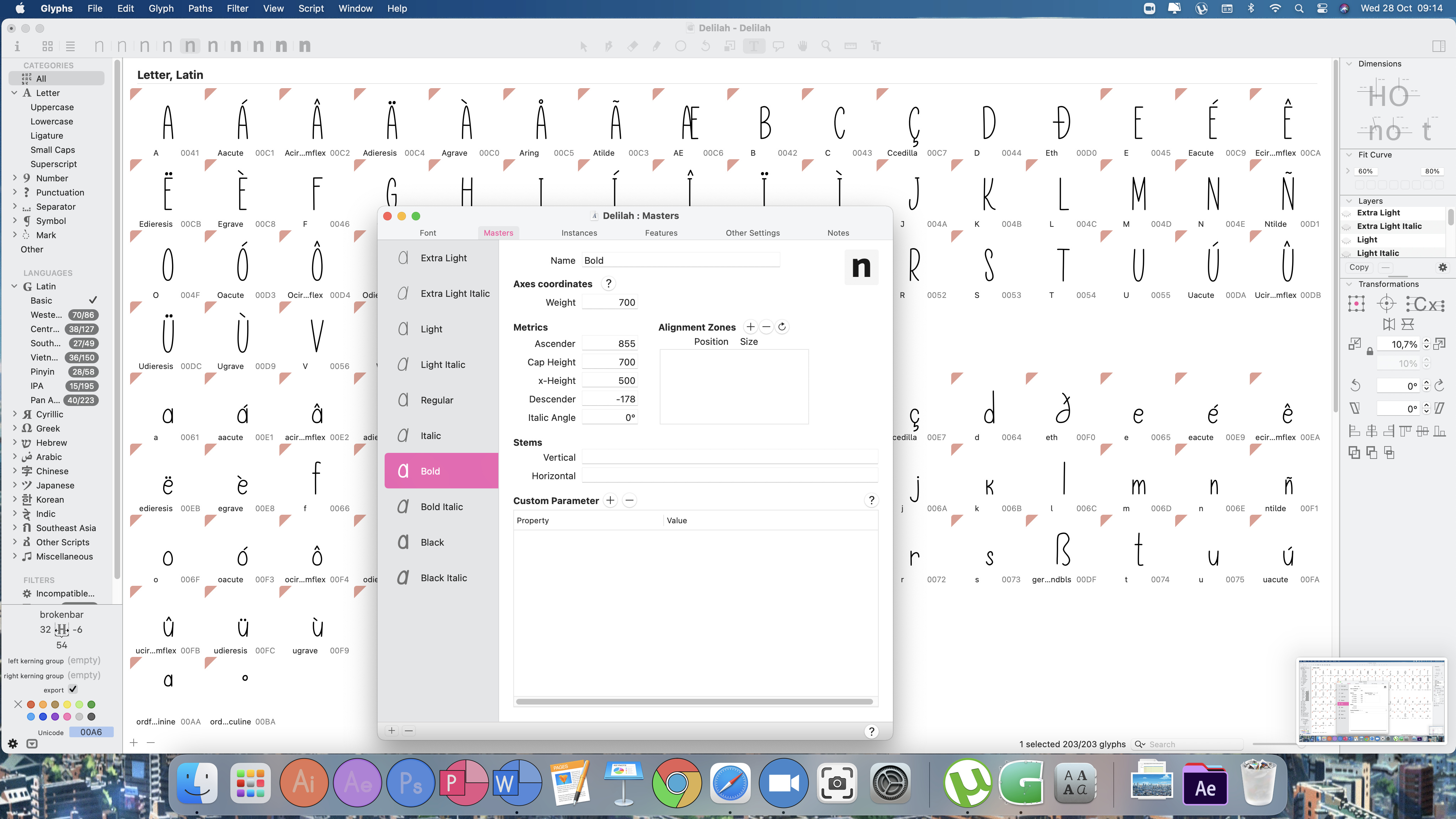
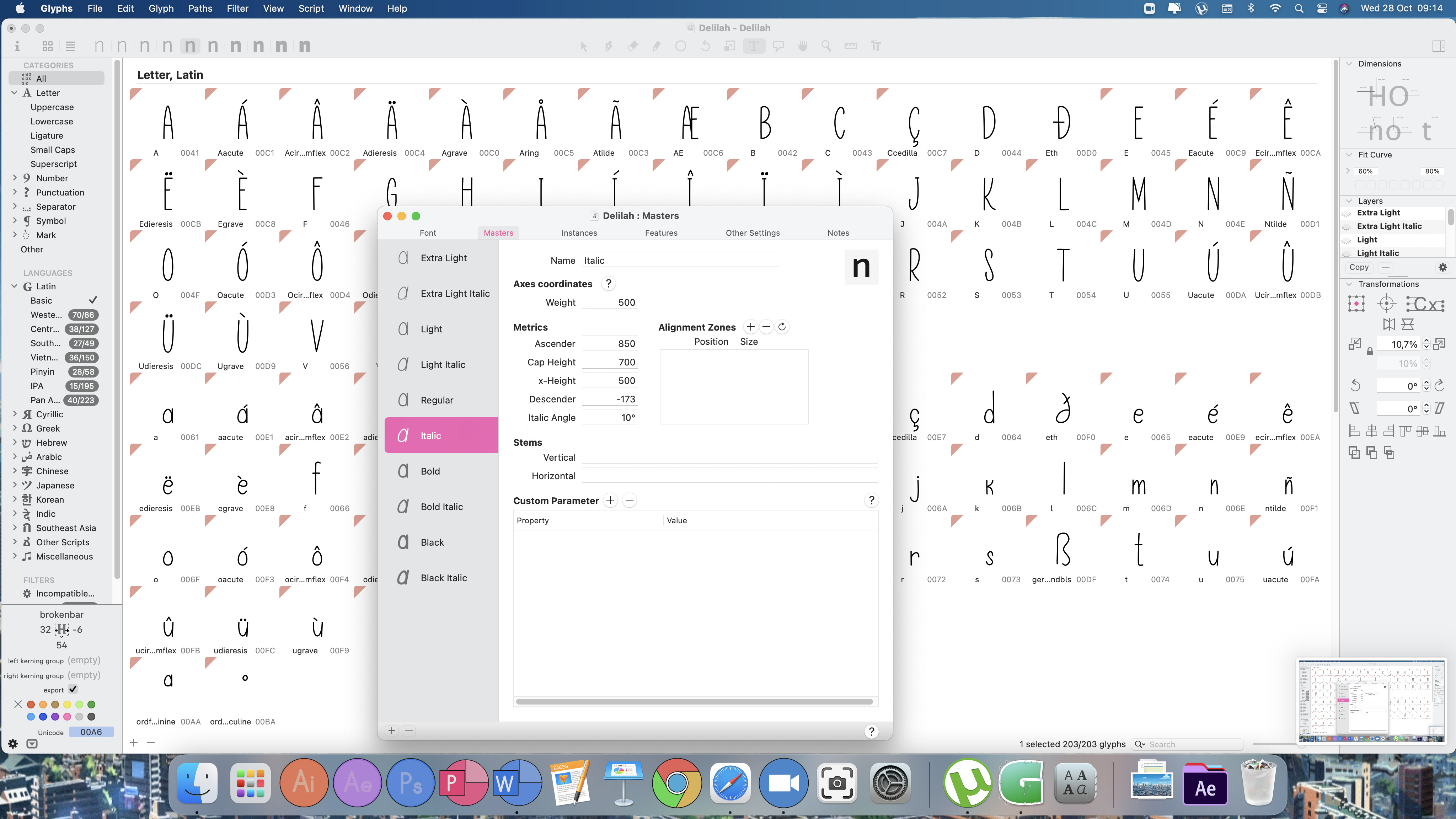
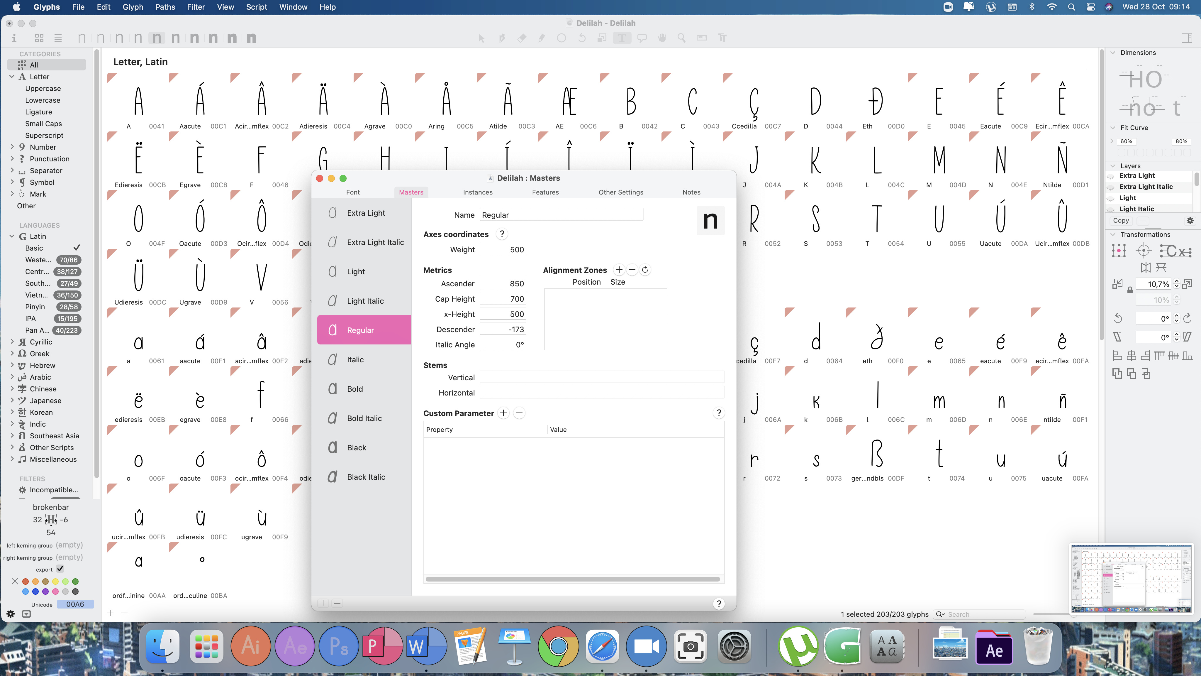
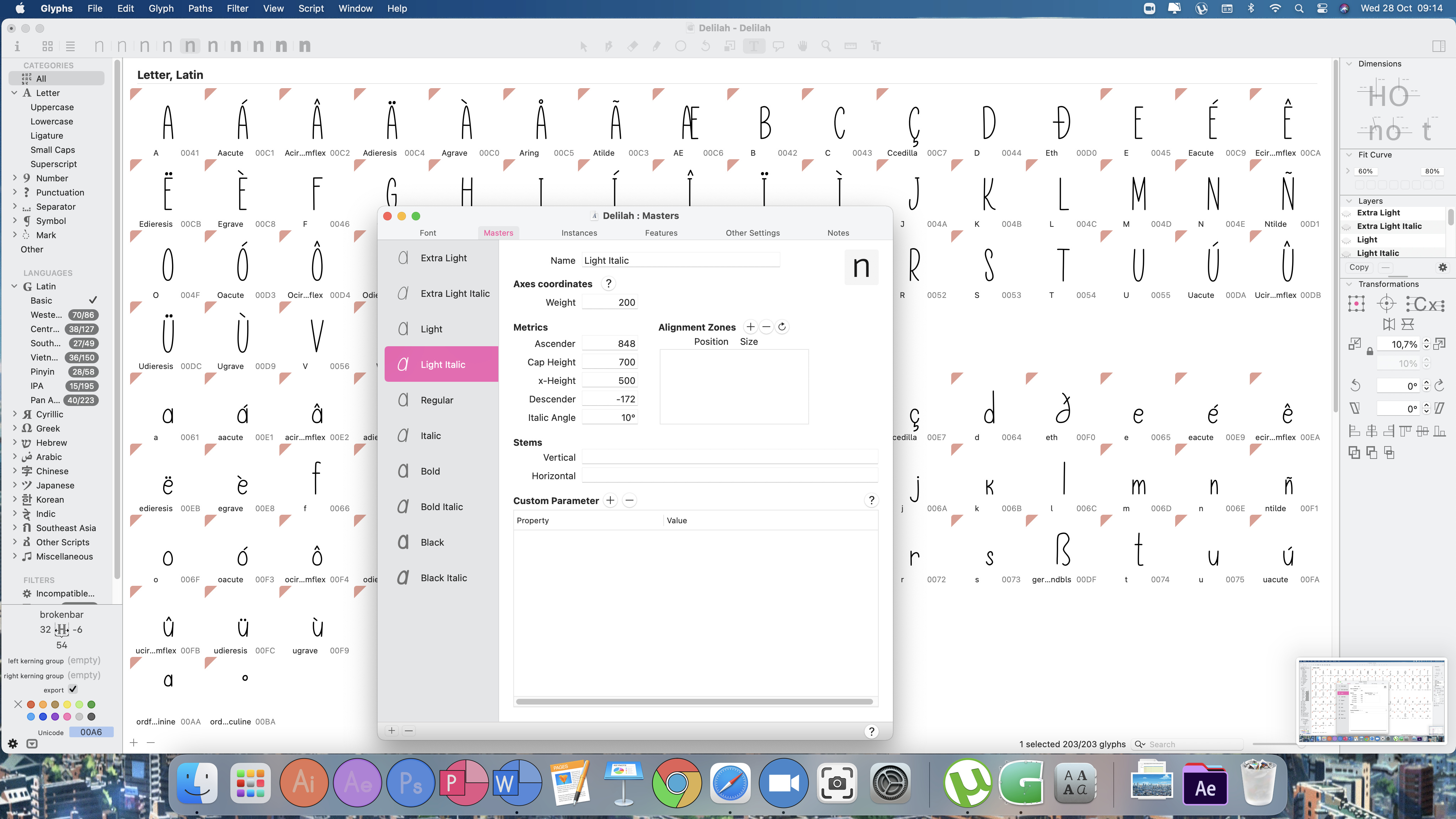
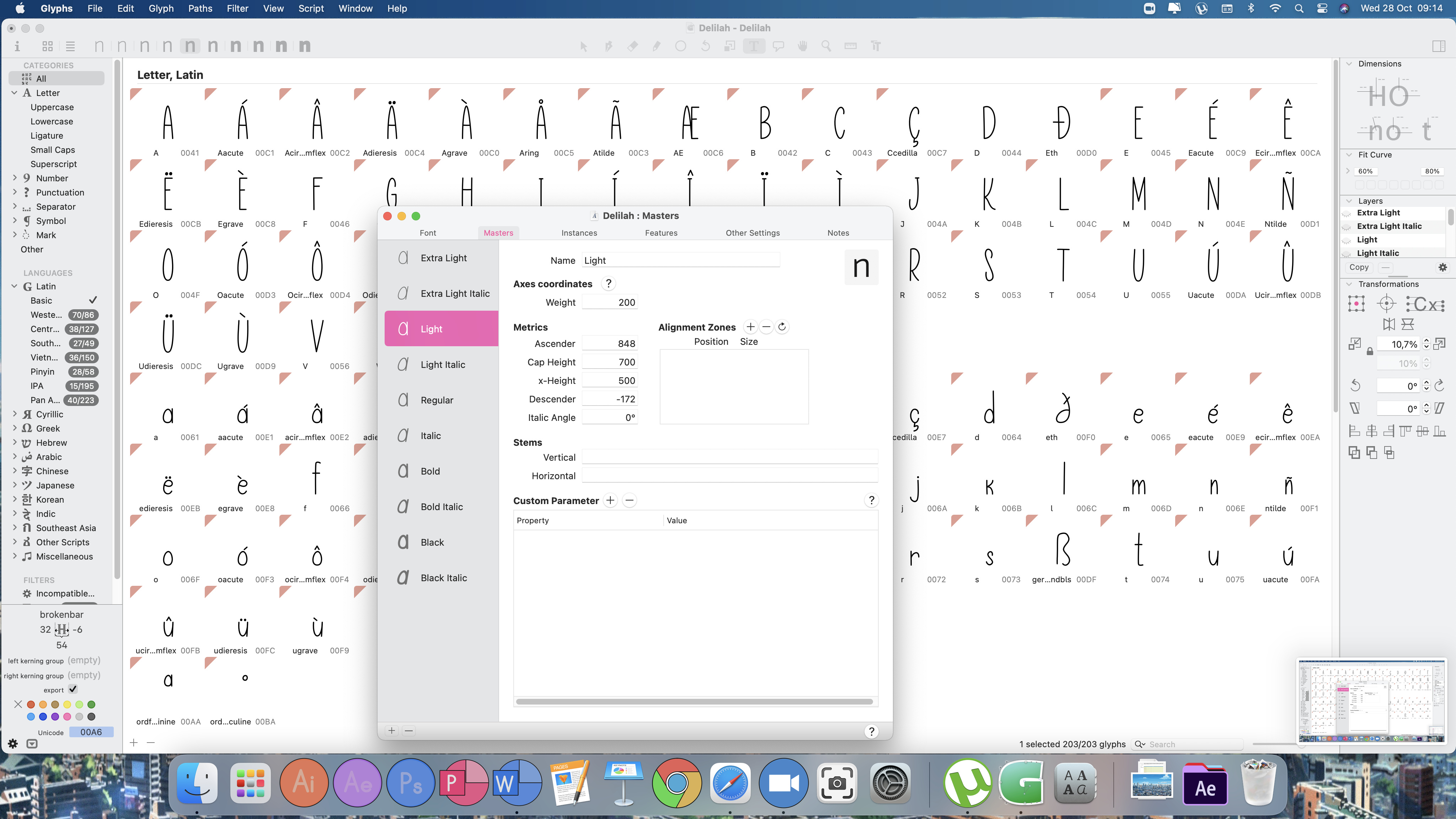
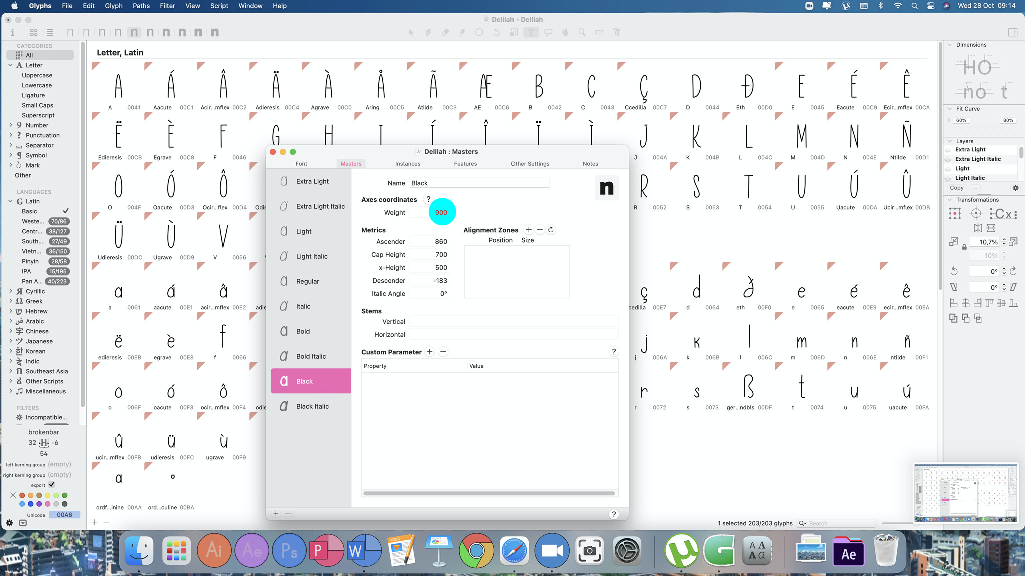
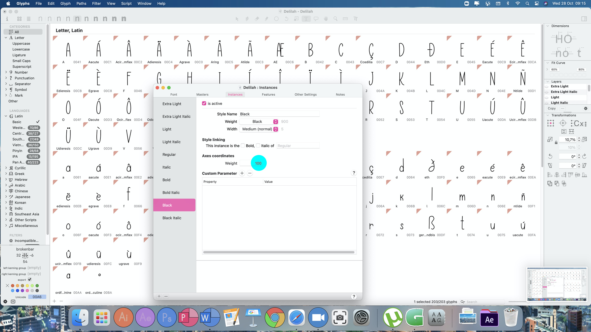
So if there is no interpolation and every master/instance is drawn individually, make sure that weight that is mentioned on Masters tab is the same as you use on the Instances tab. Based on your screenshots - all masters have weight 200. It shouldn’t be this way. Start from, lets say 50 and then increase by 50 in every next master. Then use the same numbers on the instances tab. Again, it works if you don’t use interpolation. If you do want to have instances in between the masters then you should use the weight numbers differently.
All of the above, absolutely. One thing I might want to add: see whether you really need all those masters – the concept of masters is (basically) that they represent the extreme points of your design space. So, in this case, only the lightest and the boldest should be represented by masters. Everything in-between is calculated by interpolation (the exact points on your weight axis are defined by the instances). Furthermore, it’s far easier to only worry about two masters instead of eight.
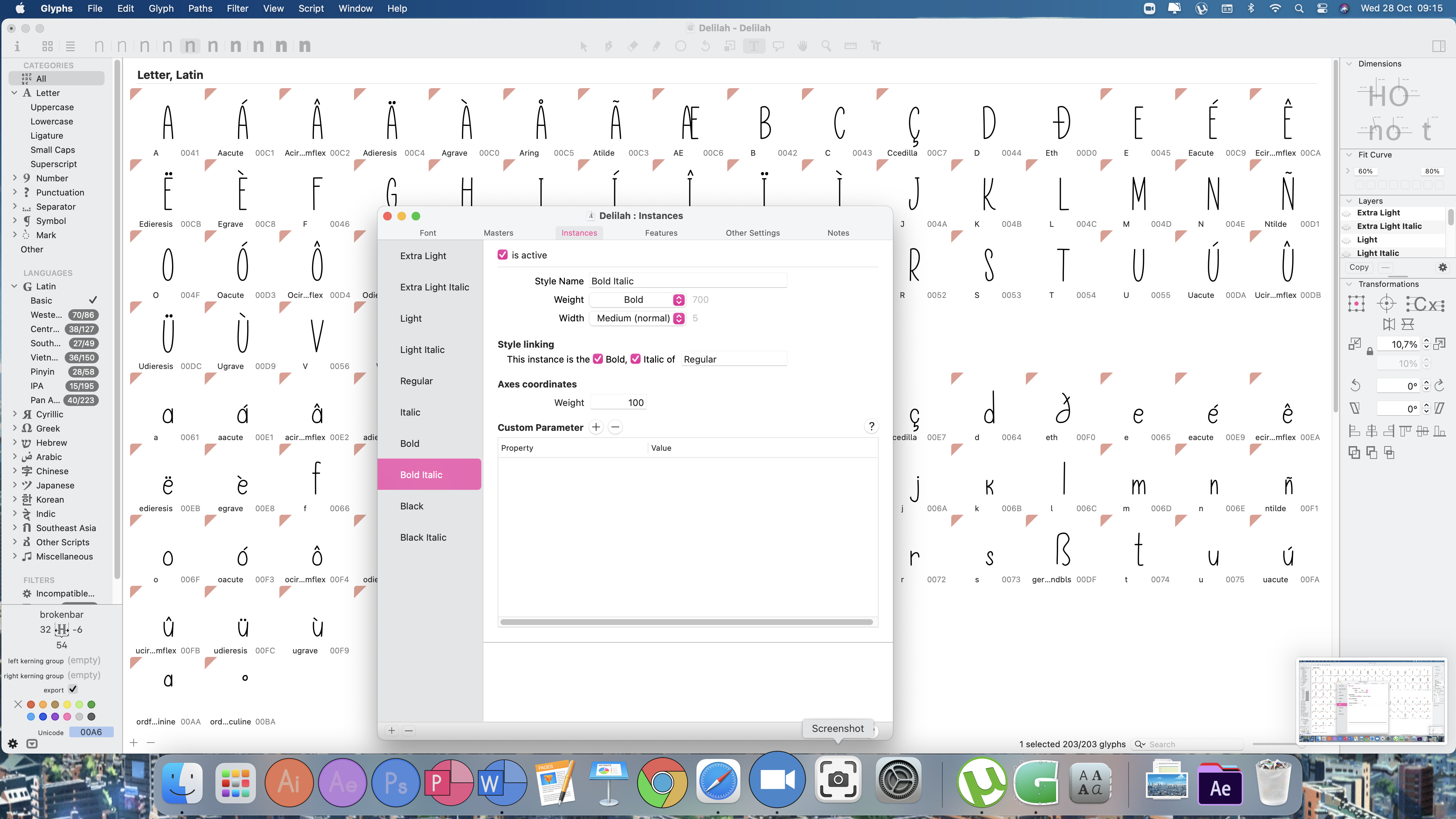
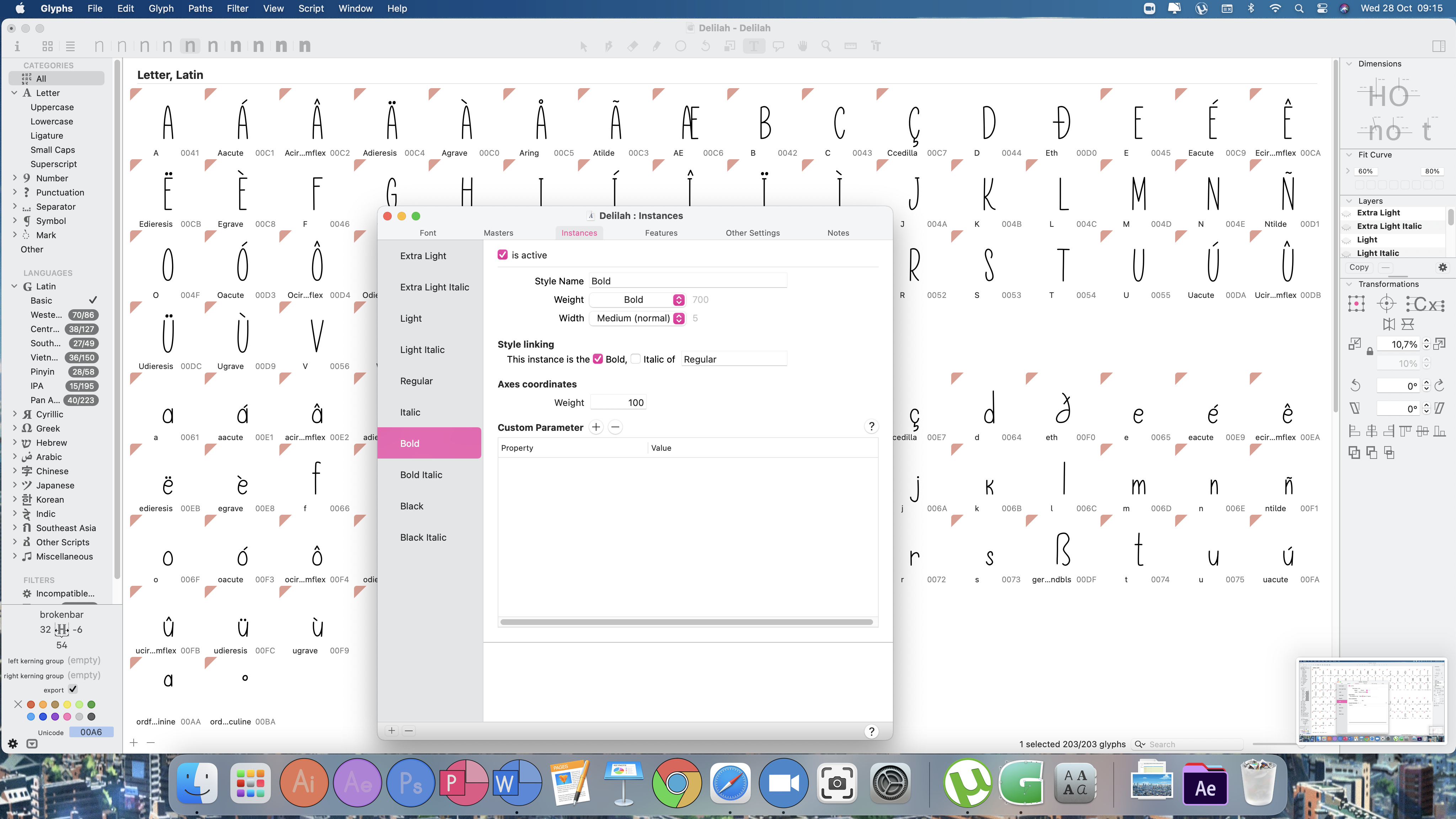
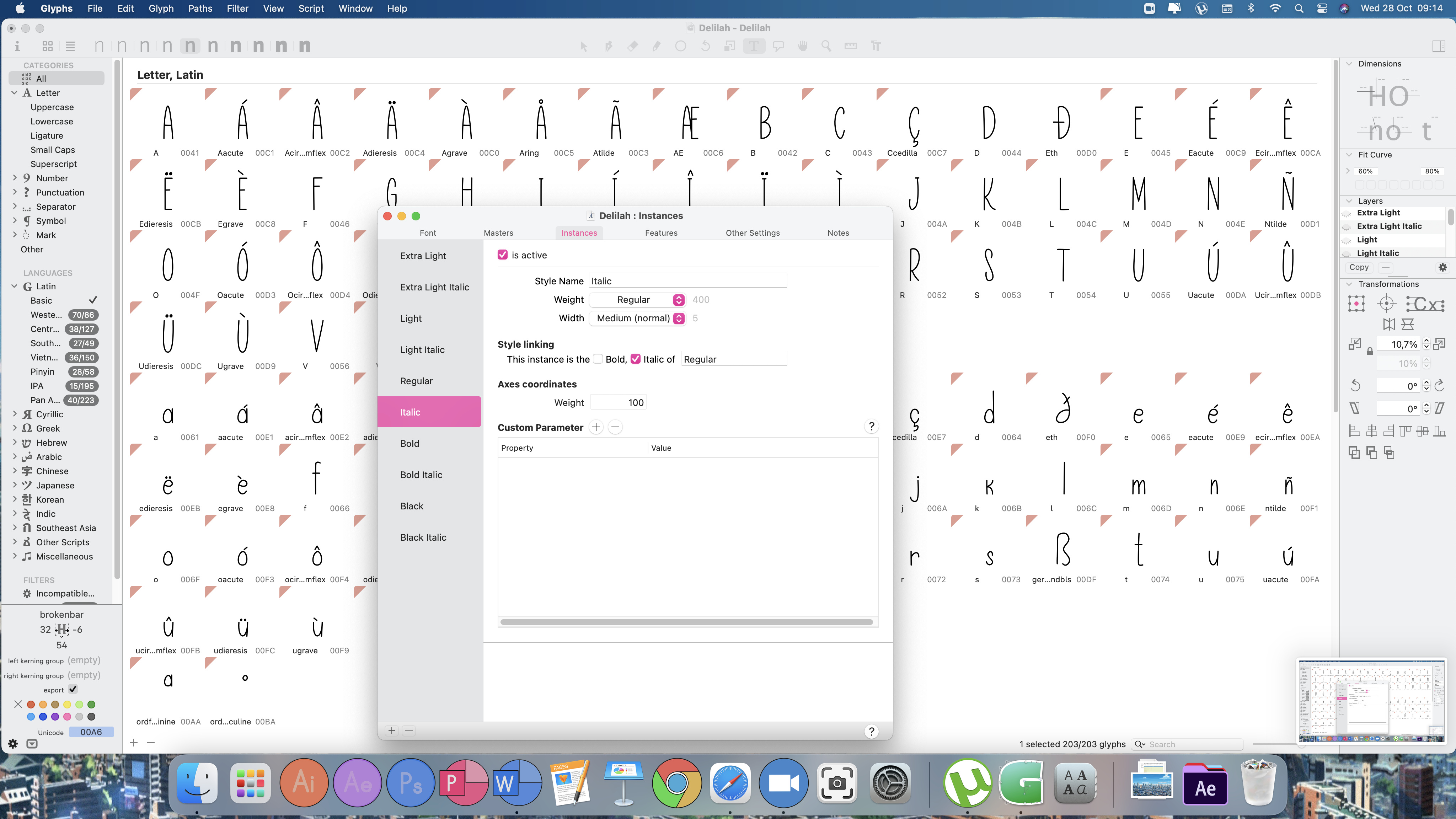
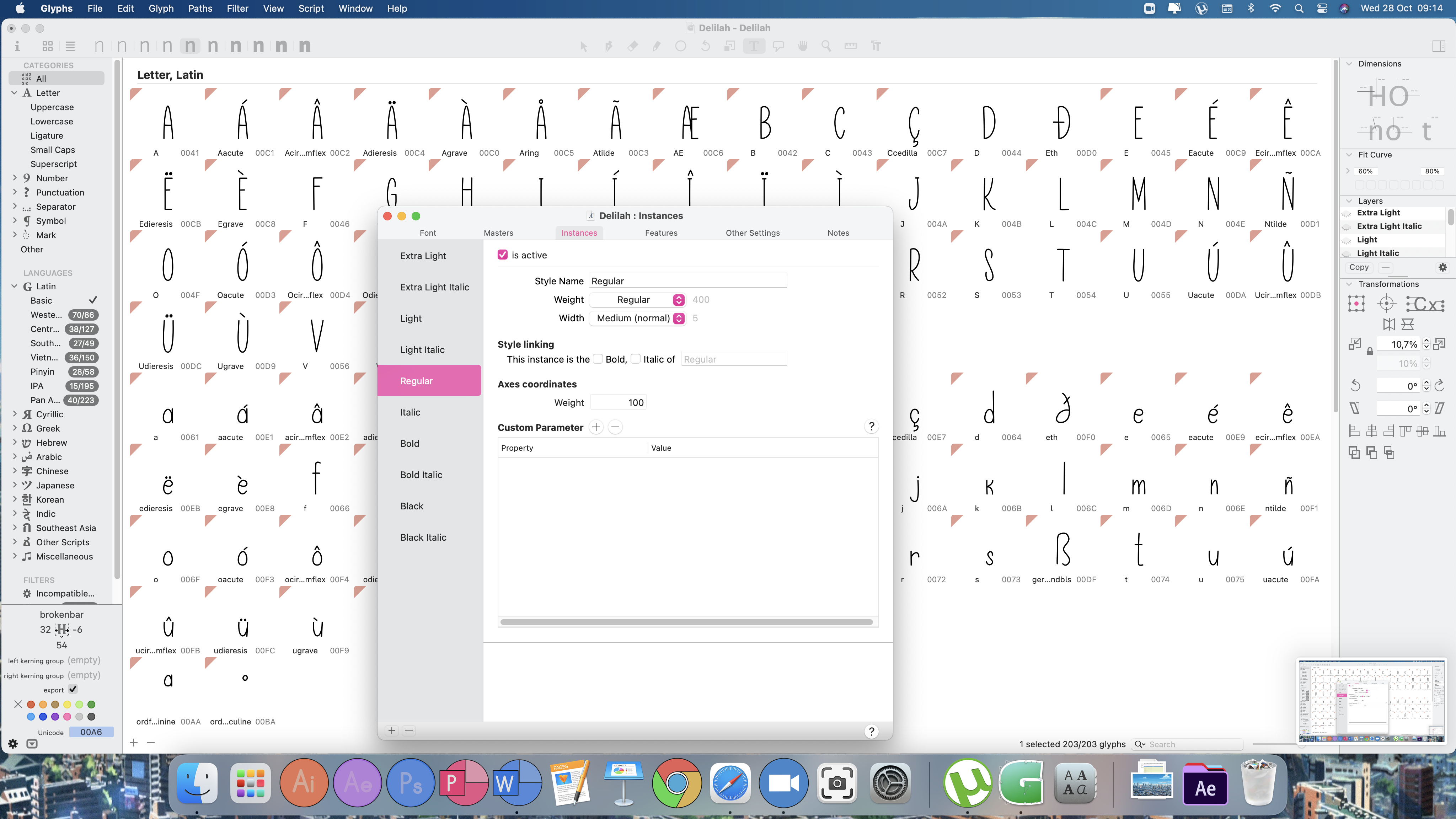
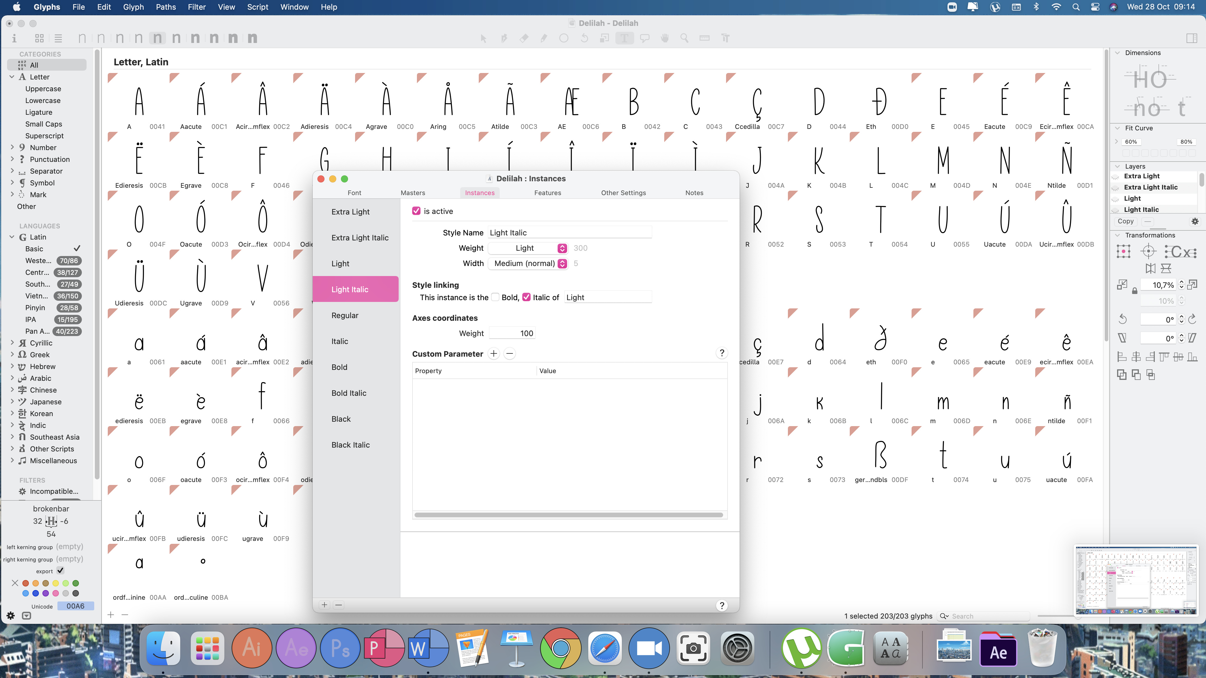
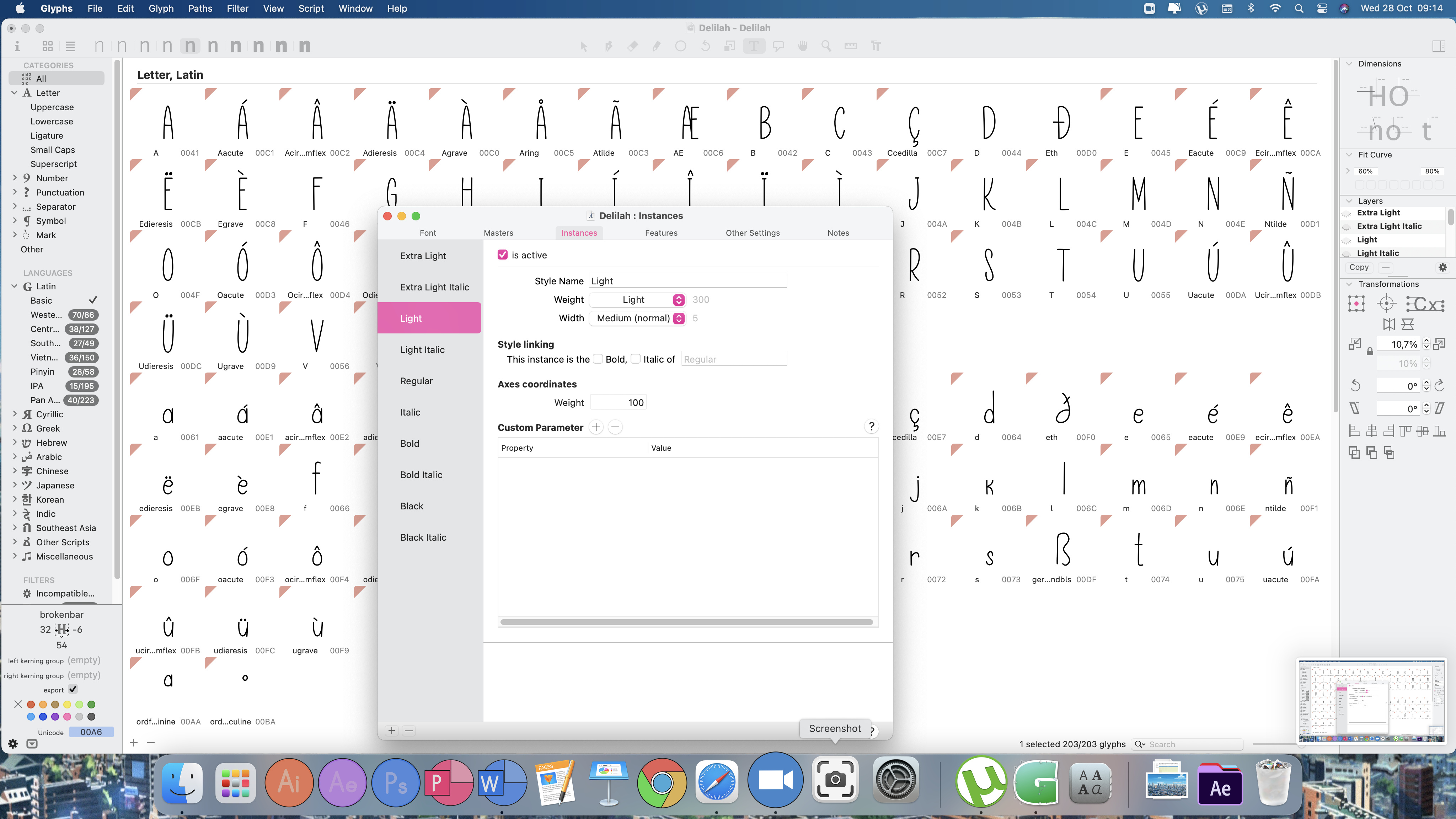
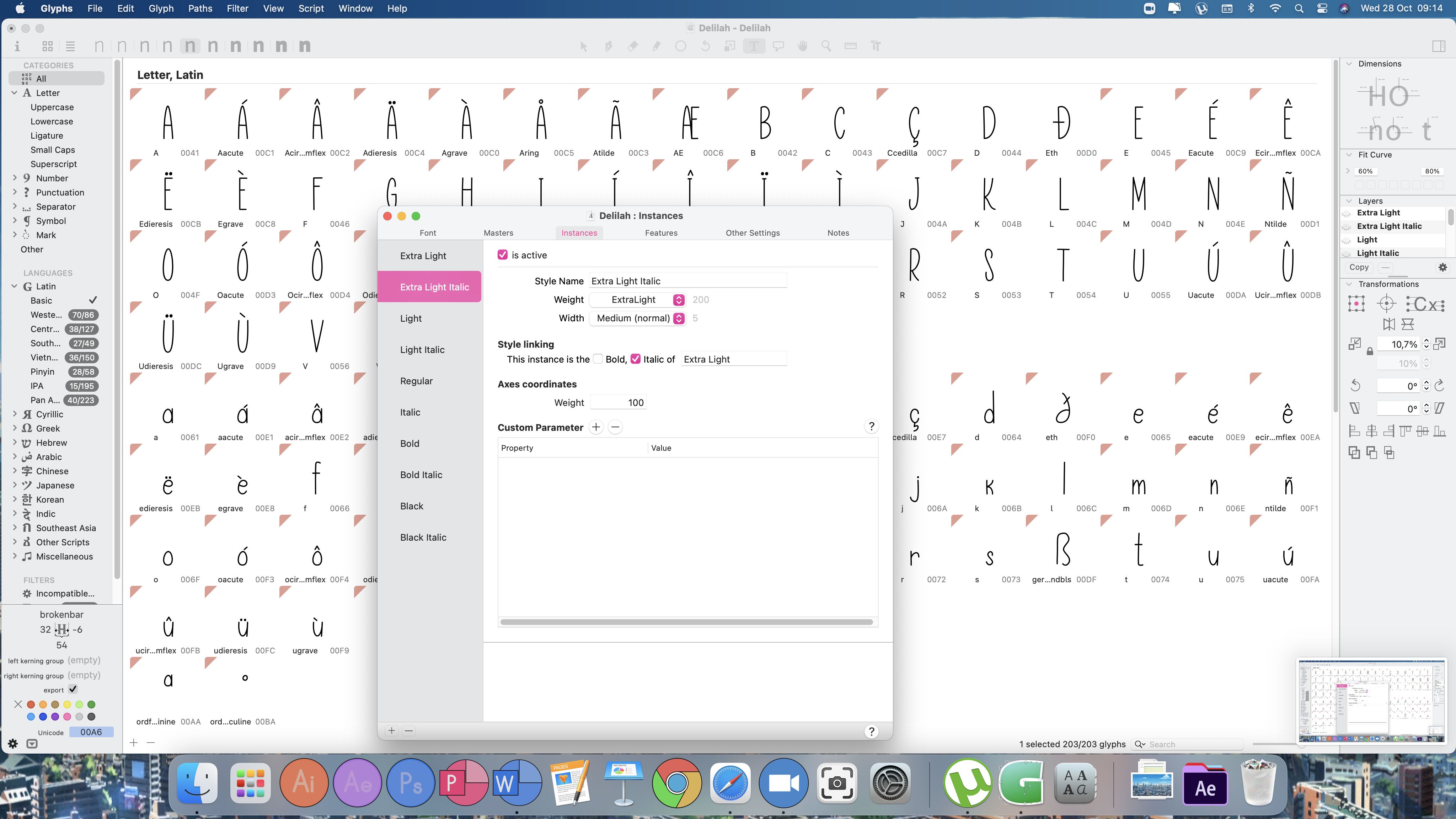
All of your instances seem to have the same Axes Coordinates — 100, but there’s no master at that location, so it gives you empty fonts. Try to replace them with “Instance for each master” under the plus button.
Axis Coodrinates is where you define the “actual” weight values for interpolation from masters. The other Weight dropdown menu on top is used just for sorting in the menu. And those 2 weights don’t have to be the same. That might be confusing, have a look at tutorials here.