Hello there !
Thanks to really talented people here, my new font project is coming along
Before creating my sample images, I want to be sure that everything is OK with Myfonts.
I succeded in resolving some of my problems, but I’m stuck with 2 of them…
So sorry I come again to ask you to ask for help…
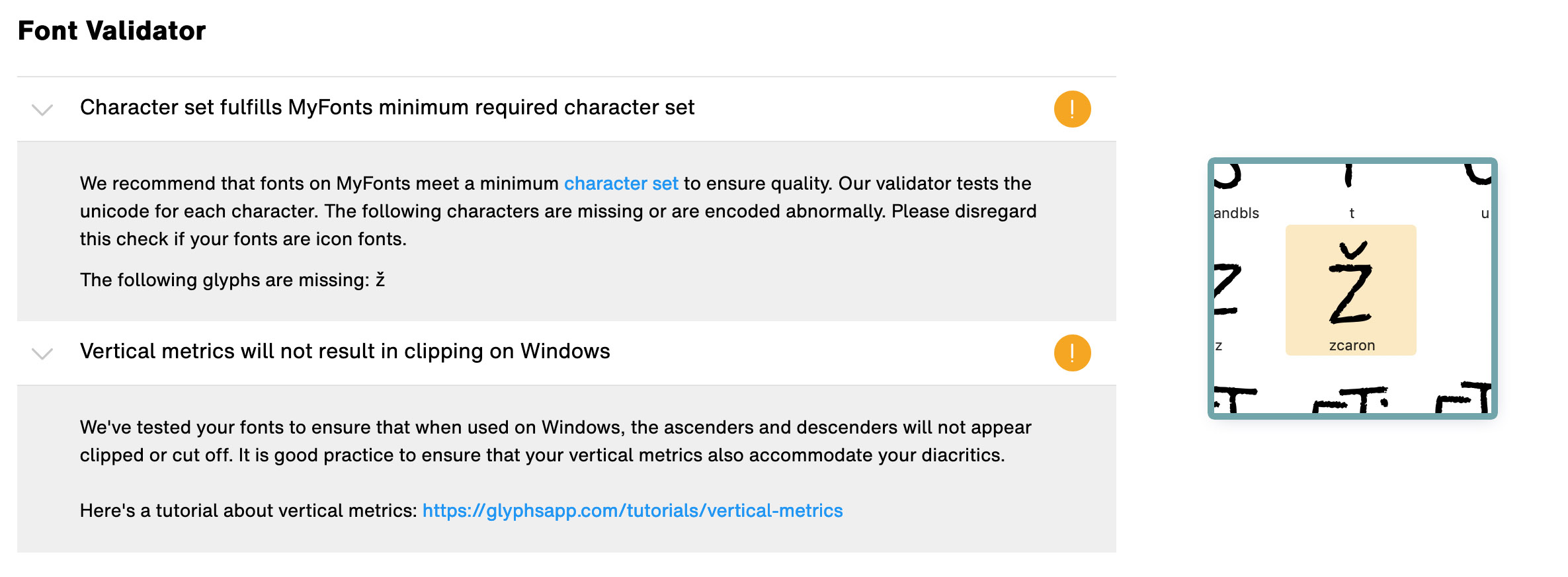
First :the mysterious missing character.
I don’t understand why zcaron is missing because that glyph do exists in my font file !
Secondly : the Windows vertical metrics issue.
I obviously read your tuto (Vertical metrics | Glyphs) but it seems that it is about Glyphs and not Mini. I actually didn’t find File > Font Info > Master in Glyphs Mini.
Is there any Mini tuto helping with this Windows Metrics issue ?
The second problem is not a problem. It says that the glyphs will NOT be clipped. That is good. You want to avoid clipping. Not sure why they list this.
@ArtGrootfontein just show your font “in action”. Nice catching first slide: nice name and main features listed, then some slides showing the font features and then show how to use it in all sorts of products - tshirts, books, comics, packaging - whatever your font suits for. There is a lot of free stuff like product mockups, photos etc on the internet should you need them.
Good luck to the new font!
Thank you very much @elena !
I saw that we can make up to 15 specimens… I love creating that kind of stuff but does people really slide until the last one ? (is it useful to make more than 7-8 images ?)
If I read it correctly, the section headings do not state the error but the desired condition. It would better if it said “Vertical metrics result in clipping on Windows”. In the detailed explanation, they seem to make a distinction between clipping ascenders and descenders (which the font does not) and clipping diacritics, which the font does seem to do: “It is good practice to ensure that your vertical metrics also[in addition to ascenders/descenders] accommodate your diacritics” (emphasis and addition mine).