I’m working on an italic typeface with different widths and I’m stuck with it.
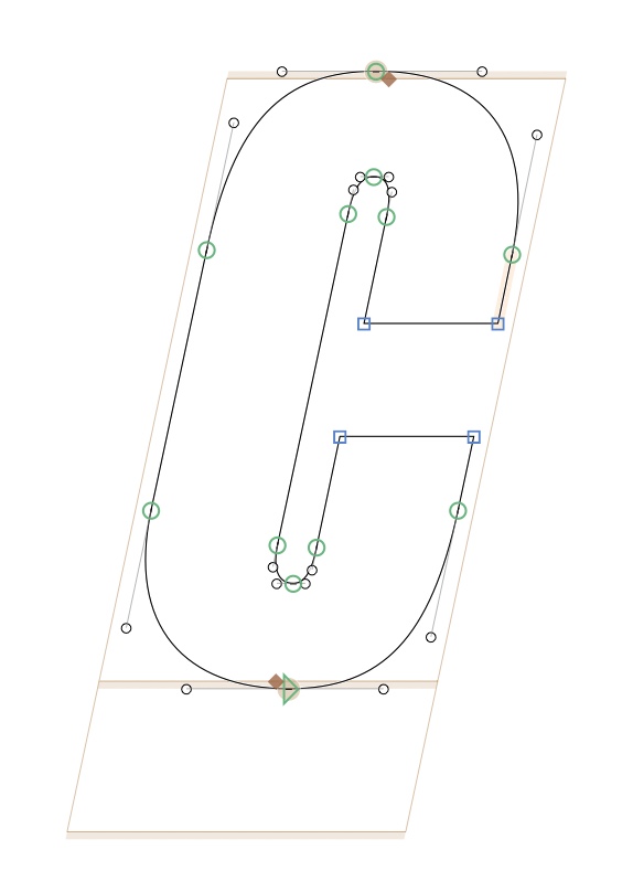
For the Condensed master, I added points on vertical stems to bring it more verticallity.
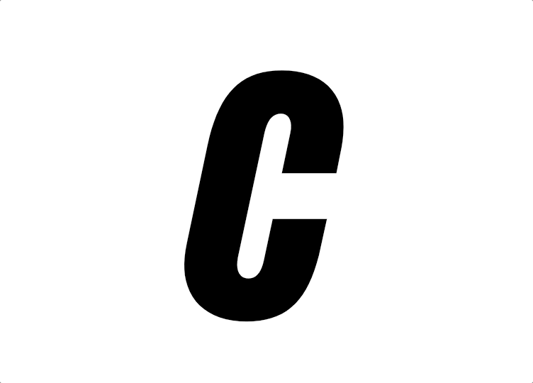
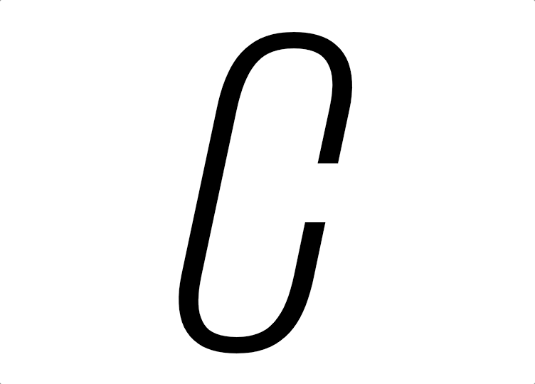
The Condensed master is more cubic and vertical, while the Extended master is really rounded.
For the upright version, the interpolation between Condensed and Extended works perfectly, but with the Italic, the interpolation is not really smooth and breaks a bit the outlines.
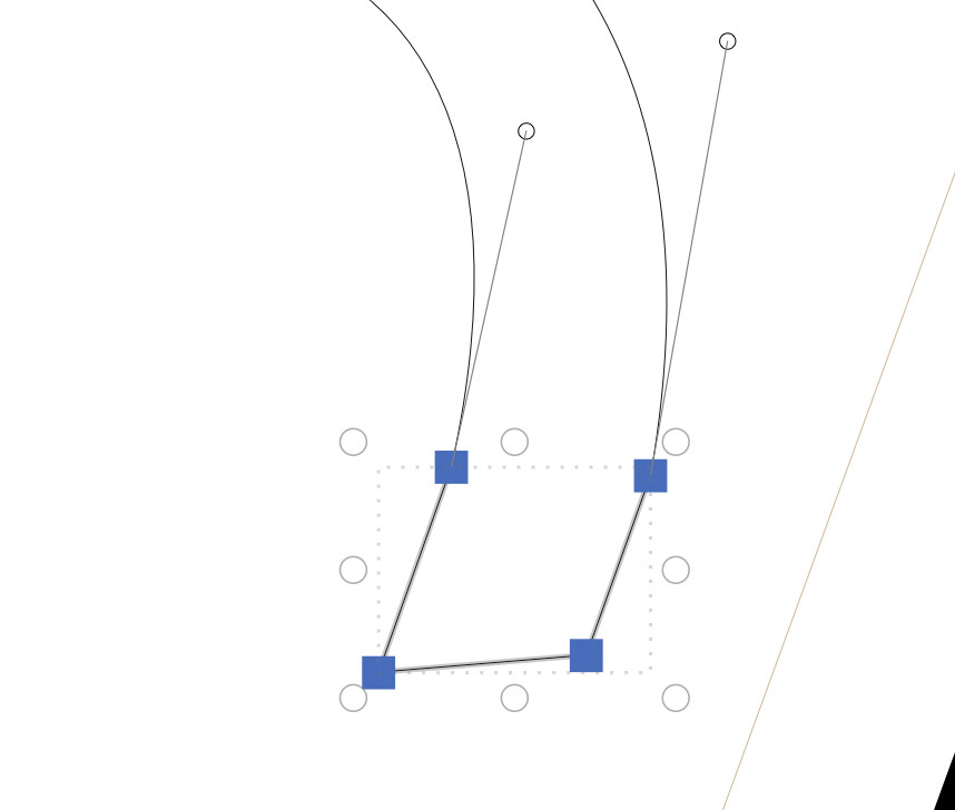
I feel your pain. Interpolating between such different structures is always a problem when you see it with a microscope. Generally you should avoid straight segments and small ones too.
I’ve taken the former approach in Neue Plak which looks like this.
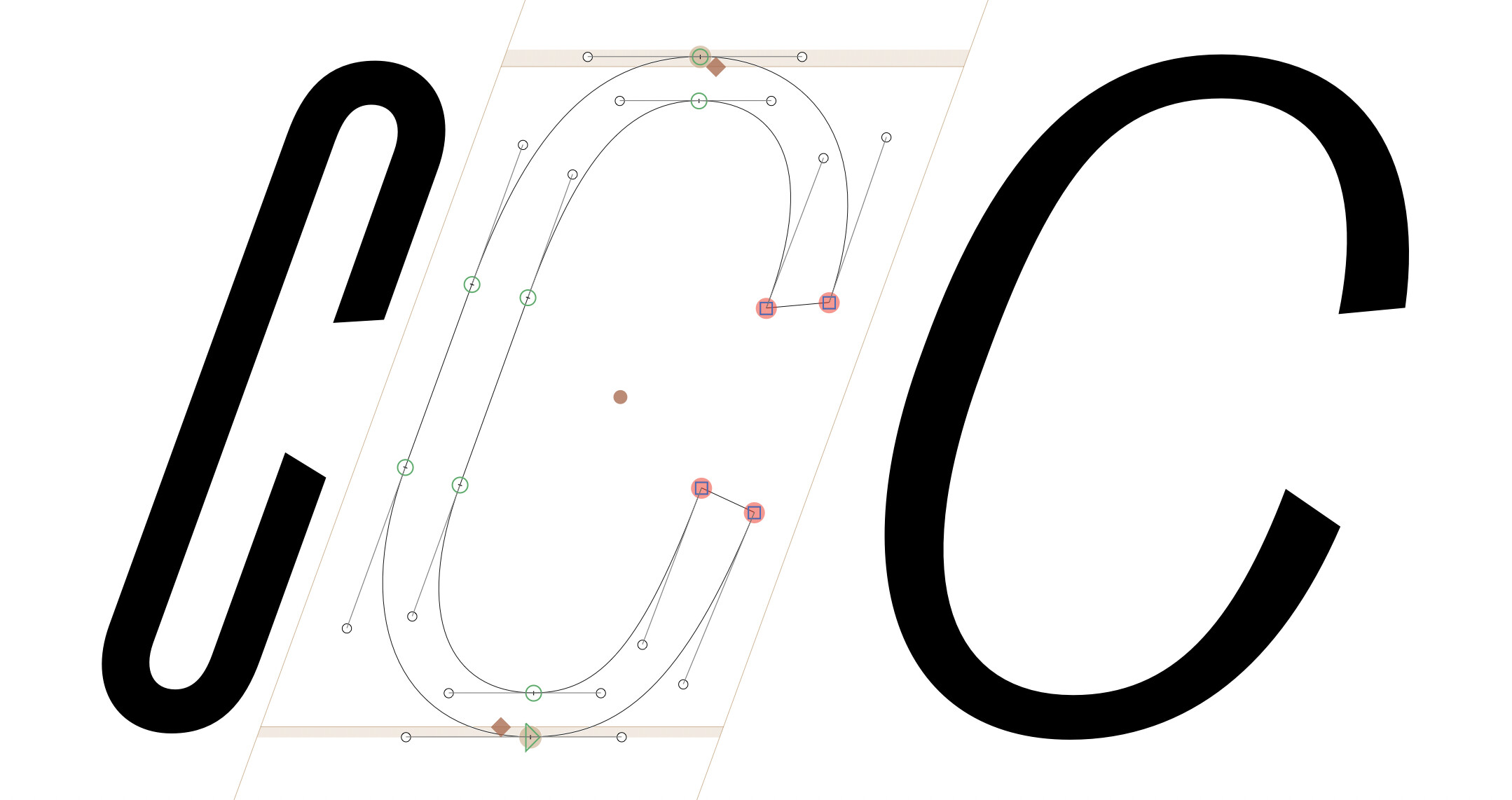
I solved that in Right Grotesk with special layers which hide the extra nodes and put the handles upright (or at italic angle), this way kinks cannot happen at all: