Hi, this issue has been bugging me for a while now, and I have not been able to properly troubleshoot the exact cause of it. When working with nested components and exporting the font later, quite a few times, the glyphs with nested components align wrongly. Either, the sidebearings are wrong, or the vertical positioning is wrong, sometimes both. On display, it looks fine, but when printed, these errors show. Also, curiously, the other day I noticed something with a u I had (for the rough draft) made with the n as a component, which in turn had the shoulder as a component. Hence, the u was composed of two stages of components, so to speak. Here, even in the preview panel in Glyphs, the u had some vertical and horizontal displacement. Exporting the font, it looked fine on display, but then again printing it resulted in the same error. Of course, I checked component decomposition for export, but maybe this only decomposes one step? Any ideas?
So far, I have been unable to find a related topic, so I apologise if this is already a known issue. Thanks!
Ah, thank you, I will try that. Of course, I used anchors for diacritic and such, but not for shoulder components or whatever else. Nonetheless, even without anchors, why would a u, which is composed of an n turned upside town, have vertical shift in it, even the stem, which is not a component?
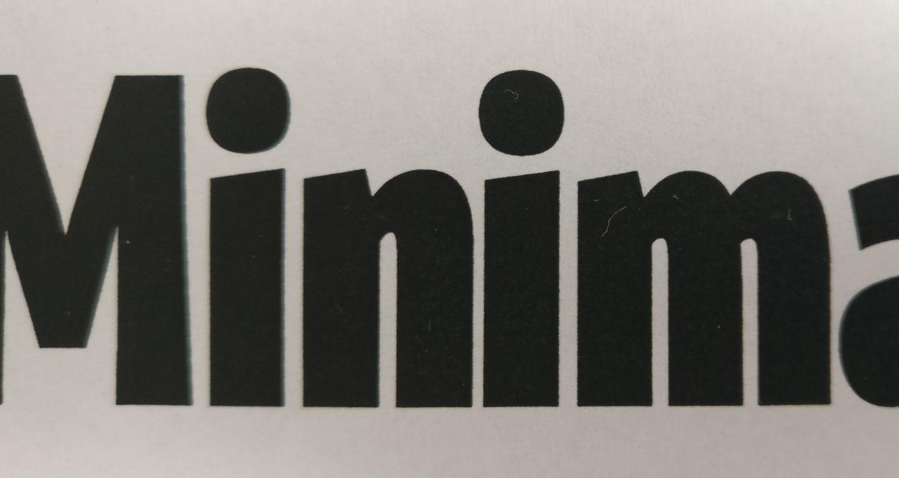
Also, I had this issue yesterday with an i. In print, it had a very noticeable left shift of at least 10 units, although it looked fine on display. The i is composed of the idotless and the dotaccent, which actually means no nested components, so it may be unrelated. Still, it is a positioning error of a glyph consisting of components (with anchors, in this case).
Hi, sure. I only have some old screenshot of the u I described, as I scrapped the sketch at some point. Hope it still shows enough despite the grainy picture. I also attached a photo of the i with horizontal shift in print, versus on screen.