A new plugin: Light Table keeps track of your file versions using Git. If you have not used Git before, this should make it much easier to get started.
Some of the highlights include:
Creating new versions
Reviewing changes
Discarding changes you don’t like
Comparing outlines and metrics with past versions
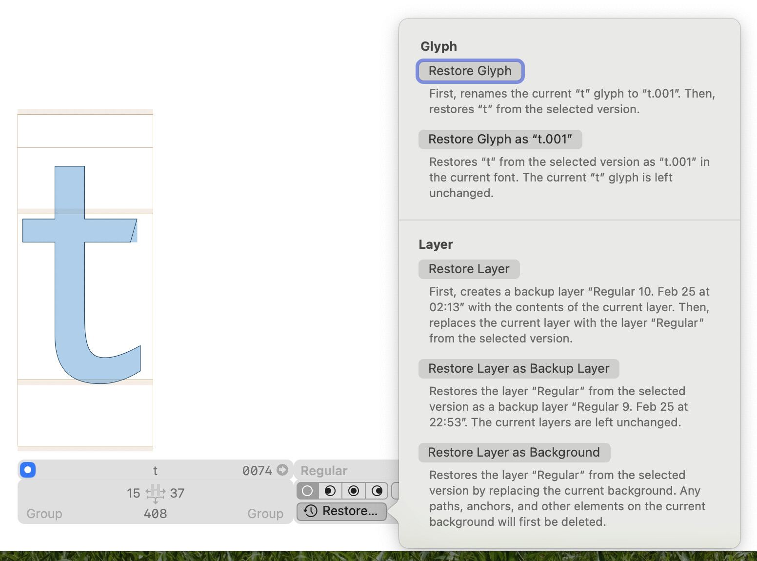
Restoring old layers, glyphs, and fonts
In the Repository window, you can review your progress, discard changes, stage files, and create versions:
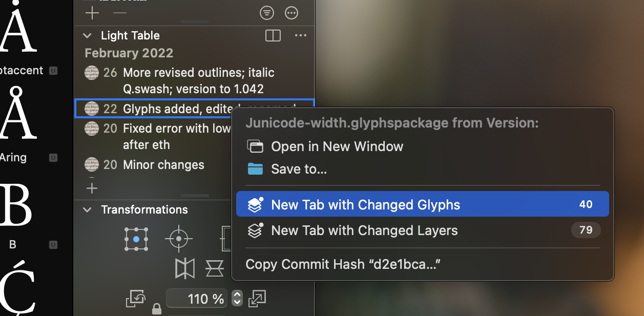
In the palette, you can browse the versions of the document or filter the list to only show versions in which the currently active glyph or layer were affected:
There is also a Python API if you want to automate any of the above.
This plugin is still in beta. That mostly means that some important features are missing, but the features that are there should work well enough. You can find a description of the existing features on the plugin’s website:
You can get the plugin on macOS 12 or later from the Plugin Manager by searching for “Light Table”.
Still missing:
Networking of any kind, so for collaboration with others you need to jump to a different Git client to push and pull.
Merge conflict resolution: This is one of the more difficult areas of Git that can be made a lot better by teaching Git how the underlying file structure works. I have some of this in the works, but not ready yet.
A command-line tool if the basic features for use in CI/CD workflows and for those who like working in the Terminal. I have a prototype that I can send you if you are interested.
Refinements in many corners and handling of many edge cases.
Regarding localization: The plugin is available in English and German, with partial translations into Italian and Simplified Chinese. If you want to translate the plugin into your language, contact me and I can send you the localization files.
Thanks! I should mention that Light Table integrates directly with Peter’s excellent Font Proofer app: Right-click any version in the palette and choose Compare in Font Proofer…
Light Table then asks you where to create the new Font Proofer document. You can also customize the master or instance to compare, the text content, and the layout arrangement:
I totally dig your amazing tool, Florian. Thanks so much for making and sharing it. I find it so helpful for non-coders or designers who are not all too fit with git to get into it, will definitely teach some collaborators of mine how to use it.
@FlorianPircher This is just wonderful! As a person that works a lot with designers that are not really used to git this will be a game-changer. Like @Mark said it’s time to teach people how to use it
Thank you! I hope I’ll find the time soon-ish to record an introductory movie giving an overview of the workflow. That should help ease people unfamiliar with Git into the tool and provide a summary of Light Table’s features for more advanced Git users.
Sorry, I didn’t wanted to imply that you need to do more work and teach to people. I was referering to me as a person that works with many designers it can be my little contribution as a way of thanking you
This is where I would put a commit list, if I had one.
For now, you can use the list in the palette. It does not show every commit, only commits affecting the document. You can review the changes somewhat by opening a tab with the changed glyphs or layers:
Anything in particular that you would want to review? Are you more interested in comparing the a version to the version before it (the changes that you have made when creating the version) or comparing to the current version (the changes you have made since that version)?
Hello! I have been using Light Table the past couple weeks and think it’s a wonderful tool; being able to see changes visually is so very nice.
I have a little feedback and a couple questions
Feedback:
It would be nice if anchors also showed in the comparisons, in addition to outlines and metrics. For non-Latin scripts that rely on a lot of anchor work it would be hugely helpful to see where I’ve moved anchors around from previous versions.
It would also be nice if the commit/long comment box would preserve anything typed across file closing/reopening. Ideally I could jot a bullet item in the long comment box as I work then have it available at the end when I’m ready to push a version; currently once I close the font this info goes away, so I’m currently tracking in a separate file.
The little indicator icons block a little too much of the red corner marker for incompatible masters, not sure what a good solution here is. If there are folks who don’t care about that then maybe having an option of whether to show the icon on the left or right could work.
Questions:
I know it’s not currently available but am curious about what the future holds for network support? I have a design partner and we would like to move our sources to github and use Light Table for synching; currently we can stage through LT and push/pull via console/editor as a bonus step. This is mostly fine except for when there are merge conflicts. Leading to the next question…
Do you have any suggestions on how to deal with font merge conflicts? Not being able to “see” the differences between the two options is a little difficult to deal with; I can (mostly) manage looking at the text editor, but my design partner cannot. For the most part our work won’t overlap enough to cause conflicts so I was hoping to not work out of separate branches.
Yes, this is something that I wanted to do for a long time and just never got to it. The main thing that I am undecided on is how to show the anchor names: always, on selection, is this controllable or not, if so, how …
Maybe it’s best to just do something and iterate from there.
I think that should be fairly simple to do; added to the list.
Those indicators currently are more of a neat hack. There is no API in Glyphs to add custom icons to a glyph cell in a way such that the icons don’t collide, so I am just drawing the status icon over the glyph cell at a fixed position for now. I want to make those indicators smaller (or at least scale with the glyph cell size).
I could also just draw them on the left center where they don’t interfere with anything, but I think that just looks weird and I am quite happy that the current placement covers the unsaved-dot that would otherwise conflict visually.
For now, you can disable these indicators in the Status section of the Light Table settings if you want.
Anything related to networking is complicated. It involves a lot of dealing with complex protocols and wrangling with services like GitHub which not so fun and thus not very motivating. So, for now, I cannot find the time for anything networking related.
I have some prototype code for merging files (which is also applicable for resolving merge conflicts) but nothing that is usable just yet. If you have a merge conflict and can share your files with me, that would help me find an optimal strategy for merging. However, I don’t yet have any timeline in sight when this might become usable.
Hmm good point on the anchor names. A minimal approach could be to just show the little dots (no names) so when looking through previous versions you could see them jumping around and at least know what version it was changed; then perhaps adding a toggle in the palette to display the names or not.
I think the indicators are perfectly fine, especially knowing that they’re a bit of a pain to work with Agree that aligning in the center would look a little strange. And one can always use the layer mismatch filter.
Totally understand re the network parts, it’s easy enough doing that as a separate step outside of Glyphs. Re the merge conflicts, I think for now we will just go for it and see, in practice, how many actual conflicts come up while working on a real project. Worst case I’ll log into the other machine and do the merge myself if it happens on that side. I’d be happy to send examples of conflicts if they happen.
Thank you again for this tool! We have been hemming and hawing about moving to using git for our projects for years, and this plugin is exactly the missing visual piece we needed to just go for it. It has already been a huge improvement for the few projects I’ve set up with it so far.
Coming back to the anchors: I am still not sure how to display the anchor points.
Most of the time, an anchor point will not change from one version to the next, so I would need a clear way of showing an anchor point that does not differ between versions.
For anchor points that did move, how would the connection visually be made between the before and after placement? A line connecting the two points to say “these are the same anchor, just moved”? Or hope that the before/after points are close enough most of the time that the connection is clear in context?
How would before/after anchor points be displayed? Maybe a filled-in dot for before and an outlined dot for after?
If you or anyone else has ideas of how to best visualize before/after anchors, let me know or send me sketches.
I would just pick a style of the old and new anchors (color or fill/stroke). They rarely move in a confusing way. And if it is not clear you can look in the change list.
I agree with Georg, I think one fill and one stroke would be enough to show changes; I’m not sure names would be necessary to display. You could fill the anchor with the same light blue to indicate previous and outline for current, so it matches the fill that’s there now; or if you wanted to keep the red anchor for current, the previous could simply be a blue outline.
The two things that made me avoid such a design are that
the anchors then look like they are part of the outline and
the combination of filled “disk” anchors and stroked “ring” anchors is already used for mark-to-mark anchors like top/_top.
The first issue could be addressed by offering different colors for the anchors, although that would complicate the theming system more than I would currently like.
The second maybe is just not as relevant as that difference is clear enough in context.
I think I will implement something similar to your sketch for now and then see if/how much it needs to be tweaked to not be distracting.