I am relatively new to glyphs and may be, I just did not find the right way.
In Fontlab, editing and viewing the content of classes ist very easy. Visually based, one could say. Drag and drop. Show glyphs in font view with one click and so on.
But in Glyphs, I have no control. I have no visual preview of the glyphs. And I can not show the contents of a class in the font window, so I have no doubt, if all required glyphs are in there.
The available Scripts aren’t really helpful(e.g new tab with ot class) because I don’t see, which glyphs could be missing. Also the Font Info Window seems to be unscriptable, isn’t it?
So, how do you guys organize and control your classes? Or did I overlook the obvious?
By the way, drag and drop for glyps would also be very helpful for the font tabs. Especially when working with foreign scripts, it could be painful to add glyps. If I could drag them from the font view or better from the external small glyph viewer (don‘t know the name of this in 3 new window), it would speed things up a lot.
Depends on what you want to do. You can use it to script the classes, but not the interface in the Features tab. A visual editor is as @GeorgSeifert mentioned in the works.
Part of the problem is the glyph naming scheme in the screenshot. uniXXXX names are not meant to be read by humans. Converting the names will make things easier.
Select the Glyphs you want in font or edit view, then right click > copy glyph names > space separated (or one per line) and you have the class code in the clipboard.
There’s also a mekkablue script called Features > Mew OT Class with Selected Glyphs.
Consider building your classes with tokens if your letters fulfill a certain criteria (e.g. all Glyphs with a certain name suffix, etc.)
Thanks for your thoughts.
I am aware of the problems. And I am sure, the “Glyphs-way” is perfect for many people.
But.
I have to port fonts from FL5, where many things were pretty much different. This is a lot of work and a lot of learning for me. And everything, that I change, is causing new problems.
Sometimes, I have a very chaotic workflow. This is also causing a lot of re-arrangement. And also the reason for a good portion of paranoia . So, for me its essential to proof things. And that works best with a good visual overview (for me). So in the moment, the Classes and Feature management of Glyphs is stimulating my paranoia pretty much .
I understand your fears. But because of that, Glyphs can automate a lot of the classes and feature code. That way you don’t need to make the classes in the first place.
Is there a reason you starting with Glyphs 2 instead of Glyphs 3?
I would strongly suggest to think about the suggestions from Florian and Rainer (mekkablue).
Is there a reason you starting with Glyphs 2 instead of Glyphs 3?
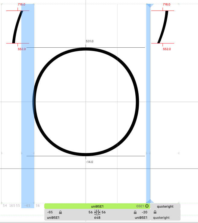
Paranoia. Again. ( mostly reasond by so many FL4/5 Bugs and glitches over the years ) You remember the problems with the kerning conversion of RTL kerning?
Glyphs 2 seems to be OK, so…
My problem with the class management in Glyphs led to the idea to do this in FL7. But FL7 don’t im-and export the new Glyphs format.
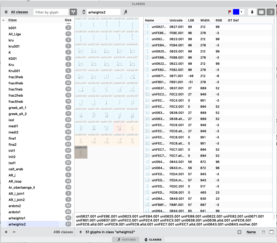
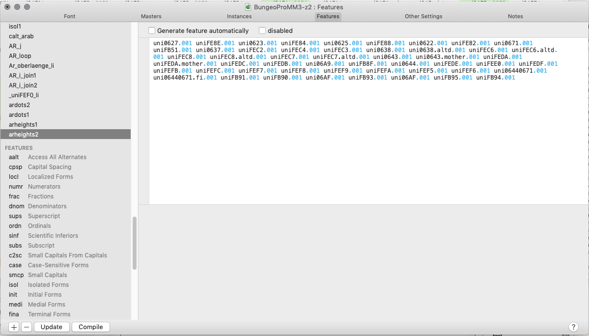
What do you use those classes for (arheigth1/2)?
It is for a feature, that switches the ascender height of arabic glyphs.
True, the Unicode names in FL were irritating, but when looking for glyphs to collect in a Kerning or Spacing Group, I usually don’t look at their names, but rather what they look like. Especially when I am not familiar with the names of script system. So a visual interface which allows to visually check and change the contents of Kerning and Spacing Groups would be ideal to me. Being able to sort the contents of a group (Script System, Name, Unicode, manually) would be great too.
Ralf, I am a recent convert to Glyphs but I use version 3. Although it can be frustrating to change your working ways from FL5 to Glyphs, it is well worth the effort. It just takes some time to.
Don’t RTL kern in Glyphs 2. You can keep the RTL kerning clean in Glyphs 3, you cannot in Glyphs 2. In Glyphs 2, the RTL and LTR kerning pairs were not directionally separated.
So one could end up with weird kerning pairs, and difficulties when kerning between non-directional symbol and directional glyph.
There is a problem when converting between the two ways when the kerning groups are not directionally clean. And that is very difficult to resolve.
Do not mix scripts in a kerning group. Especially not when they have different directions.
If you sort by Unicode and most or even all of the glyphs do not have a Unicode (frequent scenario in Arabic), how should it sort?
What’s the point of sorting a kerning group? Especially manually?
The class-centric approach of FL is to treat kerning groups as OT classes like any other and you need to assign glyphs to the class. Glyphs follows a glyph-centric approach where the group is assigned to the glyph. That has a few advantages: you cannot accidentally have the same glyph in multiple groups (a frequent source of errors in FL4 and 5), and it is easy to find all glyphs still unassigned.
There is a Show Groups in the View menu that overlays all group members for the current pair in the Edit tab, so you see what you are doing when you are group kerning. And there are plug-ins and scripts that help with the kerning, including finding similar shapes.
It can handle it just fine. But it is cleaner in Glyphs 3 where each direction has its place.
That was the reason to have separate LTR and RTL kerning. That way you can decide where each pair goes. The script is similar to what Glyphs 2 would do on export when it tries to separate the RTL and LTR pairs to put them in the correct lookups. And as you see the problems with the script, you might have those problems in Glyphs 2, too.

 . So, for me its essential to proof things. And that works best with a good visual overview (for me). So in the moment, the Classes and Feature management of Glyphs is stimulating my paranoia pretty much
  .
.