This might be a dumb question, but oh well. I am trying to make a font using hand-drawn and scanned art, then will image trace in Illustrator. I am not interested in redrawing the whole thing in Glyphs Mini or Illustrator. I’d like some areas of white to appear within the letters for a distressed look. The paths show up in Glyphs, but fill in for the actual font. I’m new to Glyphs, but not new to Illustrator or Photoshop. This font will be used in-house, and not sold for public use.
Paths in fonts do not have white and black areas. The outermost counterclockwise path is filled, clockwise paths inside of it are not filled. Your path directions may all have got set the same direction. Also make sure that your paths are closed. Open fonts are removed when the font exports. If this doesn’t fix things open your compiled font file in Glyphs and compare it to your working file and see if the unfilled areas are in the compiled font.
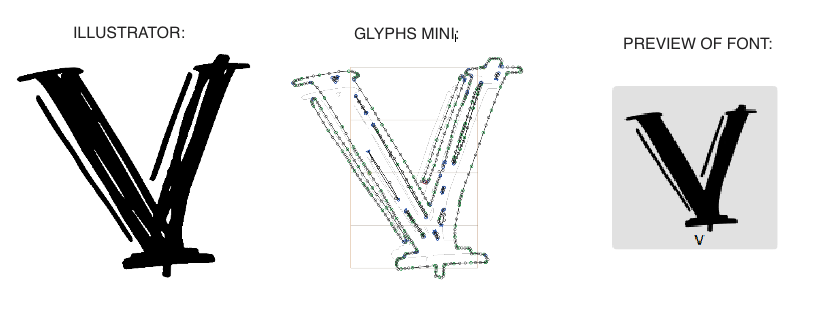
I have no idea what you mean by “outermost counterclockwise path” vs “clockwise paths inside”. just did image trace and let illustrator make the paths, cleaned up a few, then did the ol copy / paste. If I do a large gap inside, say for a letter a, it keeps that. But I have little holes for a distressed look, and it ignores those. This one I’m working on now is a very quick trial dummy. So in other words, I scanned in a quick scribble and have done nothing to clean up the paths. The less clean-up I have to do after I scan in my linework, the better, as I’m on a tight deadline. I’m trying to design 3 different fonts to use, and would like a distressed look similar to this as one option.
I’ve attached a screenshot of the images side by side:
Maybe. Do a “Select All”, then do “Correct Path Direction” (Cmd-Shift-R). That likely will fix everything.
“counterclockwise path” and “clockwise path” refer to path directions. The inside path of an /o, for example, versus the outside path of the /o must go in opposite directions. That is the way it works. For more information about paths refer to the Glyphs manual about drawing paths.
I don’t want to (i.e. don’t have time to) redraw every path. So do I just have to resign myself to the idea of not being able to use a font with little gaps within the strokes?
Ugh. Not a helpful comment, but thanks anyway. Generally speaking, by the time a person goes through the trouble of asking for help on a forum, he or she has already spent a decent amount of time trying to solve the problem.
I am doing the detail work in writing out the letters by hand. This project needs to be done as efficiently as possible to make it feasible and to not waste my employer’s money.
Take a look at changing the path direction of those details inside the glyph using the Paths -> Reverse Contours menu (Control-Option-Command-R). You can double click a path (or drag around the nodes) to select it, then choose Reverse Contours. You should also be able to select multiple paths and reverse them all at once with a single Reverse Contours command.
What is also possible is that you accidentally copied double paths from Illustrator. To see if that is the case, double click near a path and delete, and if it looks pretty much the same, you have double paths. Best way to circumvent that is to prepare the outlines in AI better. Look into the trace settings.
THANK YOU mekkablue! That was it–the paths were doubled up! Illustrator had created superfluous paths and filled them with white. Then Glyphs naturally filled them with black. The solution was that simple. Thanks a million!
Older versions of Illustrator used to double paths when they were grouped or joined. In the current AI, in the image trace panel, Advanced, [V] Ignore White might help.