Plagiarism? Difference between Lettering and Typography

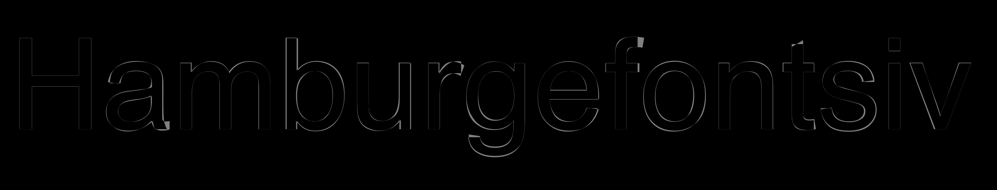
Hi, today I want to talk about something completely different. I am in the process of finishing an all caps font inspired by a lettering found in an old building in the center of my city. I am having issues with determining whether what I’m doing is plagiarism or not, and so I’ll give you a little bit of context.

I was helping a friend of mine move his stuff into his new apartment ( building which had the lettering engraved on stone ) and when we finished unloading everything from the car I noticed this engraving on stone which just included the letters “A” “C” “D” “I” “L” and “E,” all in Caps and so happened to be that I was beginning to find interest in designing fonts, so I thought I could just grab those ( The letter “A” being very different from all other letters ) and make a full font by digitalizing those letters and then designing from scratch all the rest of the letters, which I have done by now.

The real issue comes now that it’s finished, because I am now thinking whether it’s okay to design a full font from a lettering found on the facade of an old building ( Probably from the 30’s ) and I’m also doubting whether the family of that illustrator could be randomly roaming around and find out that some of his letters have become famous in a digitalized form. I have no intentions of commiting plagiarism but I do feel like I want to release this font because I have worked hard on it and really I have created everything else from scratch.

To search for examples of “inspired by” fonts created by big type foundries I went on to Hoefler and Co’s website and looked up on “Decimal,” a typeface that “examines” the style of old wristwatches and “transcends its forms to celebrate its ideas.” Here’s a link to the explanation of the typeface: Fonts by Hoefler&Co.

Keep in mind that the only letters I have digitalized and retouched from the engraving were the letters: “A, C, D, I, L, and E,” all other glyphs have been created from scratch.

Now, the thing here is that in order to achieve a “celebration” of sorts, I’d have to completely change the glyphs found in the engraving of the lettering I’m referencing, right? So for example, the letters that I found in the building must be changed in design to emphasize that it’s a reference right? Because otherwise, it would be plagiarism? Right? ( I have to accentuate that all the other letters have been designed completely from scratch )

Another solution would be talking about the lettering from which I designed all my other glyphs, and giving credit to history rather than to a person who I will probably never meet in my life.

Thank you in advance and I hope you find this topic of interest, because nobody wants to really plagiarize one another <3

UPDATE: I am now just using one glyph that comes exactly as it is from the lettering, other 3 glyphs are different now. So it’s just an “A” I’m using.

-Mau

Is the author still alive?
Yes > plagiarism
No > revival

3 Likes

This isn’t legal advice, but: building a type design based on a few glyphs from a 1930s engraving wouldn’t strike me as problematic plagiarism. In fact, I did a rather similar project with carved glyphs from considerably later.

1 Like

I do not see this as plagiarism at all.

2 Likes

From what I know the designer can’t be alive, I’ll try to find him/her, but if I can’t then I’ll just pay homage to his/her “A” Glyph design since I have now changed the rest of the glyphs found on the engraving. I don’t know if using one Glyph could be a copyright problem when it comes to typography.

UPDATE: Found that the building was designed with the influence of French architecture in the beginning of the 1900’s and was a living complex for people who worked in the tobacco industry.

I see! I am also not using more than 2 glyphs found on the engraving, I have changed the other ones to my liking. Thanks for your feedback.

I’m not a lawyer, so that is the value of my opinion. Borrowing a style from an old hand-lettered sign wouldn’t give me any worries unless it were famous or clearly trademarked. Most old signs are iterations on work that came before. The signwriters were borrowing from each other too, and most of them are now dead. I have an old font file, dated 1993. I don’t remember where I got it, and the name doesn’t show up in any searches. I took a screenshot of some glyphs and uploaded to whatthefont. The closest relatives—by 2 different foundries—were called Eden. Each, though customized, was attributed to American type designer Robert H. Middleton in 1934. There are many other examples on myfonts that are also very similar. These 2 foundries not only used the design; they used the name.

2 Likes

Type designers have been taking inspiration from signs for probably 200 years now. I think it’s accepted and normal.

3 Likes

Really appreciate your response. Was thinking about throwing a lot of work into the trash just because of the guilt and feeling (funny thing to say when you’re designing fonts? haha), I’m still going to release but I will make sure I pay tribute to history and will elaborate on what made me feel like I should create this font based on these engravings.

Thank you for your answer! I agree, and I think it’s still important to give credit where it’s due, this is why I am discussing this subject, and I really appreciate the points of view.

-Mau

It can be very hard to credit the proper persons. I hope you can find out who they are but you may never know.

2 Likes

Interesting thread. I am learning Glyphs and thought I would pick a poster from a hundred years ago, from an ad campaign designed by a famous poster artist. It would be good practice to develop a font this way. I have about 10 characters and I would build around that. The poster designer has been dead for over 70 years.

I understand that there is no copyright on the lettering in a poster that old, correct? But is there any rule of thumb (or article I could read) on how to credit a font developed/inspired by a poster? Thanks.

1 Like

There are some examples of what some designers do when this happens apparently, in the case of the font family “Decimal,” Hoefler&Co were inspired by old wristwatches which shared similar types of fonts and they did make it a point on their website about how they got inspired. Nonetheless, they also explain that their font is just an “inspiration,” meaning that the glyphs are not really just copies of the glyphs found in the wristwatches they were inspired by, but slight changes in design were made so that the font wasn’t exactly as it comes in the wristwatches.

So this is what I’m getting from the replies of the thread:
When you copy an entire font and release it with another name - infringement of copyrights
When you copy an entire font and make a slight change, then release with another name - infringement of copyright
When you copy a few glyphs from an old poster or engraving (no more than 7 glyphs I would say? Not sure) and create an entire font out of them with a clear design of your own) - no infringement
When you copy a few glyphs from an already existing digital font and create an entire new family - Good luck, it will probably be terrible because the main idea just works the way it works with what’s already there and you’re just trying to change the designer’s font in full, and also you are infringing copyrights because as this font is digital and has a license price, you’re basically stealing someone else’s work. (Or maybe not if you paid for it? We’d have to ask haha)

This is funny because I am starting to see the similarities between music and typography because of how sampling/referencing old music in new songs is valid unless you do certain things and/or copy certain things without changing them or putting your own effort in experimenting with them. Still, this copyright world is a strange one and still want to understand it.

What I’m learning from this really is that we shouldn’t stick to just making a font from a clear inspiration but also having different font ideas that come uniquely from experimentation of your own from-scratch ideas, although I would argue that taking a couple of old-lost glyphs and creating a full font from them is also a type of experimentation and it’s definitely not just copying straight out of someone else’s creativity.

Glad you found this thread interesting!

This is the difference between Helvetica and Arial, both of which have the most expensive lawyers out there:

Having said that, the rule of thumb is just “don’t be a jerk”. If it feels wrong, it probably is. You can justify that by being transparent and sharing the full story and sources. But if you merely trace someone’s work, you won’t have much to say. Many foundries share their process, have a look how it’s done (Klim has a lot of good thoughts on copying, for instance).

2 Likes

Couldn’t have explained better. Also, that image is pure humor.

What you’re doing is certainly not illegal. My understanding (which might not be 100% accurate) is that you can actually copy another font pretty directly IF you draw the glyphs by hand, so that it can be demonstrated that the internal representation of the font is different from the original.

And given that the media of the two items (stone vs. an electronic font) are so totally different, I don’t even see an ethical problem with it. Certainly do acknowledge the source of your inspiration in your documentation.

I think this is a great and totally valid question.
Looking at the market, I assume this procedure is perfectly accepted. Some truly original type designers have been inspired that way, and released typefaces with well respected foundries.
An imho good example would be “Los Feliz”. It was also inspired by, and modeled after, some sign painting, and the specimen booklet even makes a nice story from that.
Another typeface, from the same foundry, was inspired by old documents found in a museum (Dalliance is the name of that typeface).
I think there are tons of other examples for that kind of process. Not to mention the tons of openly Bodoni-inspired type faces.
As mentioned before, being open about the inspiration might be a good idea, not selling other people´s ideas for one´s own.
On the legal point, broadly speaking, it is rather difficult to have typeface design protected by copyright law (maybe depending on the jurisdiction, ask you lawyer… ) . In any case it´s much easier to protect a piece of software, and that´s why when you look at a font licence, you will find that it says more about software, and not so much (if anything) about type design.

1 Like

So far this is the closest answer to what my process feels like at the moment. I am really glad you pulled this project upfront- “Los Feliz” really assimilates what I’m going through and how I should approach this.
The designer is most likely not alive since the building I found the engraving on was made in the early 1900’s, but if he or she is alive indeed, they wouldn’t be able to sue me, at any rate if someone decides to devaluate my creation, the most they could do is make a better version of what they think the font should be in reality, in which case this is not a matter of copyright issues, but rather a matter of craftsmanship and how good my design is so that people accept that the font I’m creating really does fit with the inspiration and first-found glyphs.
Finally, telling the story as it is is what’s really important, showing how I came to the idea, how I saw it in my own head, and what I felt when I saw it.

It has been my understanding for many years that you can copyright/trademark a font name, and you can copyright the vectors as software, but you can’t copyright an alphabet or a style. The proliferation of nearly-identical fonts seems to give weight to this idea. That still leaves the ethical issue of borrowing work and passing it off as our own rather than using it as an influence and a springboard to create something new. I think we all know where the line is, and I think most of us want to do the right thing. The comment above about “don’t be a jerk” really sums it up in my opinion.