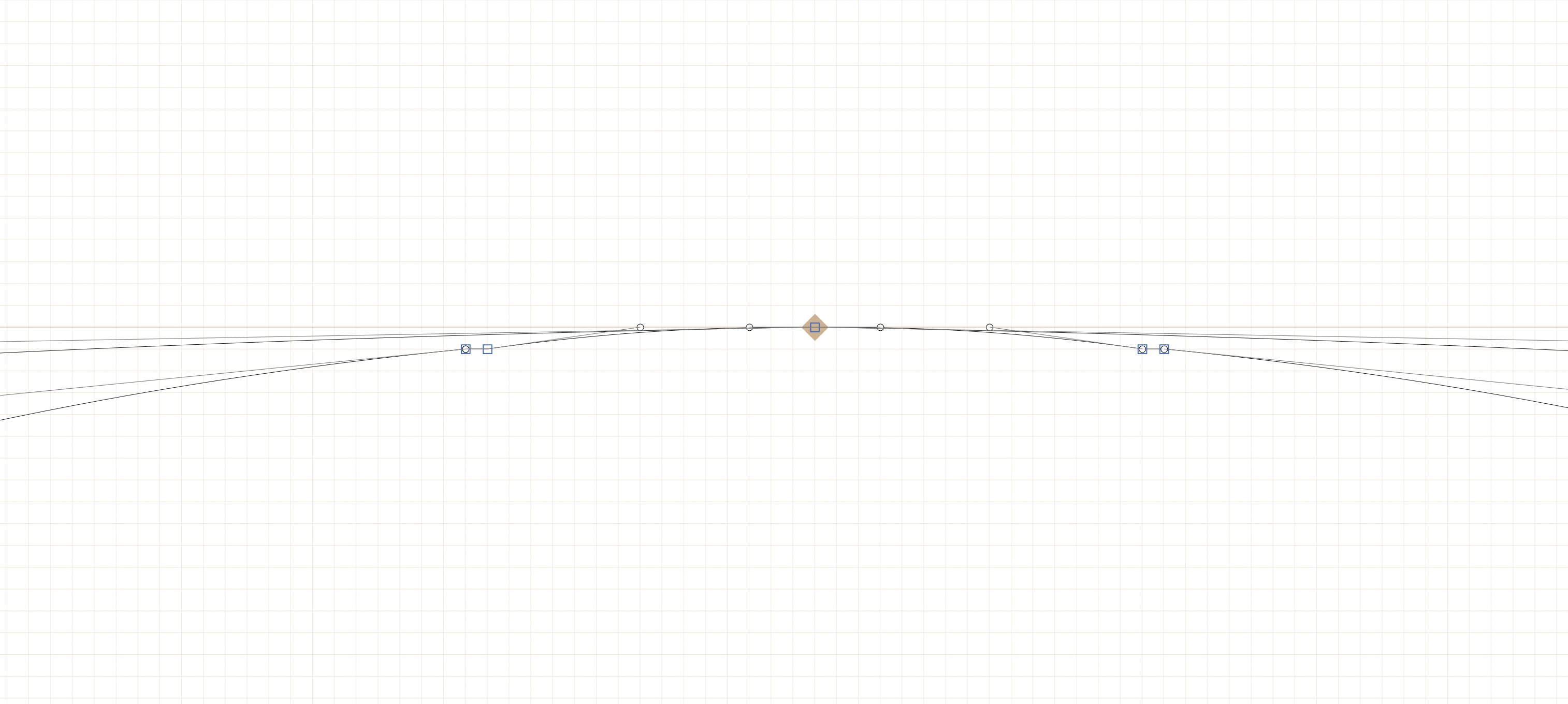
I’ve been using Glyphs for a few weeks now after designing a typeface in Illustrator. I spent extensive time ensuring each of the characters is pixel-perfect in the latter, however when I copy/pasted them into Glyphs, I noticed point distortion near the thinnest areas of certain characters (see screenshot).
I did some research on the forum and followed one suggestion to change Grid Spacing from 1 to 0. This helped, however I was then unable to precisely scale the characters to their respective heights.
I understand the program’s method of interpreting points is a bit different from Illustrator, so I’m wondering if I have to re-draw everything or if there is a better method of eliminating the distortion while maintaining the scale of the typeface. Below is a screenshot demonstrating the issue.
The main problem of getting AI paths into a font is the bad outline quality of AI. It’s OK for illustrations, but they are usually not good in a font.
And secondly, font rendering is profoundly different from vector rendering in AI. You can see that if you compare a word before and after converting it to outlines. But that means that any pixel perfection you have aimed at within AI, is most likely lost in a font.
@mekkablue@George_Thomas Thank you both for the insight. I’ve still got some learning to do in Glyphs, but am able to see how I can remove redundant points and clean up the curves. Moving forward, I will do my font work in the program from the start.