I’ve got a complex cursive font that I’ve created from a series of wordmarks I designed. I’ve read all the pertinent tutorials and tried to find similar questions to see if I can figure the positional/contextual coding, but this is not a type of font I regularly create and I’m having a hard time applying the knowledge.
The last time I did this, I was able to design the font with the contextual subs in mind and I was able to solve the entire thing with like 3 lookup blocks and 11 lines of code. Doing it in reverse, however, starting with what the font needs to look like/how it needs to connect and building a contextual sub system that works around that, is proving to be much more difficult for me.
WHAT I HAVE
This Illustrator screenshot shows a good example of the range of forms I’m trying to solve for.
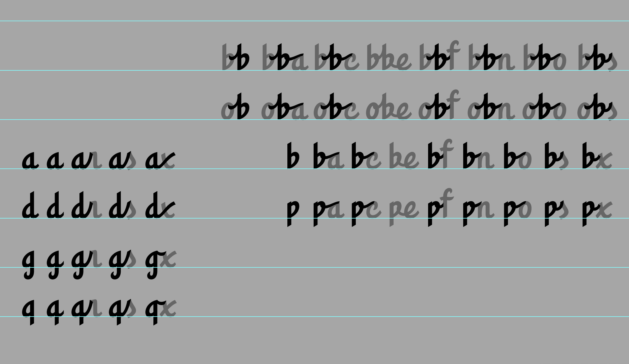
I’ve created positional forms for all my base lowercase letters. As you can see, many of the ISOL/FINA (chopped tail) forms end up being identical to each other and many of the INIT/MEDI forms (connecting tail) are identical to each other.
However, I also have specific forms of the medial letters that lead into unique forms like r/s/x (among others) and my defaults for those three letters are single strokes that combine with the tail of the previous letter to create the full letterforms in those combinations. Furthermore, letters that loop into a high connector (like b/p/o) each have alternates that lead into letters like c/e/o (among others). Compounding matters further, I also have a series of b, h, k, and l alternates that do have an attached tail leading from the FINA form of b/p/o into the top of the ascender, as well as a series of r alternates that also connect from the FINA form of b/p/o.
My main caps are standalone forms that generally don’t connect to the second letter of the word, but I have a few alternate caps that can connect to the lowercase letter that follows. I’m less worried about these as it can be a discretionary option for the user, but certain forms such as an alternate with longer tail for the E that leads into tall ascenders like b/f/h/k/l/t or for unique combos like Cr, Ec, Er, Ex and others.
Essentially I just don’t know where to start with the coding. My INIT, FINA, and ISOL classes are equal, but I have a couple hundred medial alternates (many of which should also be used as the INIT alternates when followed by the appropriate letter) and I don’t know how to adapt the tutorial properly for this level of complexity, where to place the code for the contextual subs relative to the positional code, etc.
Any advice on how I can proceed is much appreciated.