I been checking the project from a friend, and he wonder how to reduce those big white “interlines” between a text lines in the preview typefaces to export .otf and GX.ttf files.
Should we set something in the typeface that we are not considering?
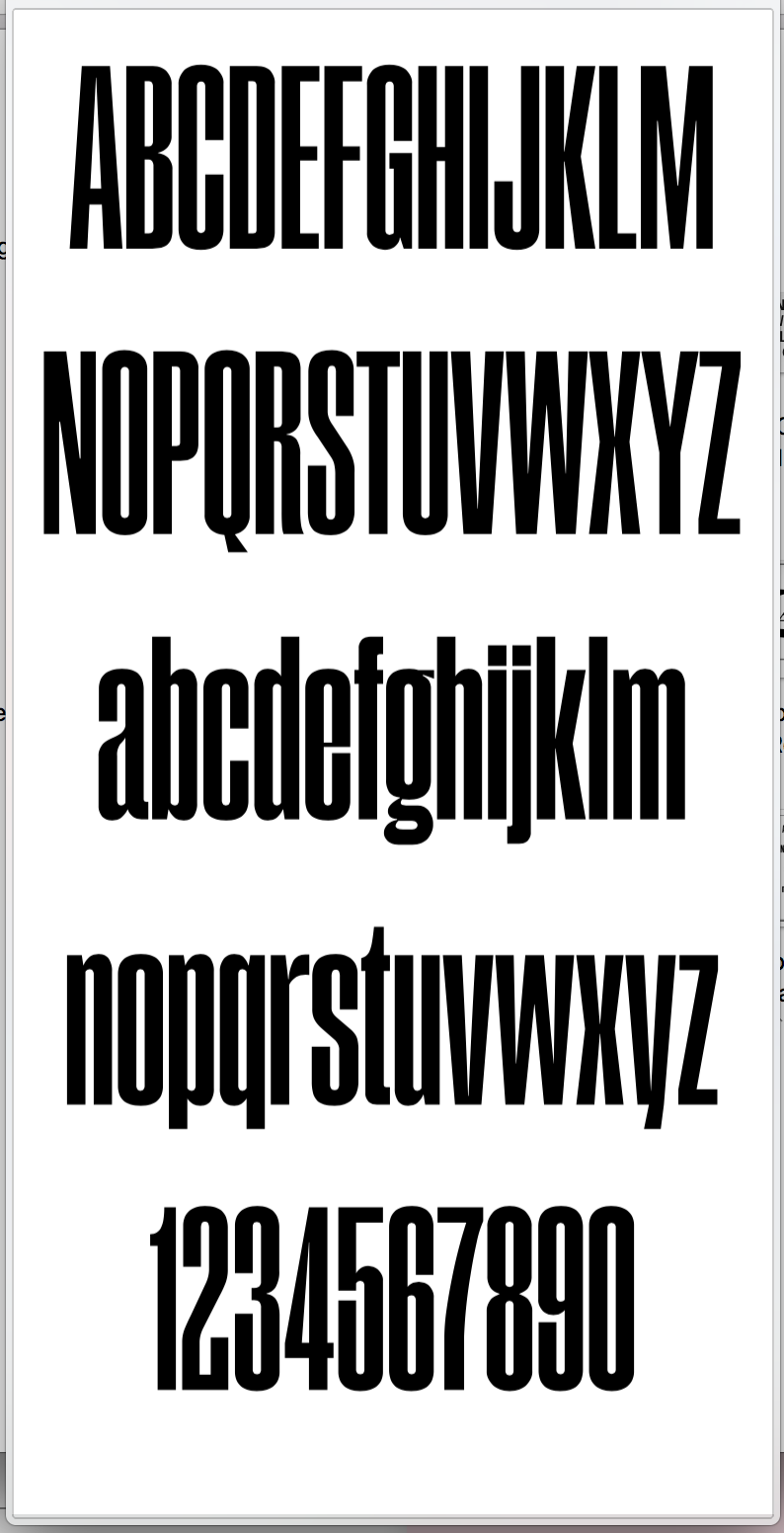
This typeface is develop in Glyphs Rainer , The project uses the vertical stretch axis and its vertical metrics exceed 1000 in squares. Does that generate that display problem?
My question was in which app you see the big interlines. Space between the lines is hinted at in Font Info, but every app that uses the font interprets those differently, or, even ignores them completely.
Theoretically you can variate vertical metrics too, but I am not sure about its implementation at the moment, especially in 3rd party apps.
But there is a different way to approach this. So you want to variate the cap and x-heights? If that is what you wanted, I would expect the line distance to stay the same, no? Then mission is accomplished, the two pictures show the expected outcome.
Otherwise, and maybe that is really what you friend’s project is all about, it is actually a combo of font size, width and perhaps also weight. Because in the right picture, what you really have there is a very condensed version, at twice the font size.