(done after decomposing so glyphs containing components wouldn’t get slanted multiple times). The method does work rather well set to slanting, while cursifying resulted in some funky shapes in this font.
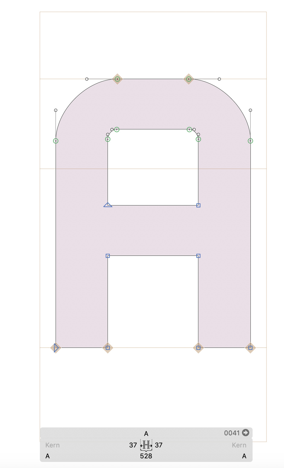
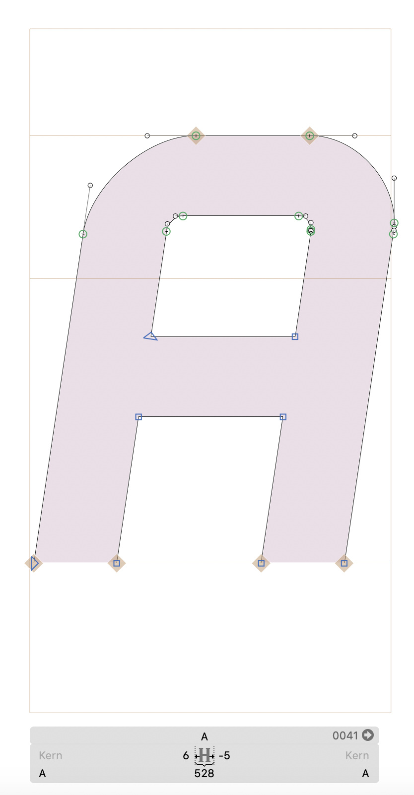
However, I have one problem and one concern. When slanted, next to a curve point, a new sharp point is added. It is hardly noticeable but it still makes for an unoptimal path and could cause a sharp point in some cases. Here is an example of a bold /A/ and the same glyph when slanted:
Notice the two additional points I’ve described.
Now of course, I could export the instance and then delete the points manually, but there’s a few in each glyph and hundreds of glyphs themselves, so could this be done automatically in some way - or better yet prevented from happening?
My second concern is the spacing. The exported oblique OTF works well and the text retains good spacing, but looking at a single glyph, they are no longer centered and often have negative LSB/RSB. Is this an acceptable practice with italics and obliques?
Thank you very much for both the very helpful tutorial and being available to ask you for these clarifications,
Val
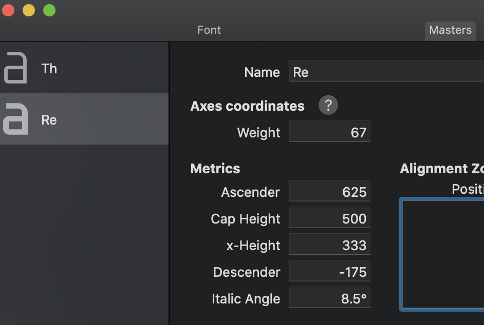
Best praxis is usually to take the center of the x-height as pivotal point for slanting. Glyphs does that by default. Just make sure you also set an italic angle for the master in Font Info > Masters. Then the measurements actually respect the italic angle.
@mekkablue Thanks Rainer! That did slant the sidebearings. What had confused me earlier was that the “italic angle” needs to be added to a master - which is not italic - rather than an instance which is. And that then the bounding boxes of a non-oblique master get slanted as well which is a confusing sight in itself:
It’s manageable this way, thank you. I guess I should still remove the italic angle info when exporting non-oblique instances so their bounding boxes dont get slanted, or am I missing something?
Do you have any helpful pointers about my first problem with points being added to curves when a shape gets slanted? If I select “Tidy up paths” it just sharpens the new points. Haven’t had any luck with scripting removal of short segments either.
Sorry, @mekkablue not sure what you’re refering to. I can surely explain better;
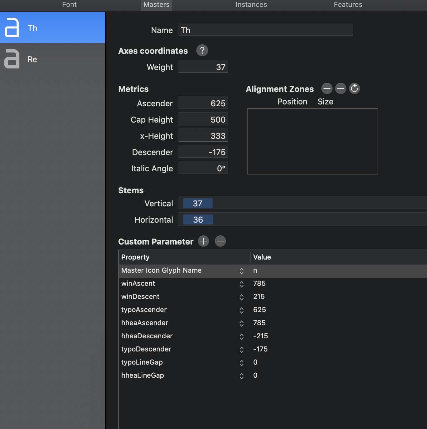
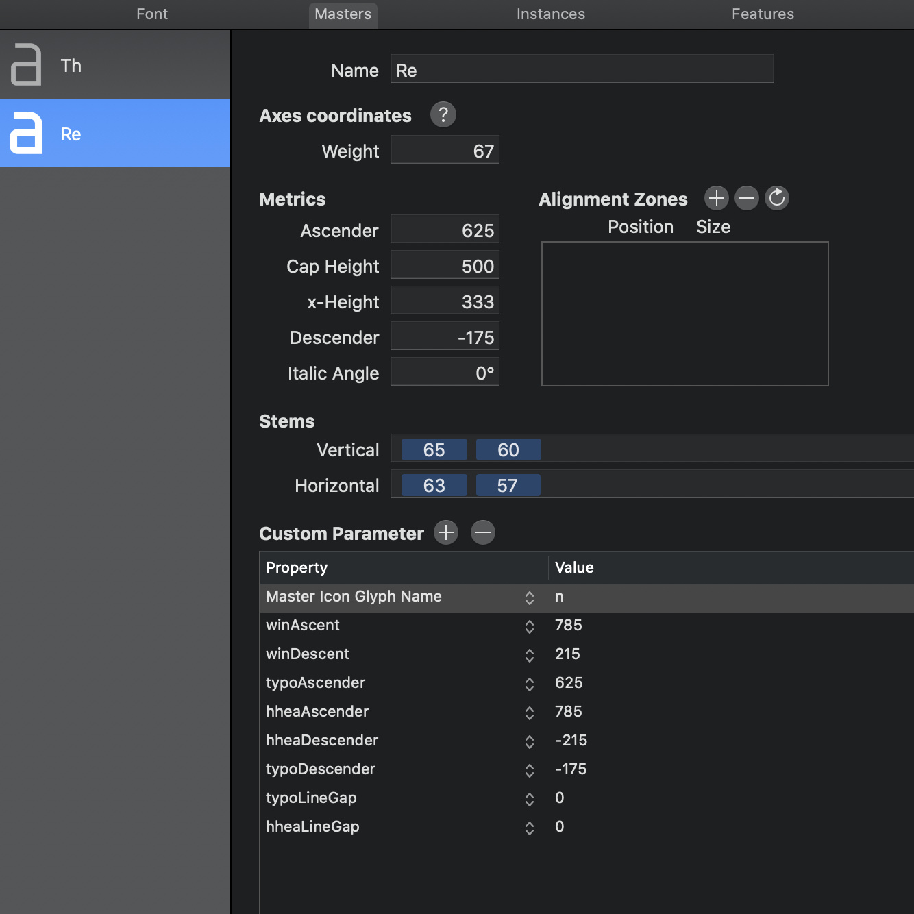
What I’m saying with that last image of a /k/ is - I set up the master as follows:
and that does fix the italic sidebearings, but also inevitably slants the bounding box of a non-italic master (as is shown in the previous comment with lowecase k).
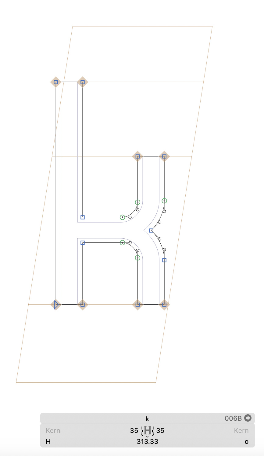
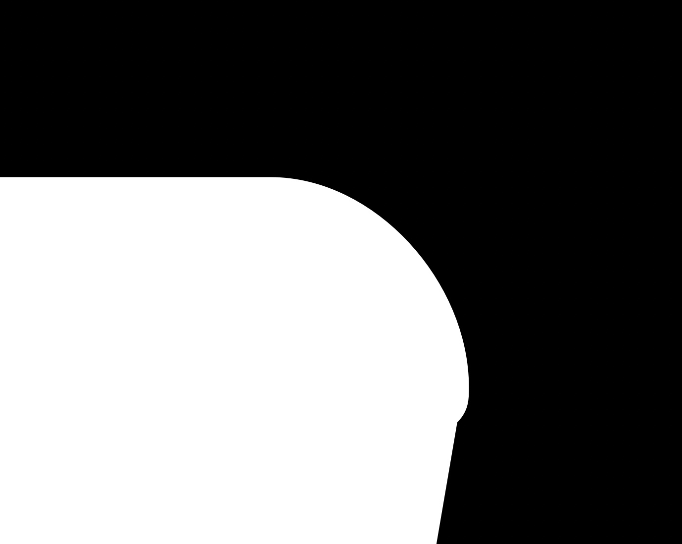
The other more pressing problem was that slanting adds a point next to some curves, which can result in a glitched sharp edge. Example: an oblique generated character:
Still not clear. Why add an italic angle in the master that contains the ‘k’ if the k is upright?
Can you post a more comprehensive explanation? Like: I have this masters (a screenshot of each masters setting and one all masters of a glyphs. And then explain what you like to get out of it.
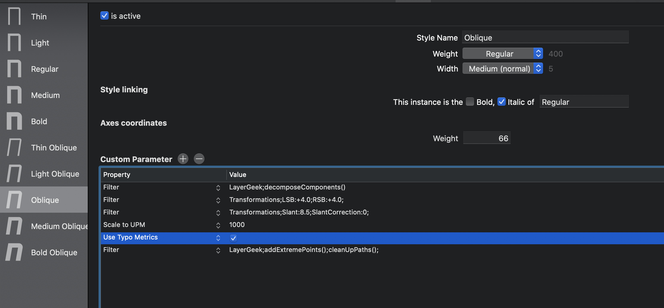
So, both masters are upright, but some of the instances are obliques by using the filter Transformations;Slant:8.5;SlantCorrection:0;. By doing so I had two problems. First, the sidebearings in an oblique instance get minimal and sometimes negative.
To fix this, I understood Rainer suggested adding an italic angle measurement to the master:
And thus I typed in this angle change to my masters:
This was probably the core of our misunderstanding then - me taking away I should add an italic angle to non-italic masters. That slanted the box to the non-oblique master, as was seen in that screenshot of the funky lowercase k with a slanted box. How can I add the italic angle setting to instances instead of masters?
The other problem was of slanting adding a point next to some curves, which can result in a glitch/dent/sharp point being added in a slanted glyph. Example: a slanted instance has dents like this one:
I think I’ve come to the bottom of this mess finally. Let me be as clear and as concise as possible.
#1: it is not necessary to type in “italic angle” if an instance is italic but the masters aren’t. #2: the dents/glitches in oblique instances seen above were not even caused by the slanting filter, but by this one LayerGeek;addExtremePoints();cleanUpPaths();, which I had added for different reasons.
Misunderstandings are a special type of hell.
I thank you both for your patience and effort in helping with this. Have a great day.
Val