Hey, quick question that came up while thinking about my problem with brace layers earlier.
Should the growth between font weights always be proportional or can it also be unproportional?
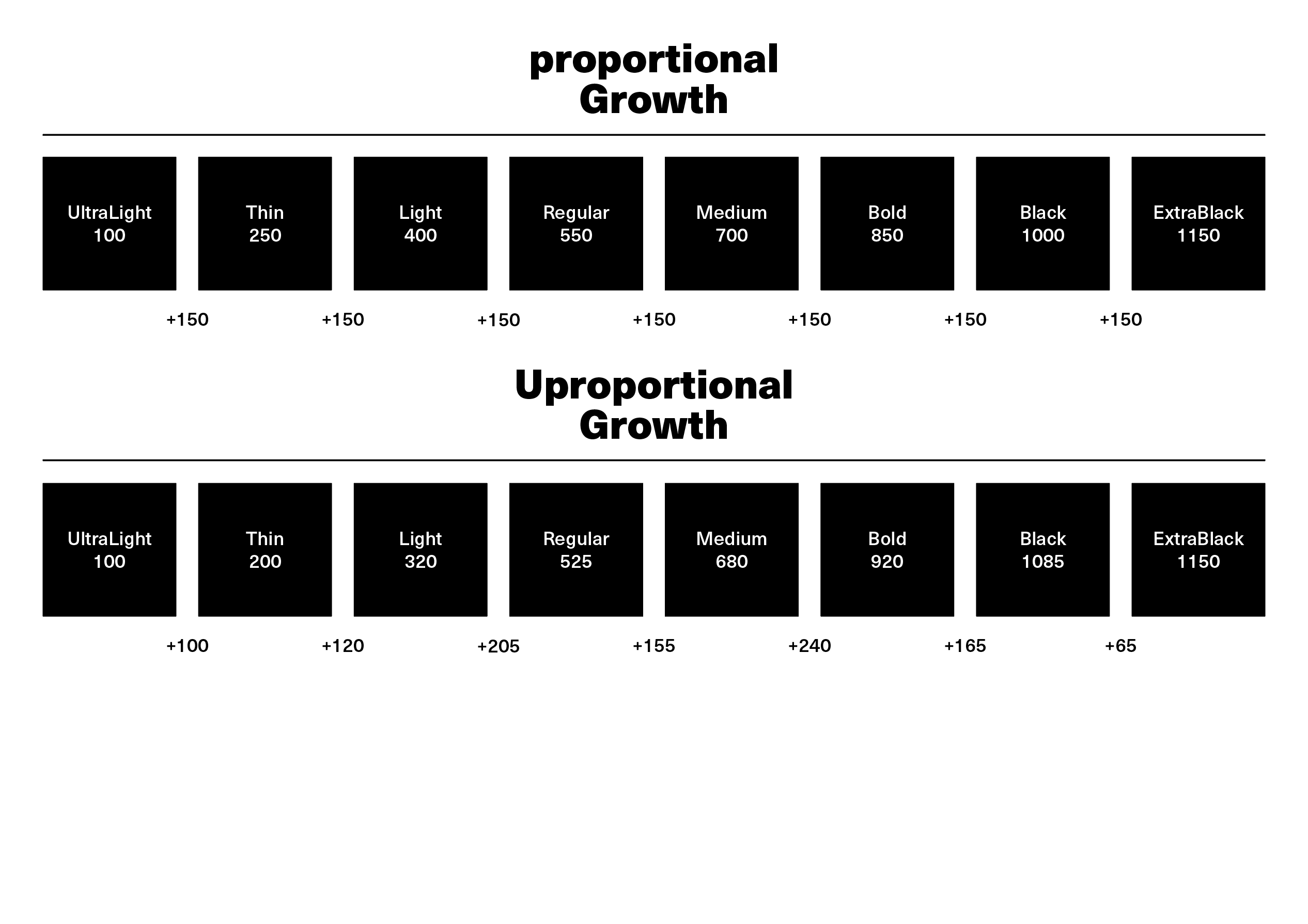
No hard and fast rule; it should be whatever works best for the design.
1 Like
Should not be proportional. There are articles on that, and of course a calculator (note that it’s not ideal and may need manual adjustments):
https://www.diacritics.club/family-steps
There was a plugin that created instances based on that directly in Glyphs
Check the part called “Linear, Luc(as), and Pablo Distributions” in part 3 of the interpolation tutorial for more theory.
Script, not a plugin. Insert Instances, works in G2 & G3.
What do you guys think?
I went with Pablo Impallari and adjusted it a bit.
(Small a & u still need a brace layer).
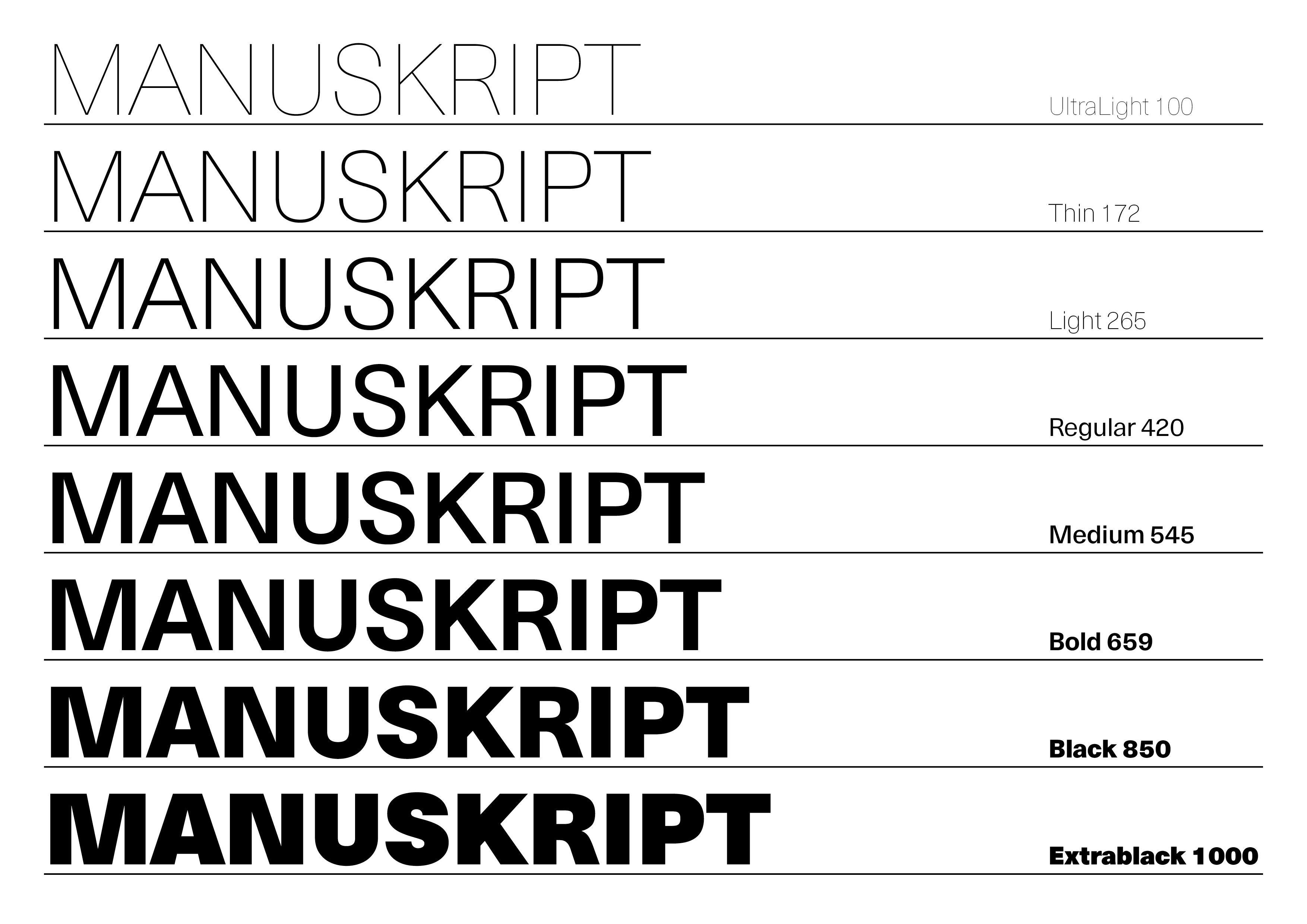
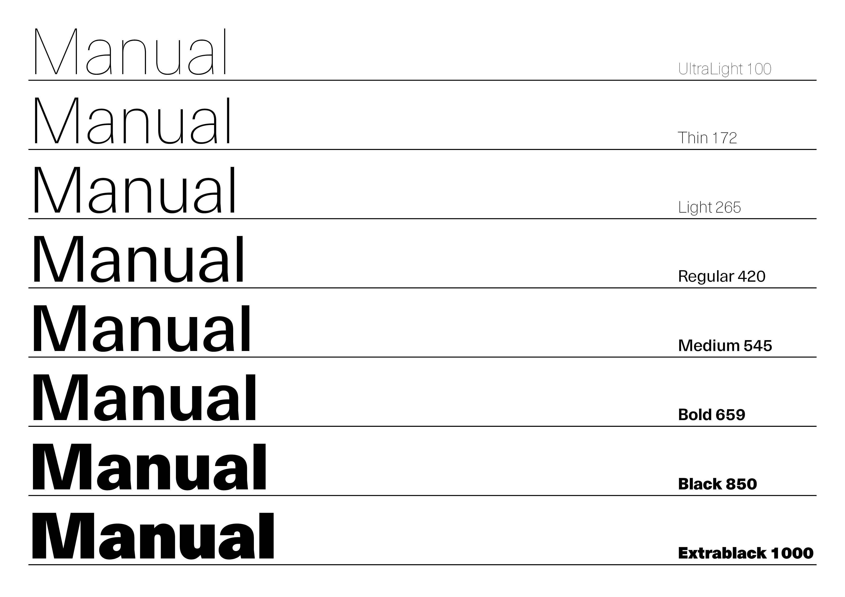
Looks fine to me, but the validity of each weight needs to be tested in more realistic scenario. After all, we are making a collection of useful weights, not beautiful gradation.
The Ultralight looks nicely monolinear, and Extrablack looks reasonably contrasted. The regular in the middle might be too contrasty depending on the preference, and you might need to add an intermediate master there.
(p.s. I didn’t know this Diacritics Club gathering and the Slaughtered Lamb pub. I miss that place, or any pub for that matter)
1 Like
Thanks Omagariさん
Big fan of Neue Haas Unica by the way!
Yes, an intermediate master is next on my list.
This has always been my intent. Pick your weights by how they are to be used, not how nice they look on a specimen sheet. Yes, this is difficult to ascertain. Yes, users have different notions.
It’s the era of variable font where we can finally leave the headache to the users 
My comment was more about the opinion that the curved weight transitions are objectively better than the straight one. Are they though?
2 Likes
Curved but not always the same curve.