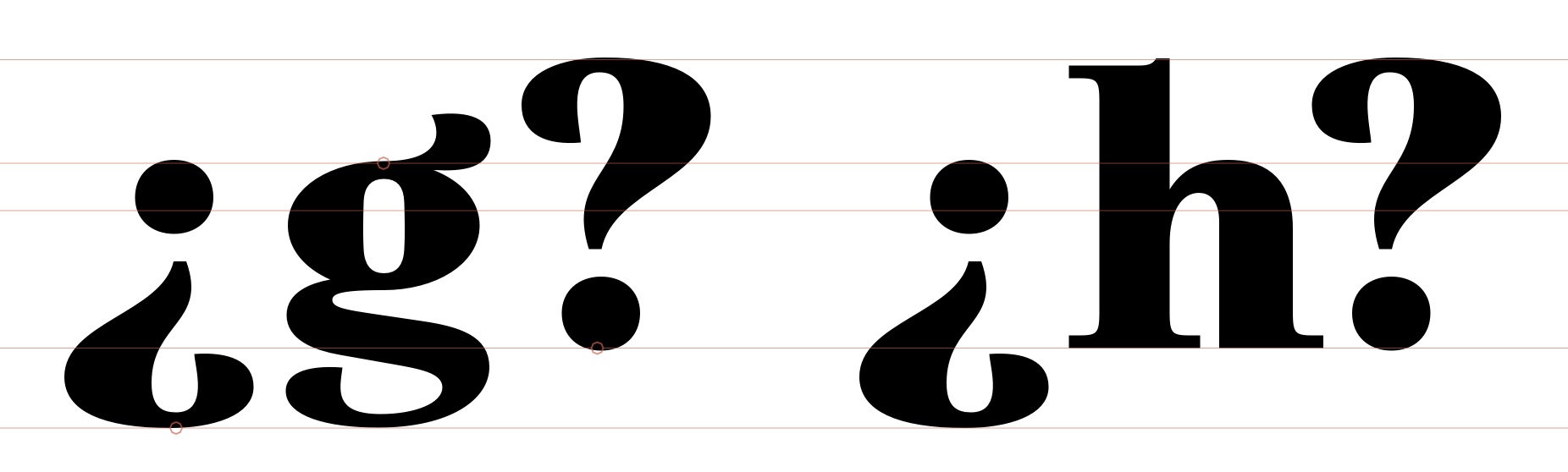
Having always designed these to match the capitals (unorthodox, I know, but so far no complaints) I’ve been adding the traditional lowered versions to a few families. Question: If the descenders are way shorter than the ascenders, is the usual solution to compress the non-dot parts to fit, as here, to prevent them falling below the baseline while still aligning with the x-height?
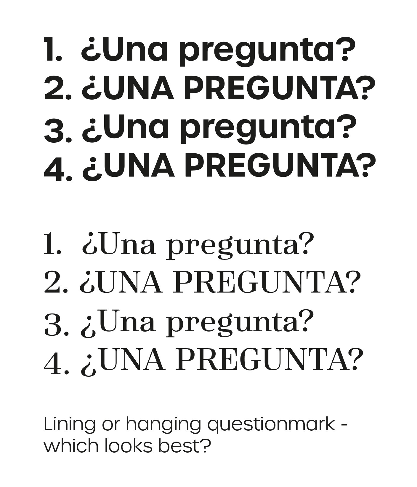
Related point I asked on Twitter: “Spanish afficionados – which version of the “questiondown” looks best? Which would you prefer to be the default in a font? Does your preference differ depending on if it’s a serif or a sans? And is the lower form perhaps due to rotating the ? in hot metal rather than aesthetics?”
It’s probably relevant to note that the opening mark can and does appear mid-sentence, such as:
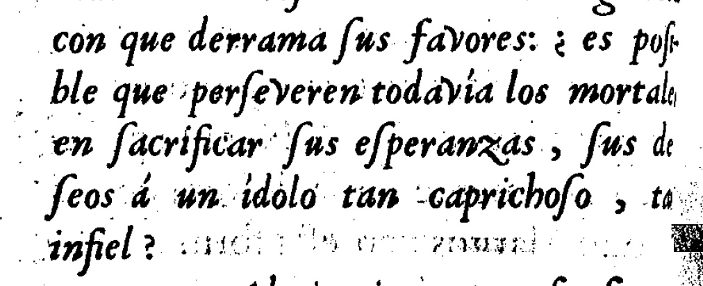
Si necesitas un signo de interrogación, ¿dónde lo pones?
I like include lowered marks, with a CASE feature added to access raised ones.
And yes, compressing it to fit descender depth seems sensible to me.
1 Like
Rian, in Spanish, the use of «questiondown» aligned with the capital letter is not usual. It is possible that it is a characteristic of the traditional writing of the language.
If there are differences between ascenders and descenders it is better to compress the non-dot parts to fit the glyph, as you mentioned before.
1 Like
Orthotypographically spoken, 2 and 3 are correct, 1 and 4 are wrong. Supply both questiondown and questiondown.case. If applicable also .sc.
I would also be interested in the actual question of this thread, which of these options is correct if the x-height–descender distance is substantially shorter than the question/exclam:
- Align the dot of the questiondown with the x-height
- Align the questiondown with the basline
- Squish the questiondown in order to fit it between x-height and baseline
Interesting postscript to this: according to the replies on Twitter ( https://twitter.com/rianhughes/status/1514570164016234496 ) apparently there was no specific questiondown cast in hot metal, so a rotated ‘?’ was used. Which begs the question (the question!): is the tradition of the lowered ? simply a result of hot metal’s shortcomings? Or is there some kind of scriptural/historical precedent for it?
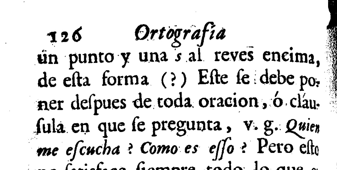
You can see where the inverted question mark is introduced in the 1754 edition of Ortografia de la lengua castellana from the Real Academia Española — the logic given (the text begins on the bottom of page 125, which is page 11 of the second PDF) is that it is unclear when exactly the “interrogative tone” begins especially in long questions, so a question mark at the beginning can be desirable. It is a simple suggestion for an upside-down question mark - I don’t see anything about aligning it, where the dot and baseline should rest, etc. So the historical/scriptural precedent would be, I suppose, however people started implementing the suggestion over the next hundred years
It may very well be the case that it was in fact lowered for the reason you’re describing in metal type. I’m no expert, though. There must be writing from this period that have greater insight into the typographic setting of the character?
1 Like
Thanks for the link, Tribby. Interesting.
I guess the question is “if they had Glyphs back then, would they have aligned the ¿ differently?”.
It’s tempting to now do what we think they might have wished they could do, but couldn’t, because the hot metal type they were using didn’t provide a separate ¿, only a ?.
Whatever the original reason for the dropped ¿ it became the norm, so should we now follow suit because it’s the expected design and anything else (even if it may look better in some cases) just looks wrong? (I feel this way about the monoline zero in Caslon. No idea why it looks like it does. Perhaps it fits with the mathematical symbols better? But — if I were ever to design a Caslon-alike, I may keep it as a historical spandrel (in the Stephen Jay Gould evolutionary sense).
We can of course do both with a .case substitution. But 98% of users, I suspect, won’t see or use it.
TLDR: Should we try and evolve orthographies for aesthetic ends, or honour tradition even if derived from the technological limitations of the past?
What we find aesthetically pleasing has so much to do with what we have seen most that this distention is difficult to make. Specifically as most of us are not native Spanish speakers and more importantly readers. So if you are used to read English or German texts, that dropped question mark might seem out of place but for someone reading Spanish a lot it might be the most natural thing.
3 Likes
The example Tribby links to in the 1754 edition of Ortografia de la lengua castellana is interesting as it seems to fudge the “what to align it with” issue by using a ? and ¿ from a smaller font (a Garamond?) than the rest of the text Screenshot 2022-04-20 at 10.33.40 am|78x64
True, Georg
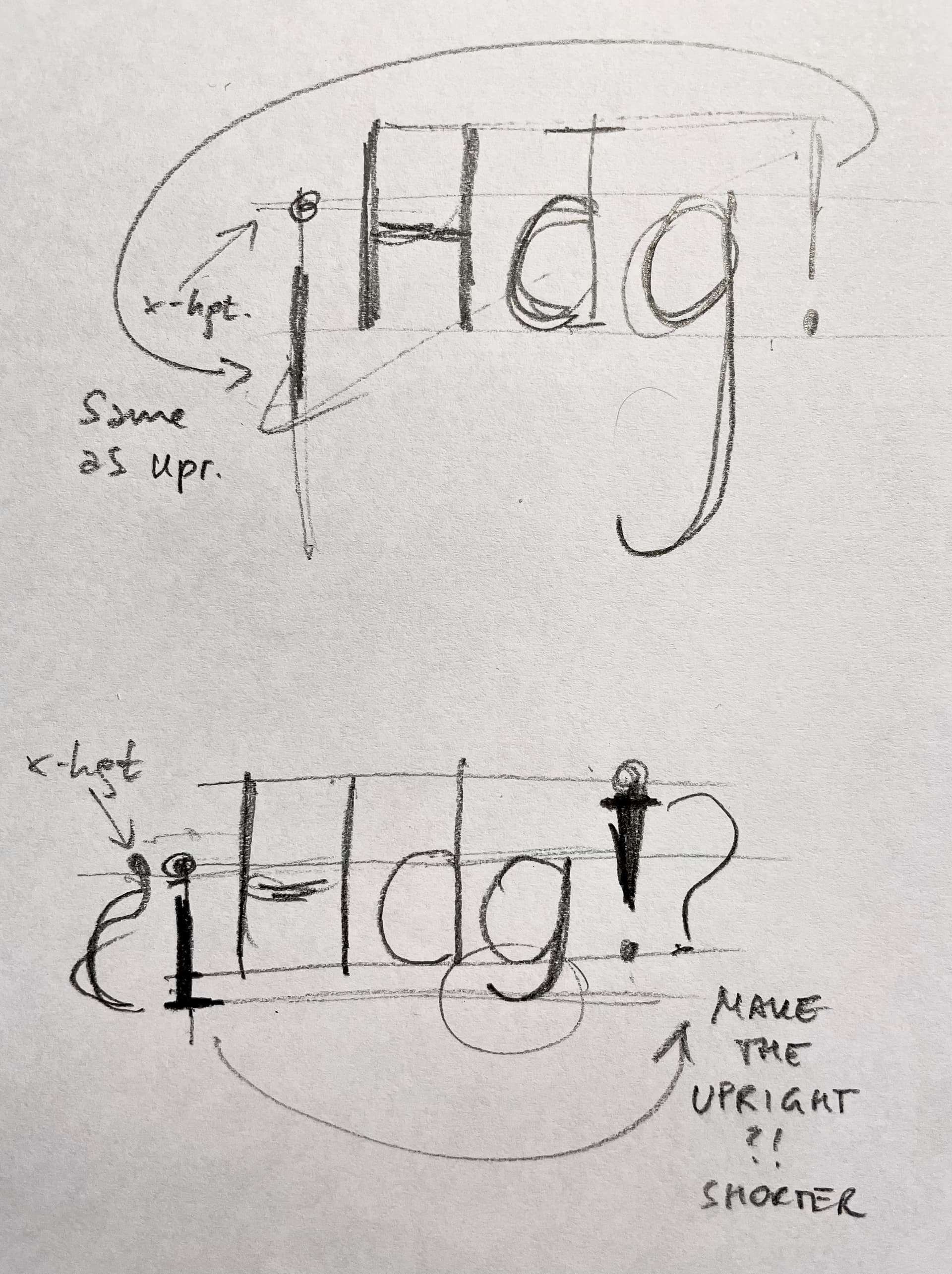
OK, I just got input from a Catalan type designer.
- If you have a very deep descender, you still just flip the
exlamcomponent and align the dot ofexclamdownat the x-height (top picture). The shape of the exclamation mark ignores the descender. - If you have a very shallow descender, you would make the
exclamdownfit between x-height and descender, and then, because the shapes need to be flipped, adapt the uprightexclam.
2 Likes
Thanks for doing the background research, Rainer! Very helpful. Tend to agree with the first point, but think the ‘!’ might look weird if it was visibly shorter than the caps. The ‘?’ would have to follow suit.
Yes, same applies to questiondown of course.
It may look weird, but that is something you will need to consider if you have extremely short descenders and plan to support Spanish. The argument was, that the primary design choice is obviously that nothing should go below the descender so you would sacrifice the height of the upright marks rather than break the descender.