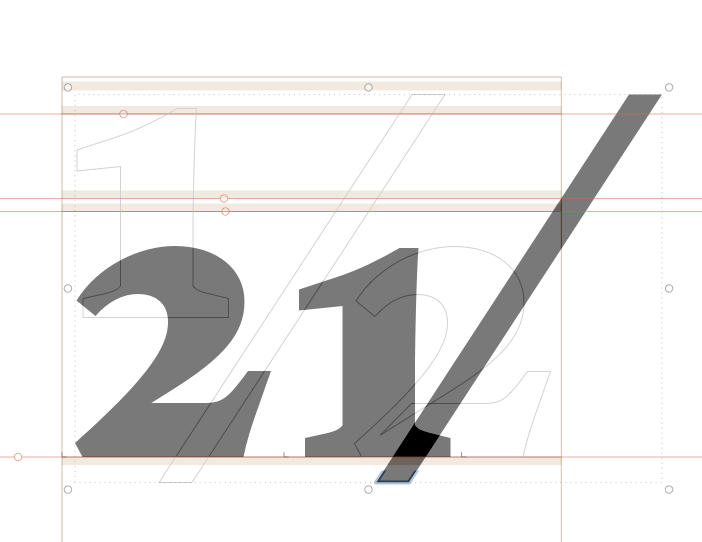
Can you tell me what is the recommended way to build precomposed fractions in Glyphs? At the moment I am using .dnom numerals to make them but if I activate ‘automatic alignment’, this is what happen:
You just have to use the proper components order. Either rebuild the components (Glyph menu > Make Component Glyph) or reorder them with Filter > Fix Compatibility.
“Make component glyph” made the trick but “Fix compatibility” did nothing. Regarding this, I’ve been noticing that every time I run “Fix compatibility” nothing really change in the masters. What can be happening?
You have to drag the components up and down to reorder them in the Fix Compatibility window. Clicking on the “Fix” button doesn’t do anything by itself. Top to bottom in that window indicates first to last or back to front, depending on how you think about it. In the case of a fraction like this, the order is numerator, fraction bar, denominator.
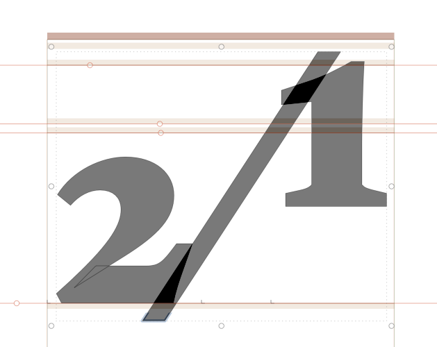
Does your fraction bar have a width? Ideally it shouldn’t; center it on the zero width. All other things being equal the fractions should work very well then. Minor adjustments to individual components can be made by disabling automatic alignment then you can adjust it however you wish.
A small amount of width is OK if unavoidable. As for kerning I do my best to avoid it because under the old standards in commercial typesetting, fractions needed to be reasonably tabular. Any of the fraction numbers can have their design adjusted a small amount to make them work.
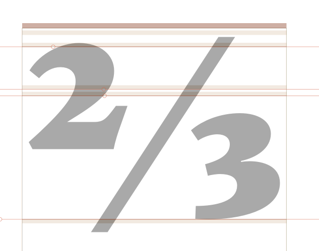
Be default, the fraction will get the sidebearings from the small numbers. That might be a but to tight for the fraction glyph. So you can use =+20 as a metrics key to adjust that.
In my experience, the fraction bar needs to have some width. It depends on how it sets with numerators and denominators without kerning. Its width depends on the weight and the angle.
I’m guessing that you make fairly small numerators and denominators then. The size of those will affect the width of the fraction bar as well. I tend to make my fraction figures 60–67% of the figure size.
No, not at all. 60-65% is a normal desirable range for me too. In practice the zero-width is usually only achievable in the lightest weight(s). That’s why I wrote ideally.