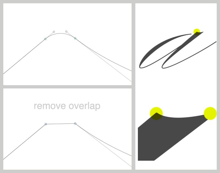
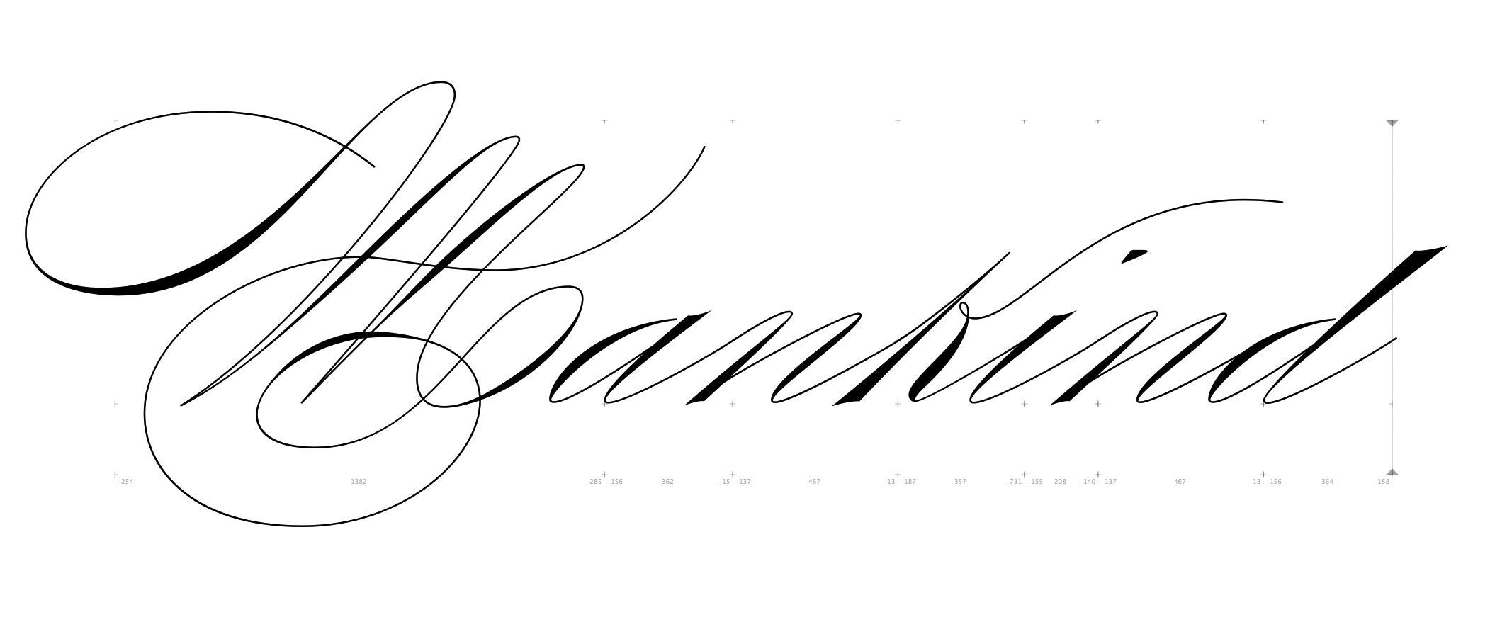
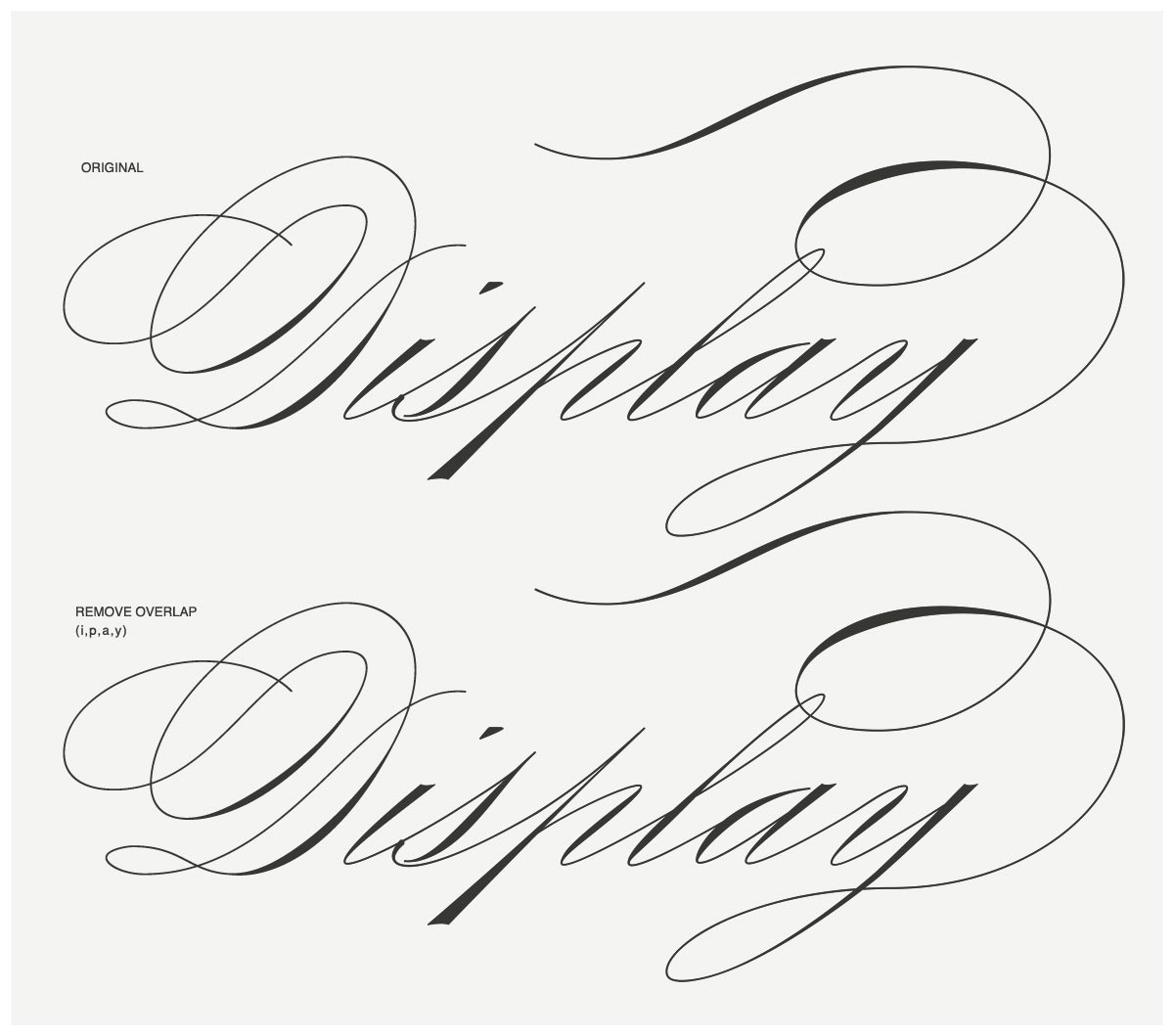
Hello, Im working on a script typeface and Im having a little bit of problem after using the "remove overlap"feature. Its removing some of the smaller curves and and replacing it with a straight line. Doesnt matter if I use Add Extremes or rework the path with correct extremes, it gives me similar results. Any help?

You can try the latest beta (Glyphs > Preferences > Updates > Show Cutting Edge Versions). But the segment really is extremely small, Are you sure you need that level of detail?
Perhaps you can scale the font to a higher UPM. What is your Grid Step setting?
I think you can set Grid Spacing to 0 in Font Info to avoid simplifying segments.
This curves are so small, they are considered not visible by the remove overlay code. How big do you plan to use the typeface?
Thanks for all the replies everybody! Tosche, I tried working with grid 0 and it gave me the same results. Mekkablue, I also tried working at 2000 UPM but was getting still the same problem, but in smaller proportions.
But considering most of your comments, I tried printing the font and also displaying it on screen with both the curves and the straight lines after Remove Overlap and there wasnt any difference. So Mekkablue and Georg are right, I might not need this level of detail, since I dont think the font will be used in very large scales… hopefully…
After merging outlines, your typeface looks as fantastic as the original. I wouldn’t mind or even notice such small corners at all.
Maybe you’re right Georg. Even though I think it looks much better with the curves if the font is applied in large scales, it makes little difference when applied in regular smaller sizes.
thanks again!
Just out of curiosity, how large do you print the word you set with it? And how far away will be the readers for reading it? Because as far as I can see in your screenshot, even if you blow it up to a height of one whole meter, the detail you are talking about will only be a fraction of a millimeter.
Mekkablue, I guess I got lost zooming while working on the font, trying to keep details that are worthless while creating a typeface. But as far as your question, it was actually perceptible the difference even when printing at around 8 cm, because when the corners are rounded it cuts a small but noticeable amount on the top and/or bottom of the letters…
I’ve actually changed quite a few the angles of the round cuts on the top and bottom of letters and removed all of the curved corners that did not make sense. It didnt affect at all the letter forms.

