Encountering this problem in some symmetric glyphs. I am using RoundedFont and RoundCorner filters.
I can work around by adding a layer but I was wondering if I could prevent that somehow?
Encountering this problem in some symmetric glyphs. I am using RoundedFont and RoundCorner filters.
I can work around by adding a layer but I was wondering if I could prevent that somehow?
Move the starting point to a smooth node. And please send me the file for debugging this.
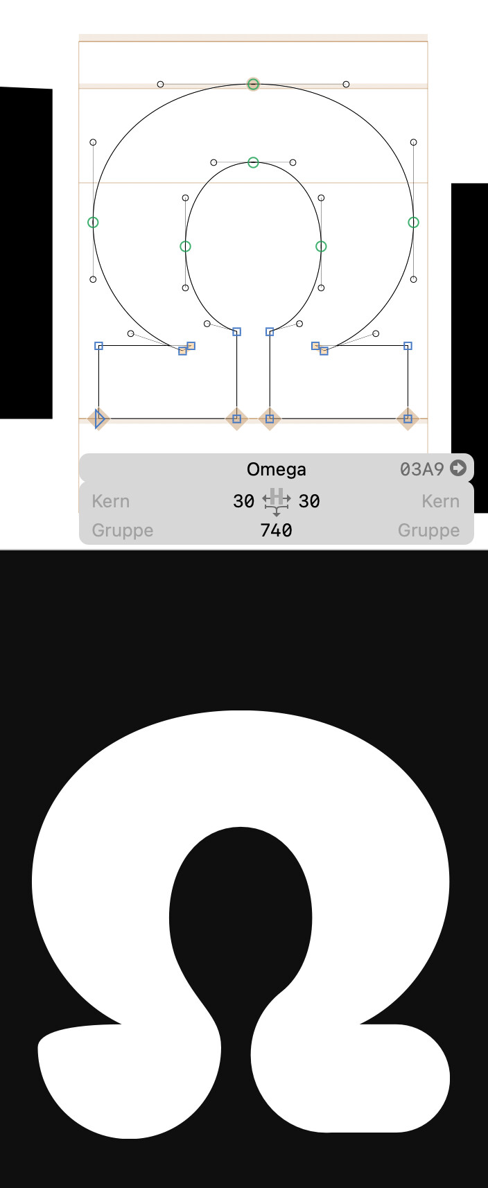
The problem is that some shapes like the top of the “M” should be fully rounded, but paths of very similar length (like the bottom of the “Omega”) shouldn’t. Both are much longer than the regular stem width. You can control it with the argument in the RoundFont filter. With “200”, the “Omega” looks good and with 240, the “M”. So for now, we need two filters:

