Hi,
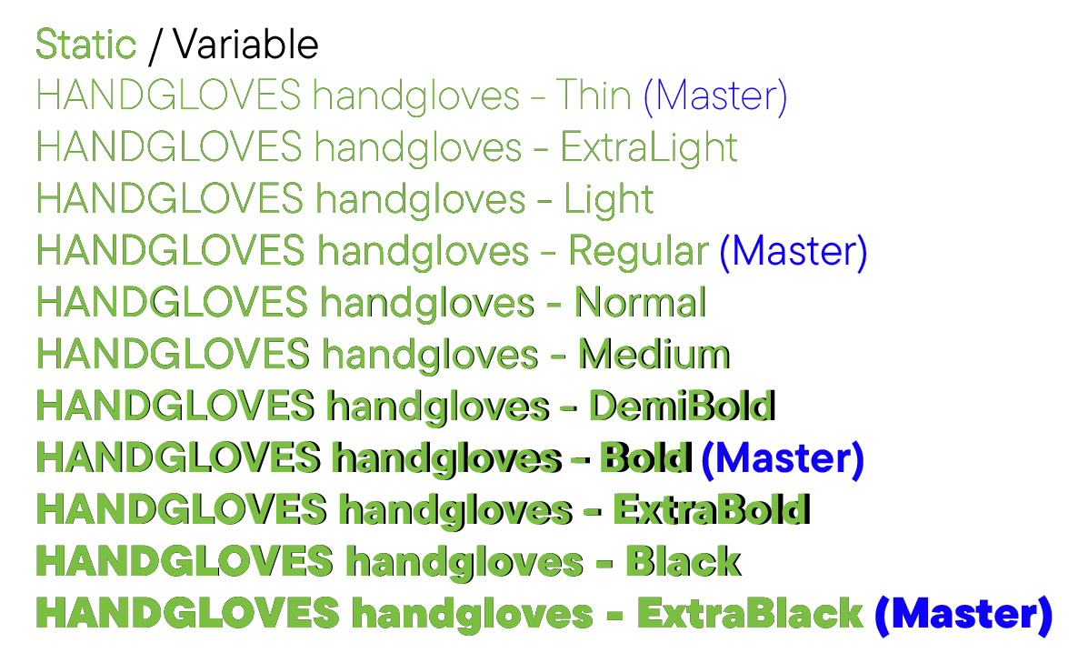
I generated static and variable fonts from one source file to compare same weights. Three of four masters looks good (interpolated instances between Thin and Regular too), but the Bold master have the difference. In variable font Bold master bolder then in static font, also instances from Regular to Bold, from Bold to ExtraBlack bolder too.
On the large screenshot it looks like different spacing, so zoom shown the little differences in contours.
Hi,
I generated static and variable fonts from one source file to compare same weights. Three of four masters looks good (interpolated instances between Thin and Regular too), but the Bold master have the difference. In variable font Bold master bolder then in static font, also instances from Regular to Bold, from Bold to ExtraBlack bolder too.
On the large screenshot it looks like different spacing, but zoom shown the little differences in contours.
Do you know how to generate variable font with contours as it drawn in all masters - Thin, Regular, Bold, ExtraBlack?
The algorithm that computes the static instances and that does the interpolation is slightly different. The “static” algorithm can handle many diverse master and produces slightly different values. The next version will have an option to choose what interpolation to use for the static instances. That limits the possible master arrangements but keeps it in sync with variable fonts.