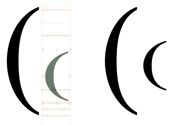
When you scale down a component with automatic alignment turned on, the glyph’s vertical center appears to be at the 25% mark instead of at the middle section. These components will thus appear much lower than they likely should.
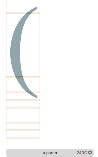
The glyph that is focused on here contains only a component linked to the parenthesis seen on the left. This scaled down parenthesis appears much lower than its full size variant.
On the right you can see an additional parenthesis with a scaled down version that has had its automatic alignment turned off and has been manually corrected to have the same center as the source glyph.
Is it a deliberate choice to have scaled down components have a lower center, or is it a bug that needs to be fixed? The form shown on the right is what I would expect to be the default.
The positioning is not from the center but from the baseline. When you use a suffix like “.subs”, “.sups” or “.sinf” (or manually set the case to “minor”) the component switches alignment mode so that you can move it up and down and still get horizontal alignment (specially useful for italics).
Is there any way to change what line scaled glyphs considers their center within the program?
As for setting the case to minor. It seems like this will only work when there is one component inside the glyphs, when multiple are in the glyph they are forcibly automatically aligned. Is there any specific for why you can only vertically align a single automatically aligned component and not multiple ones? There are a few cases where it could be useful.
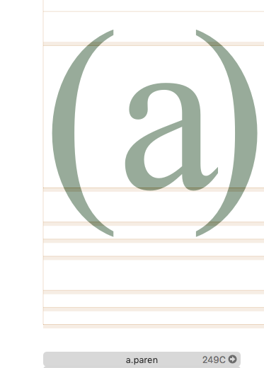
The reason for this post was that I was testing the Build Glyphs function of Mekkablue’s scripts. The parenthesised glyphs that are genereated there are simply scaled down letters and parenthesis set to automatically align. As they are scaled down and as a consequence also lowered, they appear somewhat odd beside the regular letters. I believe having these symbols centered alongside the center instead of the baseline in some way would make them look more natural.
If remove the a and ) components from the a.paren glyph I am able to modify the ('s vertical alignment. This doesn’t work when all three components are part of the glyph.
You should make a parenleft.lowercase and parenright.lowercase and use those in the aparen. In the .lowercase glyphs you scale down the components. And set them to minor.