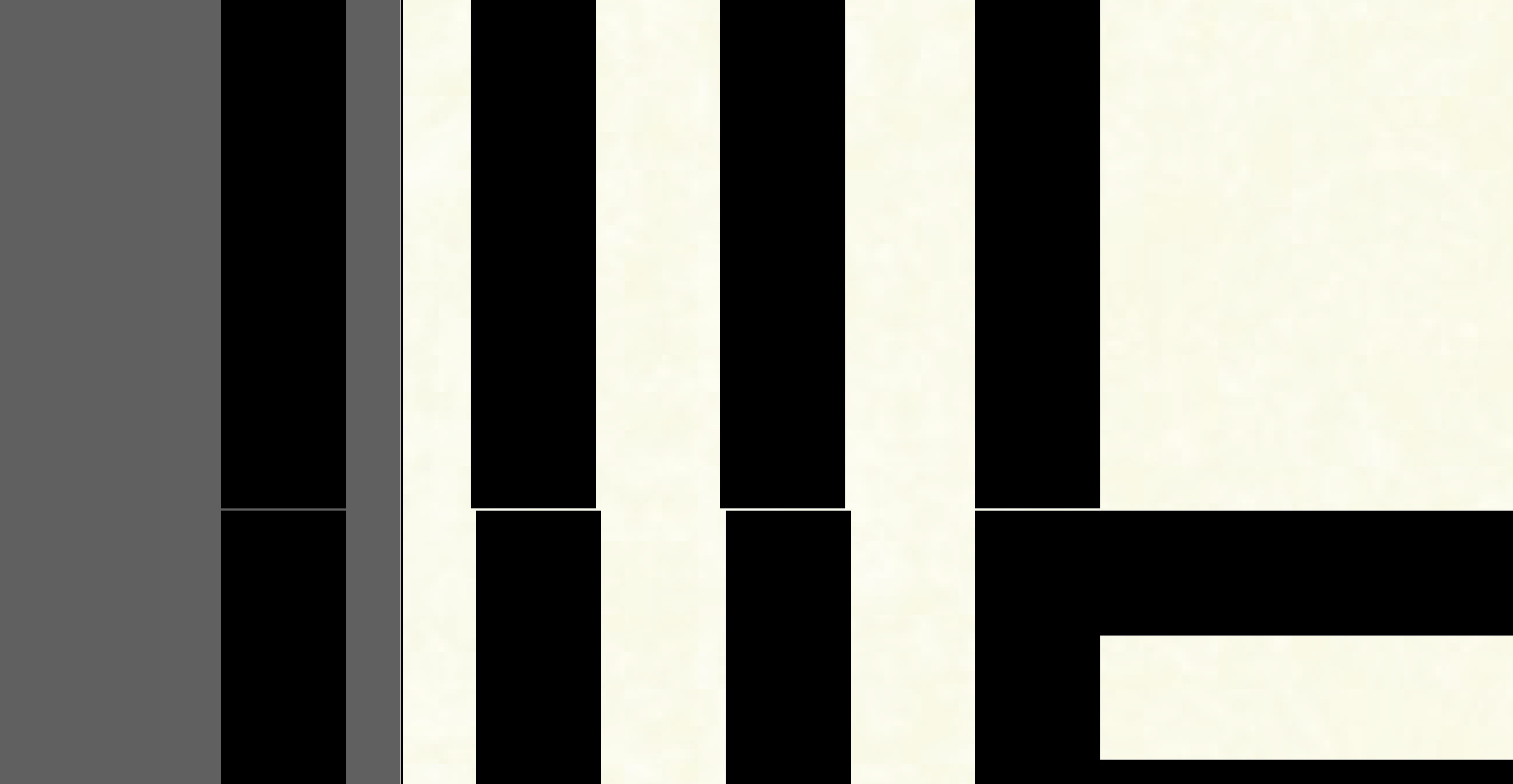
I’ve been working on an interlocking font for a while and have been frustrated with the exported results when I am working with the otf file in adobe illustrator. I am designing it with interlocking letters in mind. The only letter that is giving me issues is the F, all of the other vertical and horizontal lines line up with the others perfectly. This image is the F on top of the P without any adjustments to the forms, just some tight leading, it lines up perfectly in Glyphs mini
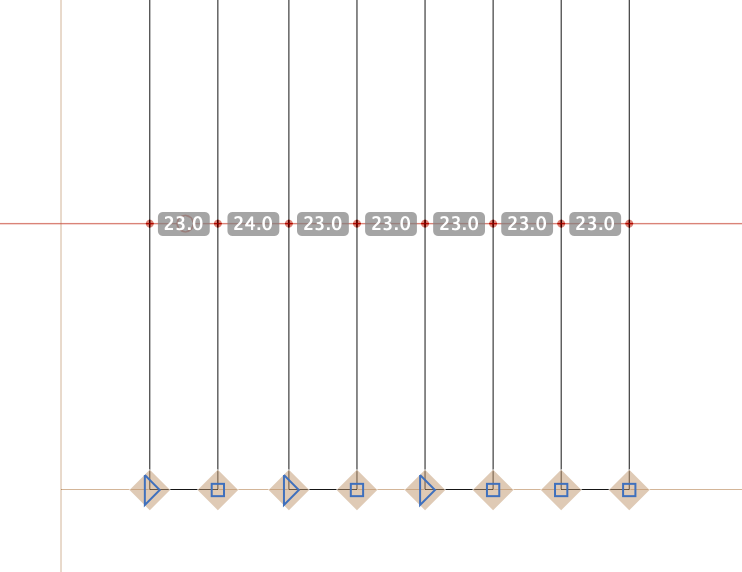
The first gap in the F is 24 units and in the P is 23. Fixing that will fix the alignment in Illustrator.
You can use a measuring global guide to help finding those inconsistencies:
This is the weirdest thing, I just tried to use the P I had as the framework for the F and it is still yielding the first result I had. Now admittedly I did create the original file in illustrator and set up a key with the parallel lines evenly distributed from each other, I started analyzing my file further to realize that almost all the other letters have a measurements in the negative space that is inconsistent throughout. Do I need to re-create the key file entirely in Glyphs Mini? The gaps in my illustrator file are all exactly 23.327 but don’t transfer to the same numbers in Glyphs mini.
In fonts, normally, all measurements are rounded to full integers. You could simply disable this but that makes it much more difficult to create consistency and increases the file size by quite a bit. You don’t need to recreate it, just go through all letter with the measuring guide active and fix it. Should take a few minutes.
And set metrics keys (https://glyphsapp.com/tutorials/spacing > Side-bearing arithmetics) to make keep the side bearings in sync.