Hi there,
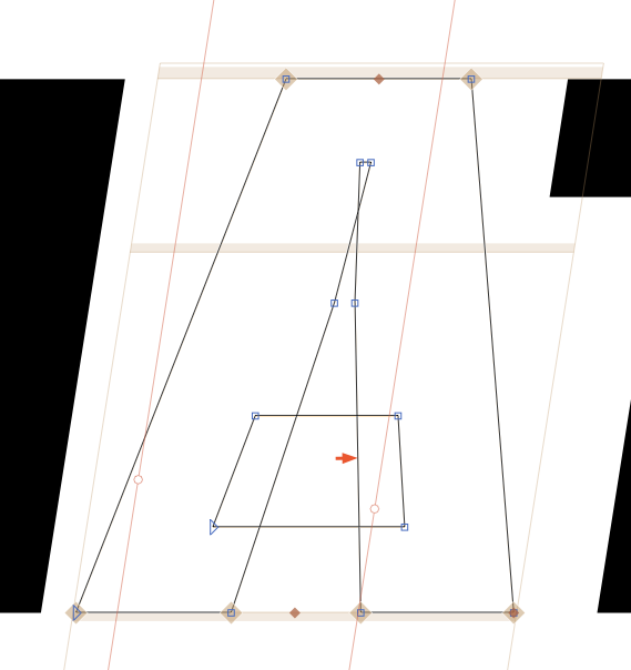
I know Var fonts can have overlaps but due to inconsistent browser support, what’s the current recommended policy for overlapping crossbars like in A (and similar)?
TIA

Hi there,
I know Var fonts can have overlaps but due to inconsistent browser support, what’s the current recommended policy for overlapping crossbars like in A (and similar)?
TIA

No. You should keep them. Otherwise the interpolation will not work well.
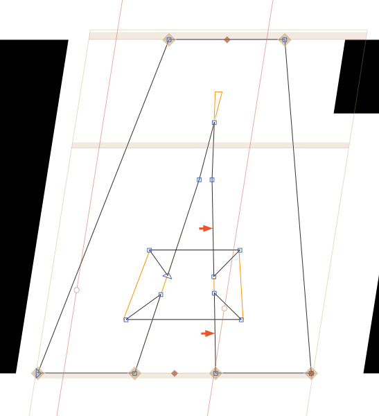
What about contour hacks like this one?

What should that improve? You don’t want to have points on the diagonals, as that can lead to kinks.
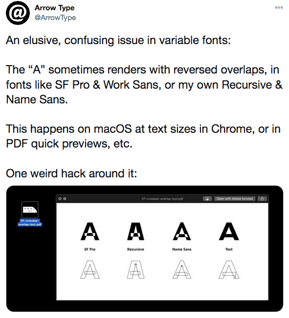
Having overlaps in only one contour would avoid this sort of situations (which I also encounter all the time with my Firefox 78.4 browser.)

It should not make a difference. If the rendering can’t handle overlaps like this, it might mess up with the single counter, too. This is clearly a bug in the rendering as the OpenType spec explicitly allows overlaps for variable fonts.
When bugs are so widespread and stay years uncorrected, developers use hacks to circumvent them. It’s a common situation and that’s why I asked.
Instead of circumventing others bugs, I would keep reporting them to the to the responsible parties. If enough people complain, bugs get fixed much faster.
And what macOS version was that?
Yosemite 10.10.5
10.10 doesn’t officially support variable fonts.
Hi. My Mac OS High Sierra 10.12.6 also renders the reversed overlaps for MT Macklin Sans Variable on PDFs previews. In addition, FontExorerX also renders the overlapping strokes in a weird way, making them visible.
These bugs have been there for years and will probably stay for quite a long time. Try to explain to a client the problem telling him it’s better to wait until the big tech companies fix them. Implementing hacks makes some sense, IMHO.
This is a more profound question. The ‘hack’ should better be that users of old machines get the static font family, or better yet, upgrade to a newer OS.
We cannot expect abandoned OS versions to retro-adapt for future technologies. macOS 10.10 was released in 2014, OTVar announced in late 2016, sensible app (i.e., browser) support was not there before 2017. The first macOS to officially support variable fonts was 10.13 High Sierra from 2017. It is normal that old OS versions do not support newer technologies. That is why there are new OS versions.
On the other hand, users of old Macs are traditionally lazy in updating, even if their hardware supports newer OS versions. In recent macOS versions, it has become much easier to upgrade though, and macOS is nudging the users more. macOS is still far from the upgrade discipline of iOS though. Having said that, pre-10.13 macOS versions are really becoming rare now, and pre-10.12 has a combined Mac marketshare of less than 10%.
Overlaps in TrueType outlines have always been allowed (and used) since TrueType was invented by Apple (Sampo Kaasila) and brought to market in 1991. When OSX came, it seemed that there were no font technicians left at Apple, because most things stopped working properly. Colored bitmaps died, hints interpretation died, flexible style links from FOND resources were forgotten, and the rendering of PostScript fonts was truly awful for many years. Apple really f**ked up well designed PS outlines with a lousy conversion to some lousy rendering technology, very ugly! I was so annoyed that I got myself a PC, and learned that everything with fonts worked much better on Windows than in MacOS9 and 10 combined.
Windows 10 has native support for variable fonts, don’t forget to double-click your variable fonts on a PC to check if you can step through all instances.
Using overlaps is needed, but awful for plotting. Vinyl letters with cuts inside will show white lines in the first summer outside, even with high quality adhesive foil. I do not consider that to be a type designers problem, but a problem of OS, printer drivers, and plotter software, which always seems to be ancient.
A system that ‘supports’ variable fonts is supposed to deliver flattened outlines to printer drivers and such.
From my experience, not removing overlaps for variable fonts would cause some rendering issues.
For Adobe apps, some horizontal bars would be rendered with one less line of pixel:
On Sketch, not-outlined variable font may be rendered with one extra line of pixel on stems:
(Are these related to hinting?) I found them unsuitable for product shipment yet. Even without removing overlaps a non-variable font would not have these issues.