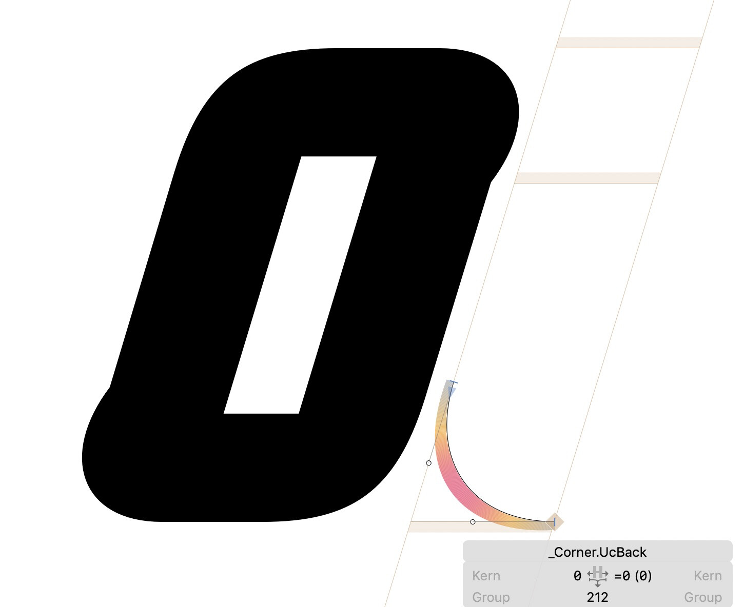
I’m working on an italic font with fairly geometric construction and hoping to use corner components for consistency sake, but unlike upright fonts where the corner component evenly lines up with the vertical edge of the glyphs bounding box, I have to slide the corner component left/right to a seemingly arbitrary degree (78 units in this case) for the corner to align evenly in the parent glyph it’s applied.
Below are screenshots of the bottom right/top left corner component adjusted so it aligns as intended, and then positioned like I normally would for an upright style with the distorted result. (And as a note, there has been no scaling/rotation/flipping of the components in the example below)
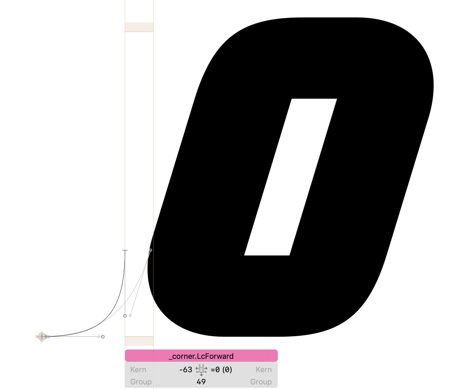
In the second screenshot, the corner component path is aligned with the left edge of its bounding box but doesn’t align properly as expected. Am I misunderstanding how corner components work in italic fonts? Is there a way to ensure they integrate seamlessly with the paths of their parent glyphs without sliding it back and forth until it looks right?
Any advice or suggestions would be greatly appreciated!
Try naming the corner glyphs with a lowercase “c”.
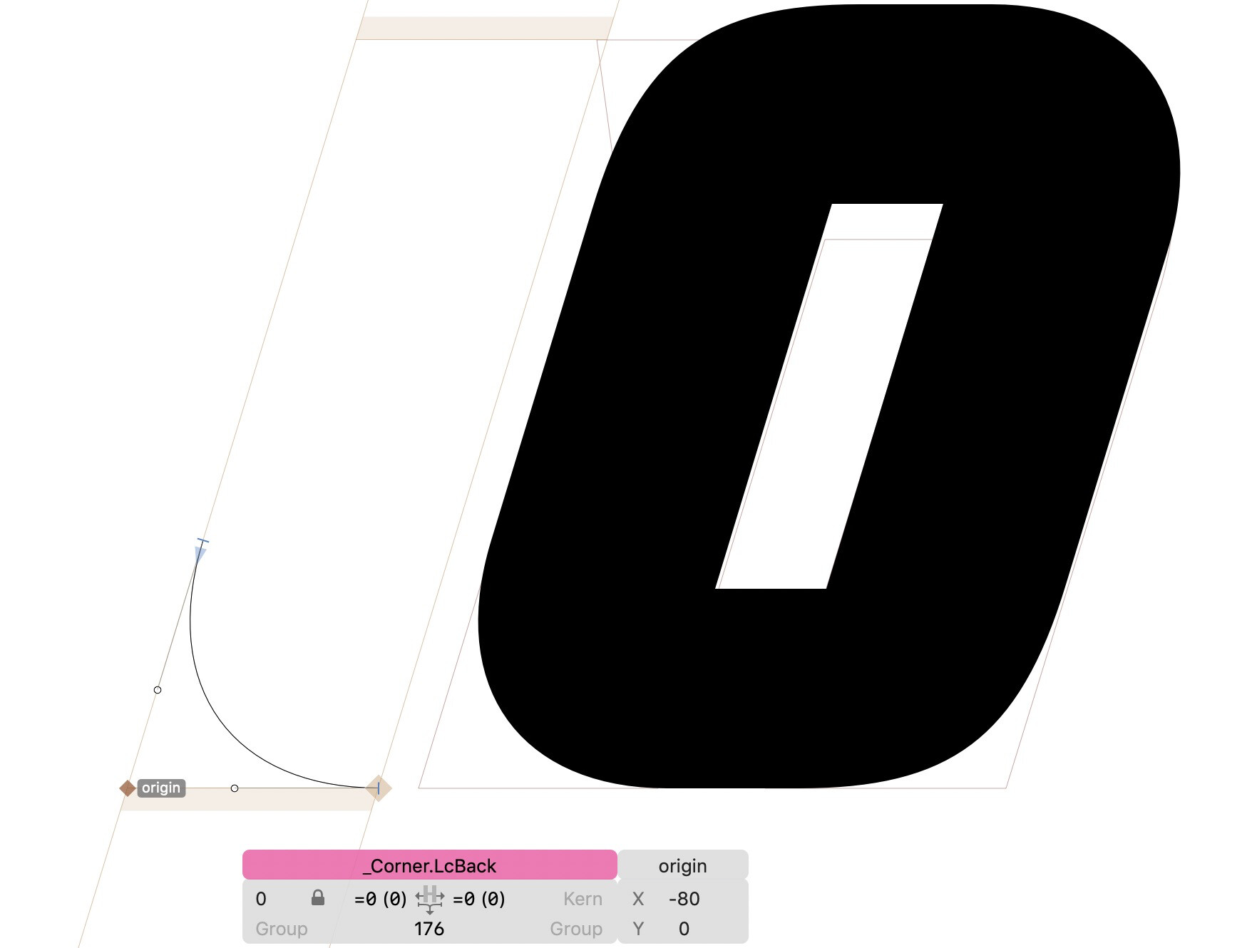
It still centers around the zero point. But the easiest is to at a “origin” anchor, that way the position doesn’t matter any more.
1 Like
So it turns out both of your suggestions work - renaming the “Corner” to “corner” removed the italic angle to that specific glyph, but then the path could be modified/redrawn as if it was upright and then is bent/warped into position when applied to the parent glyph.
But in this case, I think using the “origin” trick makes the most sense to have the most control over the paths and prevent unwanted distortion when the italic angle is applied to a path drawn for an upright/roman letter. Also, didn’t need to rename “C” to “c” in this case either.
Good to know both are options that solve the issue, thanks!!
I’m wondering why the uppercase name works at all. It is supposed to be lowercase.
It’s actually been fantastic - while I do have to have two separate corner components (one for corners leaning forward and one for the ones leaning back), it allows much better precision to manage the flow/tension in the curve than using lower case “corner” and then letting Glyphs skew it to the propper italic angle.
I run into any other surprises I’ll let you know!