Hi, I’m a bit confused about the logic of side bearings on hyphens, em, and en dashes. Looking at professional fonts (in this case Avant Garde), I see the hyphen has zero space side bearings. But En and Em dashes have 35 each.
I always had the impression that a hyphen would be placed directly next to the words, whereas an em or en dash would have a space between them and the words. But maybe I’m wrong about that?
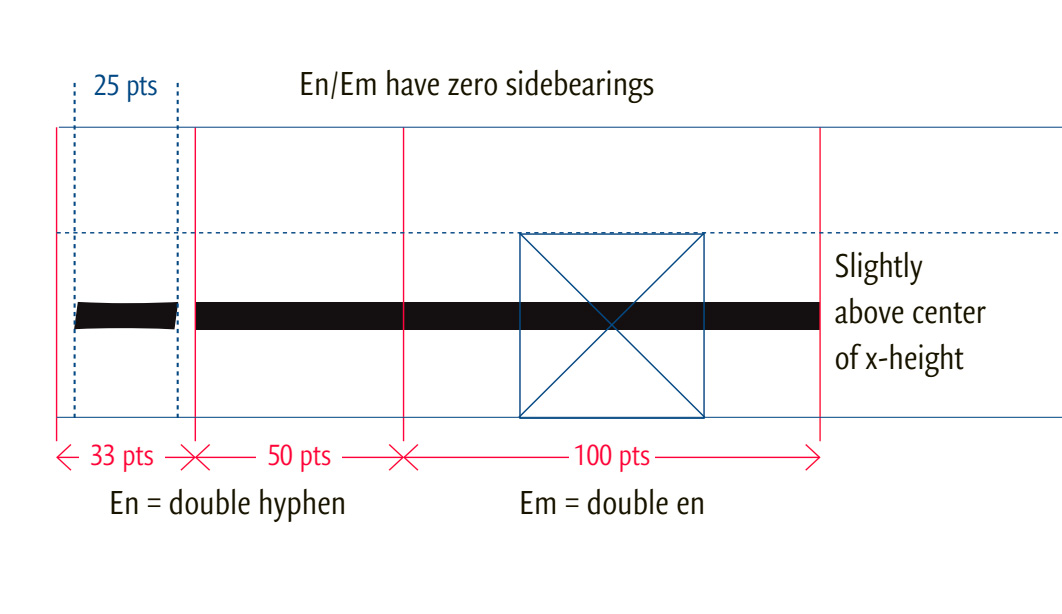
En and Em are already wide, and with a space+side bearings makes them feel too wide.
Hyphens with zero side bearings make the spacing feel too tight to me. (also Avant Garde)
So I looked at Poppins, and see the same basic approach except the side bearings are uneven. But still: less space around hyphen and more around en and em.
When it comes to checking anything quality-related, it’s better to look through fonts by well-established independent foundries, rather than free fonts / Monotype fonts / system fonts.
Opinions vary among type designers, and typographic customs vary too. How the dashes are used depends also on the language context. English typography has different uses for the dashes than German typography, for instance; and even within one language, there is usually no consistency. Different traditions come into play; meaning that what we see today as hyphen, endash and emdash in Unicode is the result of a long unification process. My suggestion would be to form your own opinion based on how the dashes are used in the languages you cater to primarily. If zero sidebearings is too tight, of course, give it a bit of space. Or, for instance, emdashes are often set without extra spaces, and for different purposes, like replacing a double zero in prices.
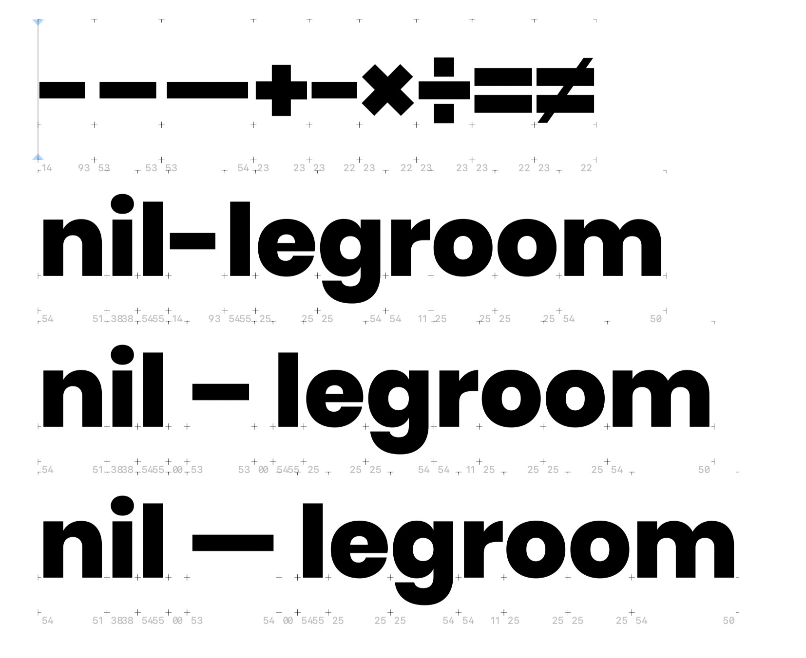
I do a lot of typesetting, primarily in Czech but very often also in other European languages. Personally, it bothers me if glyphs like hyphen or dashes have zero LSB or RSB. Mainly because there are sometimes situations in text where several hyphens or dashes are repeated in a row and the reader must be able to recognize the individual characters. ----- (Can you recognize five hyphens?) In addition, I think it doesn’t look good if the hyphen/dash is stuck to the word completely tight, a certain space looks better. Especially because the outer shapes of some letters in principle have more free space: k-o, X–H or 7—0.
There was never a hard and fast rule other than those established by organization style books such as the The Chicago Manual of Style, the Associated Press, the U.S. Government Printing Office, a local newspaper or other company, among others.
During the years I was in commercial typesetting, typesetting companies even had their house standards based on the type of work they did (legal, advertising, etc.). So it really is up to the designer and/or the design itself how sidebearings are treated for the dashes in their fonts. The user will use them as their preferences or need dictates.
The shift from em-dash without spaces to en-dash with spaces were a Jan Tschichold innovation when he specified it in the ‘Penguin Composition Rules’ a few years after WWII. Jan Tschichold’s writings, eg. ‘Die Neue Typographie’, became popular in Europe, but the Yankees never got that memo, so they stuck with the older style.